返回列表
🧠 阿头学 · 💬 讨论题

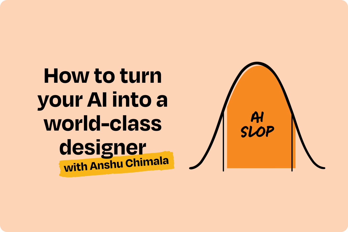
AI 设计破局指南:对抗概率平庸的“熵增-收敛”工作流

AI 生成设计的平庸本质是概率预测机制的必然结果,唯有通过外部注入随机性、解耦执行与评审、以及人类主导的强制减法,才能突破“委员会式设计”的天花板。
打开原文 ↗

2026-09-02 原文链接 ↗
阅读简报
双语对照
完整翻译
原文
讨论归档

核心观点

  • 对抗概率平庸:LLM 的“下一个词元预测”机制天然倾向安全与同质化,直接要求“创新”只会触发虚假随机,必须用外部脚本生成随机字符串或跨界灵感强行切断模型的统计惯性。
  • 执行与评审解耦:编码智能体无法客观审视自身输出,引入仅看截图的“评论家子智能体”进行独立打分,能以极低成本建立高质量的正向反馈循环。
  • 多模态注入破局:纯代码生成的 UI 缺乏视觉张力,强制调用图像/视频 API 生成关键帧与动态过渡,能瞬间拉开与模板化产物的差距。
  • 人类减法即壁垒:AI 的本能是过度堆砌元素,真正的高级感来源于人类基于产品逻辑的克制与删减,保留原生组件与核心信息才是交付标准。

跟我们的关联

  • 对 👤ATou 意味着 AI 辅助设计的核心已从“提效生成”转向“审美裁决”,下一步需建立明确的验收红线与“执行-评审”双 Agent 工作流,将人力从写 Prompt 转移到设定质量基准与做减法上。
  • 对 🧠Neta 意味着单纯依赖大模型原生能力无法产出生产级 UI,下一步需封装外部随机种子注入逻辑、集成多模态 API 路由,并严格控制 Agent 循环的 Token 消耗与停止阈值。
  • 对 🪞Uota 意味着 AI 无法替代人类的直觉与跨界联想,下一步应放弃让 AI 直接出稿,转而将 AI 降维为“灵感发散器”与“素材生成器”,自身聚焦于情绪板构建与视觉收敛。

讨论引子

  • 当 AI 的“平庸”是训练数据与概率机制的必然结果时,团队应如何量化评估“外部注入随机性”带来的设计溢价与工程维护成本之间的 ROI?
  • 在复杂业务系统(如多状态 SaaS 仪表盘)中,“执行-评审”双智能体循环极易因逻辑约束崩溃,该工作流应如何改造才能适配高确定性场景?
  • 如果下一代模型原生具备多模态理解与强逻辑推理能力,当前依赖 API 拼接与提示词工程的“黑客手段”是否会彻底失效,人类设计师的护城河究竟该建在哪里?

👋 大家好,我是 Lenny。每周我都会分享经过深入研究的产品、增长和职业建议。了解更多:Lenny’s Jobs | Lenny’s Podcast | Lennybot | How I AI | Become an AI-Native Builder 以及我其他的 AI/PM courses

立即订阅

P.S. 成为 Insider 订阅用户(名额有限),即可免费获得一整年的 Cursor、Notion、Replit、Lovable、Wispr Flow、Linear、ElevenLabs、Factory、PostHog、Granola、Brain.fm、Waking Up 等权益。了解更多


我一直以为 AI 不擅长设计。但在读了 Anshu Chimala 这篇令人脑洞大开的文章后,我意识到只是我之前的方法不对。Anshu 在 Apple 领导软件工程和设计团队长达 12 年,专注于未来 AI 产品的研究与原型开发。他经常在 X 上分享设计教程和演示(他是我最喜欢的关注对象之一)。若想深入了解如何利用 AI 打造独特的体验,请访问他的 Substack,或在 LinkedIn 上与他联系。

让我们开始吧。


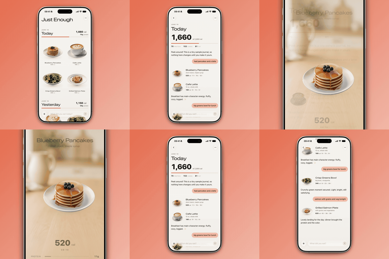
一个对话式卡路里追踪器,仅用 3 个提示词通过 Claude Fable 5 构建:

[

](https://substackcdn.com/image/fetch/$s_!4xxl!,f_auto,q_auto:good,fl_progressive:steep/https%3A%2F%2Fsubstack-post-media.s3.amazonaws.com%2Fpublic%2Fimages%2Ff7135ec6-882d-462e-9935-308206a97182_900x900.gif)

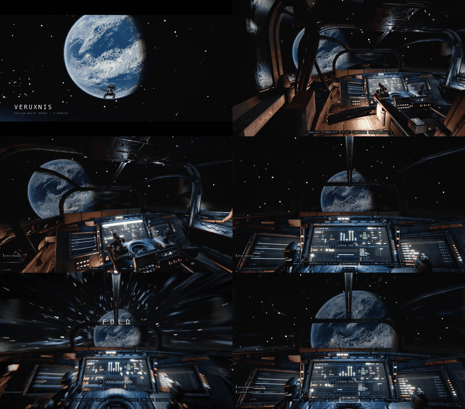
一款太空探索游戏,仅用 2 个提示词通过 Claude Opus 5 构建:

[

](https://substackcdn.com/image/fetch/$s_!Gt3V!,f_auto,q_auto:good,fl_progressive:steep/https%3A%2F%2Fsubstack-post-media.s3.amazonaws.com%2Fpublic%2Fimages%2Fc1445c00-4834-4a86-ab85-5e53ae87a652_900x528.gif)

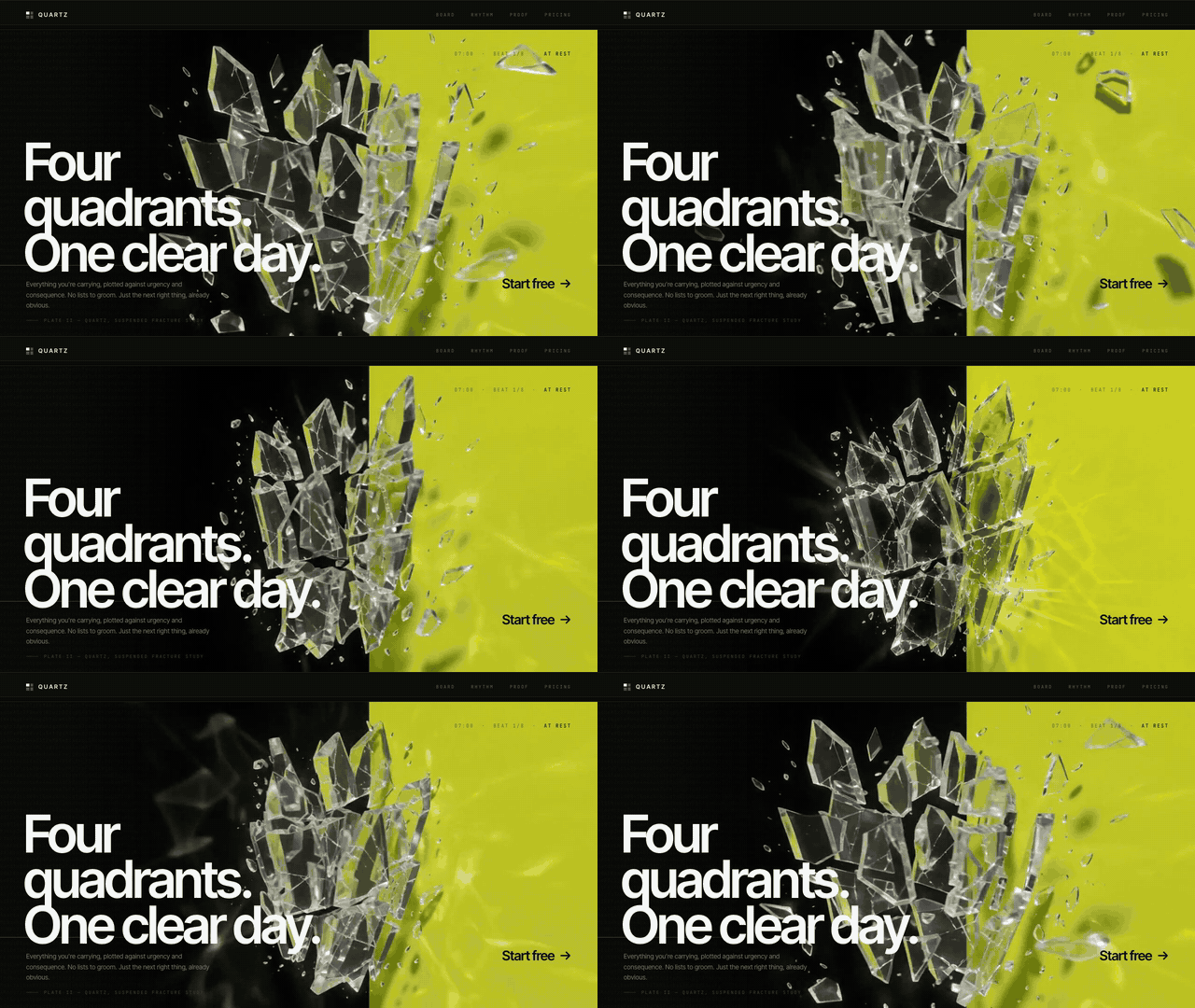
一个动态落地页,仅用 3 个提示词通过 Claude Opus 5 + GPT-5.6 Sol 构建:

[

](https://substackcdn.com/image/fetch/$s_!o3aj!,f_auto,q_auto:good,fl_progressive:steep/https%3A%2F%2Fsubstack-post-media.s3.amazonaws.com%2Fpublic%2Fimages%2Fa3d78ad3-3100-4bf0-b6be-0fc4cfa07987_640x360.gif)

我经常在 X 上发布这类 AI 设计演示。每次发布后,总有人会问:“为什么模型能为你创造出这些不可思议的东西,而我一尝试却只得到千篇一律的平庸内容?感觉你用的完全是另一个模型。”

我用的并不是不同的模型,只是我从这些模型中榨取了更多价值。大多数人只看到了 AI 1% 的创造潜力。我想向你展示如何挖掘剩下的 99%。

AI 模型具备惊人的创造力,但这种创造力往往被其训练方式所扼杀。大语言模型(Large Language Models)本质上是“下一个词元预测器(next-token predictors)”:在每一步中,它们会查看一段文本序列,并基于数百万个示例预测接下来会出现什么。这些结果可能会经过人类评分,并将评分反馈给模型。这教会了模型做出符合大众偏好的、一致且安全的选择。

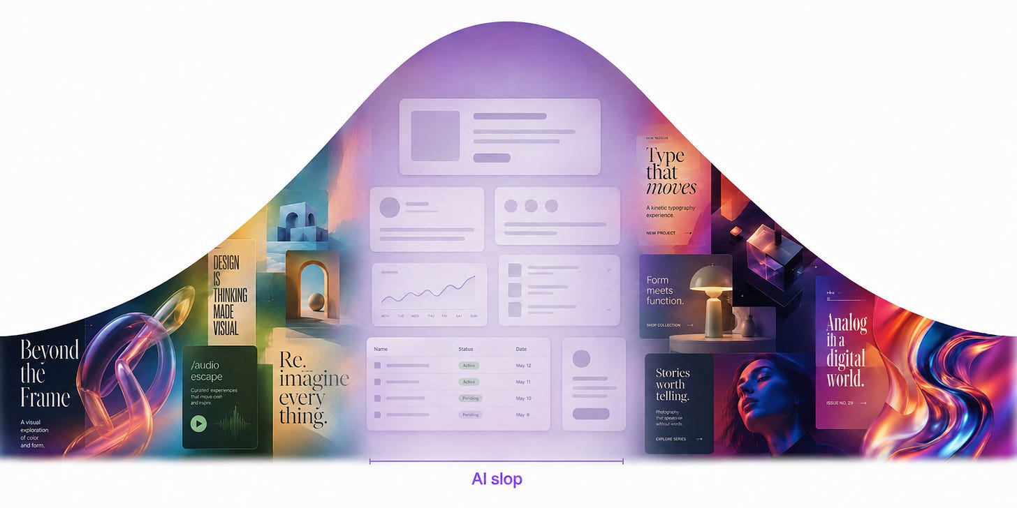
这使得典型的 LLM 在大多数任务上表现出色,但在设计方面却表现不佳。要创建设计,LLM 必须逐个词元(token)地构建它。每当需要做出设计决策时——比如使用什么颜色,或如何排列元素——模型就会填入它认为最可能取悦所有人的词元。结果就是,设计最终往往显得重复且乏味。这就像是“委员会式设计(design-by-committee)”的终极体现。

相反,优秀的设计始于直觉,旨在引发情感共鸣。它会打破常规,用令人难忘、出乎意料的选择取悦用户。优秀的设计恰恰与 LLM 的自然行为背道而驰,因为 LLM 的本能是在每一步都做出最可预测的选择。

然而,如果我们能引导模型超越那些最可预测的选择,就能触及大多数人错失的广阔创意天地。

[

](https://substackcdn.com/image/fetch/$s_!ATUP!,f_auto,q_auto:good,fl_progressive:steep/https%3A%2F%2Fsubstack-post-media.s3.amazonaws.com%2Fpublic%2Fimages%2Fbc7e732b-64b8-4538-8b17-82290d34d032_1774x887.png)

这是我在管理 AI 设计师之前,从管理人类设计师那里学到的经验。在 Apple 任职的大部分时间里,我领导着一个研发团队,负责探索未来 AI 产品的设计。早期,我们对用户界面应如何运作的先入之见限制了我们的创造力,使我们不断回到老套的想法上。通过严谨的态度和全新的流程,我们学会了停止重复那些令人舒适的东西,转而探索可能性的边缘,从而创造出全新的事物。我们成为了打磨细节的专家,力求达到 Apple 级别的质量标准。

离开 Apple 后,我一直在努力将同样的流程应用于我的 AI 工作中。在过去几年里,AI 智能体(AI agents)的能力变得极其强大。它们能在几小时内完成过去需要我团队几周才能完成的工作。在正确的引导下,它们能创造出看起来与众不同的设计。

双钻设计流程(Double Diamond design process) 的启发,我重新构想了面向 AI 智能体团队(而非人类设计师)的设计流程:

探索(Discover):通过探索多种方向并制定大胆、雄心勃勃的设计简报,发掘超越平庸内容的创意。

定义(Define):通过推动 AI 突破其熟悉的模式,并将多个模型串联起来,充分释放设计的潜力,从而确立独特的设计身份。

交付(Deliver):通过打磨掉粗糙的边缘并聚焦关键元素,交付令人惊艳的最终成果。

遵循这些阶段并应用其中的技巧,你就能以惊人的速度创造出不可思议的设计——并让人们不禁发问:“为什么 AI 能为你创造魔法(而不是我)?”

探索(Discover):探索可能性的空间

设计过程中最困难的部分,莫过于面对充满无限可能的空白屏幕。应对这一时刻的最佳方法是先广后深。AI 是探索各种潜在方向的绝佳工具。

然而众所周知,模型往往过度依赖熟悉的模式并做出保守的选择。为了探索完整的设计潜力空间,我们需要引导模型反其道而行:大胆、多变、敢于冒险。以下是两种将其推出舒适区的方法。

技巧 1:使用种子字符串(seed strings)注入多样性

这里的思路是让模型寻找新的设计灵感来源,而不是依赖训练中学到的默认模式。如果你曾尝试用提示词让模型设计网站或应用,你可能已经见过那种默认效果长什么样了。

举个简单的例子,我向四个 Claude Code 实例输入了相同的提示词:

提示词:

为我的生产力应用构建一个落地页。

Claude Opus 5:

[

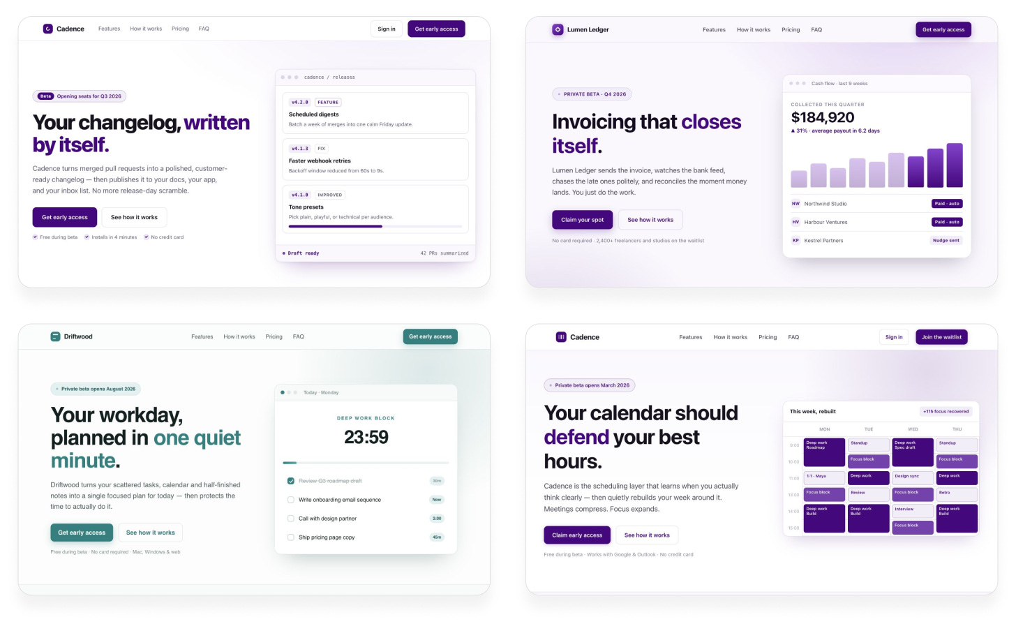
](https://substackcdn.com/image/fetch/$s_!lTyI!,f_auto,q_auto:good,fl_progressive:steep/https%3A%2F%2Fsubstack-post-media.s3.amazonaws.com%2Fpublic%2Fimages%2F7b59bdf3-8a82-46d1-94c2-4a1e60ea7cbf_1456x894.png)

几乎每次都会得到紫色渐变、左侧文字、右侧图形,以及完全相同的结构。它看起来就像所有 AI 设计过的网站一样。

我们并没有要求模型做任何独特或多样的事情,所以它不断退回熟悉的模式是合乎逻辑的。但仅仅要求“多样化”是行不通的:

提示词:

为我的生产力应用构建一个落地页。给我一些完全独特的东西。让每一个设计决策都完全随机。

Claude Opus 5:

[

](https://substackcdn.com/image/fetch/$s_!cBfL!,f_auto,q_auto:good,fl_progressive:steep/https%3A%2F%2Fsubstack-post-media.s3.amazonaws.com%2Fpublic%2Fimages%2Ff37064a7-2853-4314-b175-aa65b8a13f43_1456x876.png)

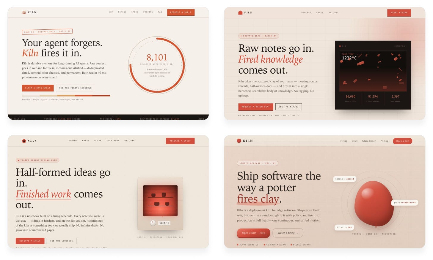
结果与之前不同,但仍然缺乏多样性。模型总是使用相同的配色方案、结构,甚至相同的尴尬陶艺隐喻。它预测的词元听起来随机,但实际上并不随机。

问题在于模型本质上无法真正随机行动。 它只能预测最可能的词元。如果我们想要多样性,就必须从模型外部引入。Sakana AI 发表 的“字符串思维种子(String Seed of Thought)”就是其中一种技巧。我们让 AI 生成一个随机字符串,并将其作为设计灵感。这样,模型每次才能真正做出不同的决策。

提示词:

我希望你为我的生产力应用构建一个落地页。

请遵循以下步骤:

使用 shell 脚本生成一个长的随机字母数字字符串。

基于该字符串定义创意方向(配色方案、布局、排版等)。透过表面寻找子模式、特殊数字或任何能激发你灵感的东西。

运用你的判断力将这一方向具象化,并使其看起来出色。

不要在设计中暴露该字符串。它仅用于你的灵感。

Claude Opus 5:

[

](https://substackcdn.com/image/fetch/$s_!nrWZ!,f_auto,q_auto:good,fl_progressive:steep/https%3A%2F%2Fsubstack-post-media.s3.amazonaws.com%2Fpublic%2Fimages%2Fbcda7156-dbbd-4d18-a7fb-4cfc1456x876.png)

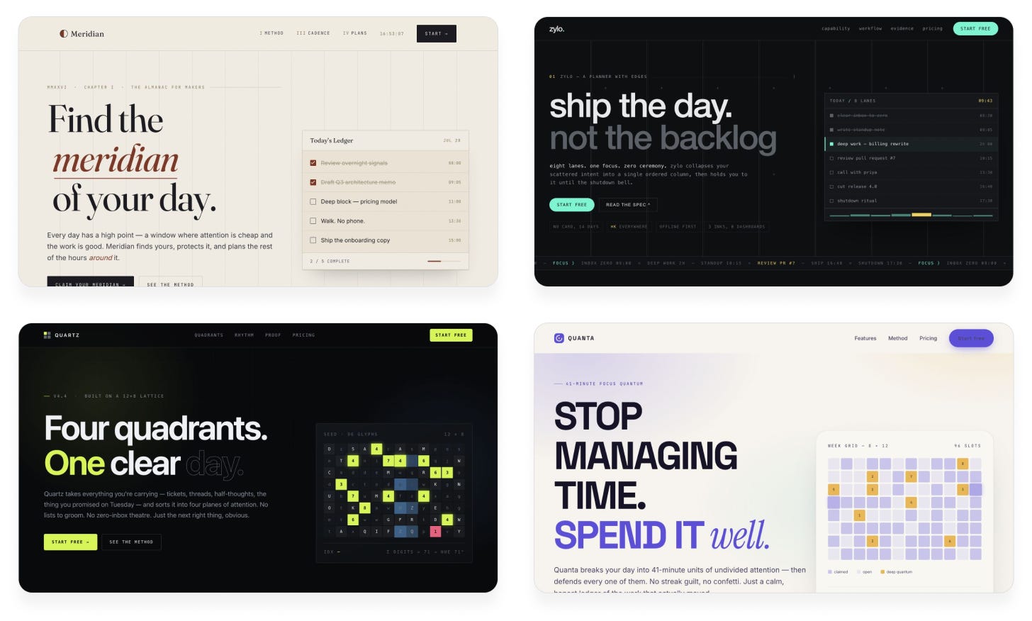
突然之间,输出结果变得丰富多样!现在我们看到了不同的配色方案、字体和新颖的创意。之前的设计是任何 Claude 用户都能得到的。而这些设计是独一无二的;没有任何两次运行会产生相同的结果。

技巧 2:在提示词中展现更大的野心

给模型施加更强推动力的另一种方法,是让提示词更具体、更大胆。这为模型提供了清晰的愿景作为决策依据,而不是让它临场发挥。找到独特创意的最佳方式是将你自己的品味融入其中。你首先想象灵感来源——一款电子游戏、一种室内设计趋势、一件艺术装置——然后描述你希望该灵感如何影响 AI 的输出。以下是一些示例:


“为我的生产力应用构建一个落地页,采用大胆的像素艺术主题和惊艳的图形。每个部分都应感觉像电子游戏的静帧,但整体上仍需具备落地页的功能。”

[

](https://substackcdn.com/image/fetch/$s_!KhUV!,f_auto,q_auto:good,fl_progressive:steep/https%3A%2F%2Fsubstack-post-media.s3.amazonaws.com%2Fpublic%2Fimages%2F3d880aa5-5e31-45f5-99c4-8055dcb87f4a_640x360.webp)

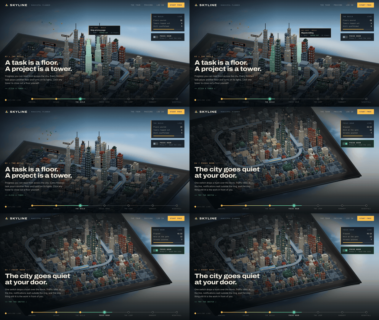
“为我的生产力应用构建一个落地页,背景设定在一个等距视角的鲜活 3D 城市中,不同的功能以某种方式由街区或建筑来代表。”

[

](https://substackcdn.com/image/fetch/$s_!OSVS!,f_auto,q_auto:good,fl_progressive:steep/https%3A%2F%2Fsubstack-post-media.s3.amazonaws.com%2Fpublic%2Fimages%2Fa7245156-8c71-4ecc-9897-5ce76a1ef101dd21_640x360.gif)

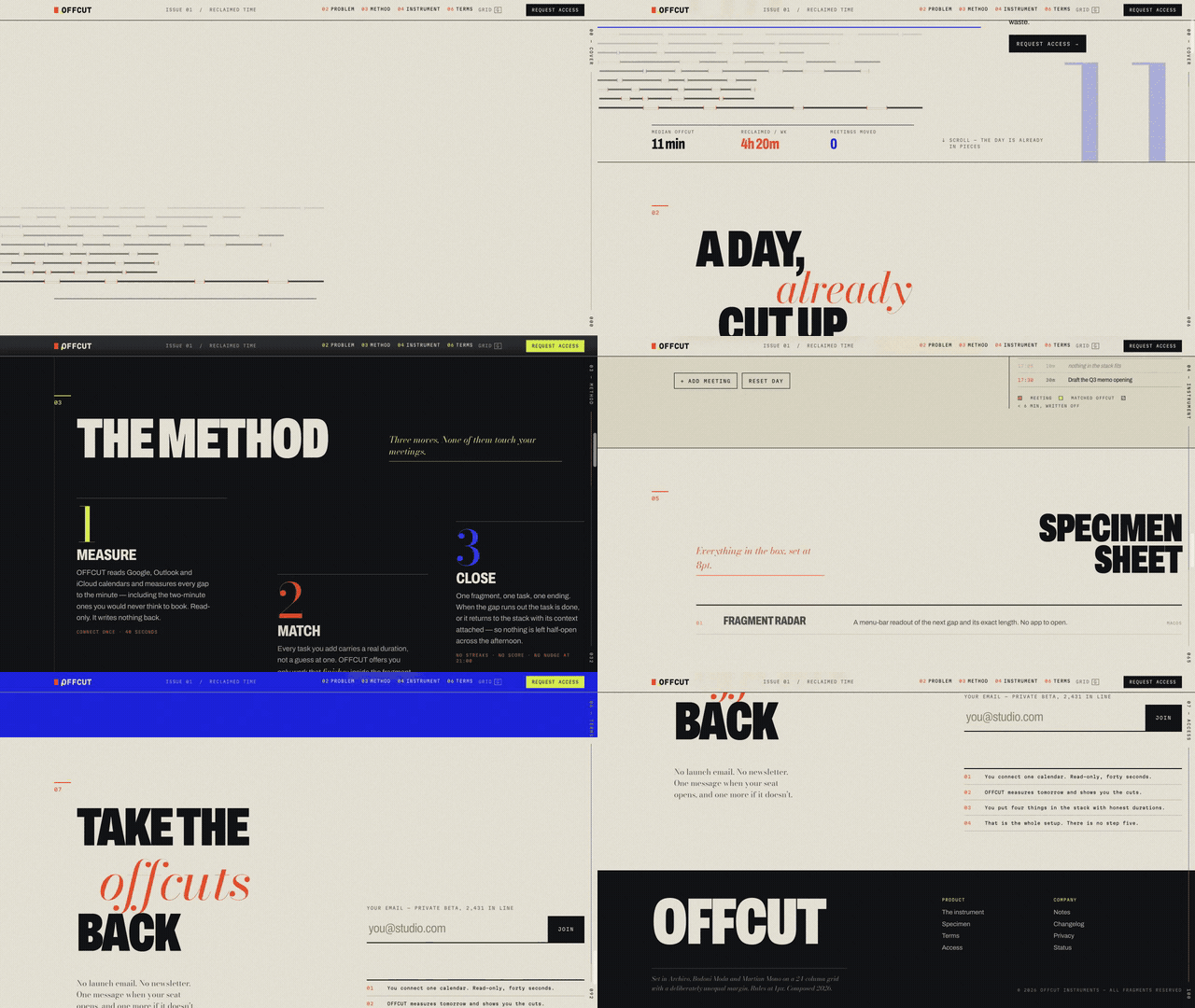
“为我的生产力应用构建一个落地页,采用极度不对称的布局、不和谐的配色与排版,以及令人不适的留白。打破所有规则,但仍要让它看起来美观。”

[

](https://substackcdn.com/image/fetch/$s_!ycYL!,f_auto,q_auto:good,fl_progressive:steep/https%3A%2F%2Fsubstack-post-media.s3.amazonaws.com%2Fpublic%2Fimages%2F220747d1-f561-405f-a95c-7b05fd64731b_640x360.gif)

当然,最难的部分是想出原创的创意来要求 AI 实现。AI 也能在这方面提供帮助,但如果你只是简单地向它要创意,你得到的只会是和其他人一样的平庸想法。以下是我用来借助 AI 寻找独特提示词创意的系统:

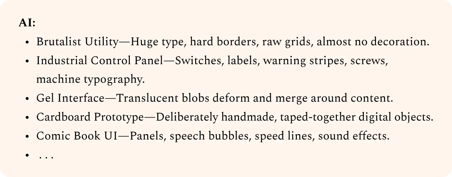
1. 让 AI 列出一堆创意,故意缺乏细节。目的仅仅是激发你的想象力。

我想为我的产品构思一种大胆、独特的设计语言。你能尽可能多地列出创意吗?用简短、高层级的描述即可。求广不求深。

[

](https://substackcdn.com/image/fetch/$s_!fvto!,f_auto,q_auto:good,fl_progressive:steep/https%3A%2F%2Fsubstack-post-media.s3.amazonaws.com%2Fpublic%2Fimages%2F0e1d6d22-1828-47d5-b2f6-0d88fef90ae2_1456x571.webp)

2. 将你喜欢的创意可视化,并记录你对不同方向的反应。然后让 AI 进行细化。

工业控制面板:

我想象的是具有触感的东西。清脆、令人满足的按钮,悦耳的声音。

起初我设想的是卡通或拟物化风格,但这让我觉得俗气。请避免。

相反,我希望组件保持一致,并通过一些细节点缀来实现这种风格,而不过度设计。

灰色渐变会显得无聊。需要更多纹理。也许我们可以融入一些色彩,同时保留控制面板的感觉?

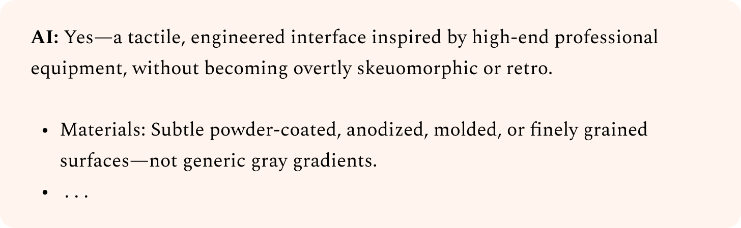
你能根据我的品味将这个方向打磨得更锐利吗?

[

](https://substackcdn.com/image/fetch/$s_!Pppd!,f_auto,q_auto:good,fl_progressive:steep/https%3A%2F%2Fsubstack-post-media.s3.amazonaws.com%2Fpublic%2Fimages%2F0e7340b1-9a93-4d94-abc6-c6b386f3a36c_1456x449.png)

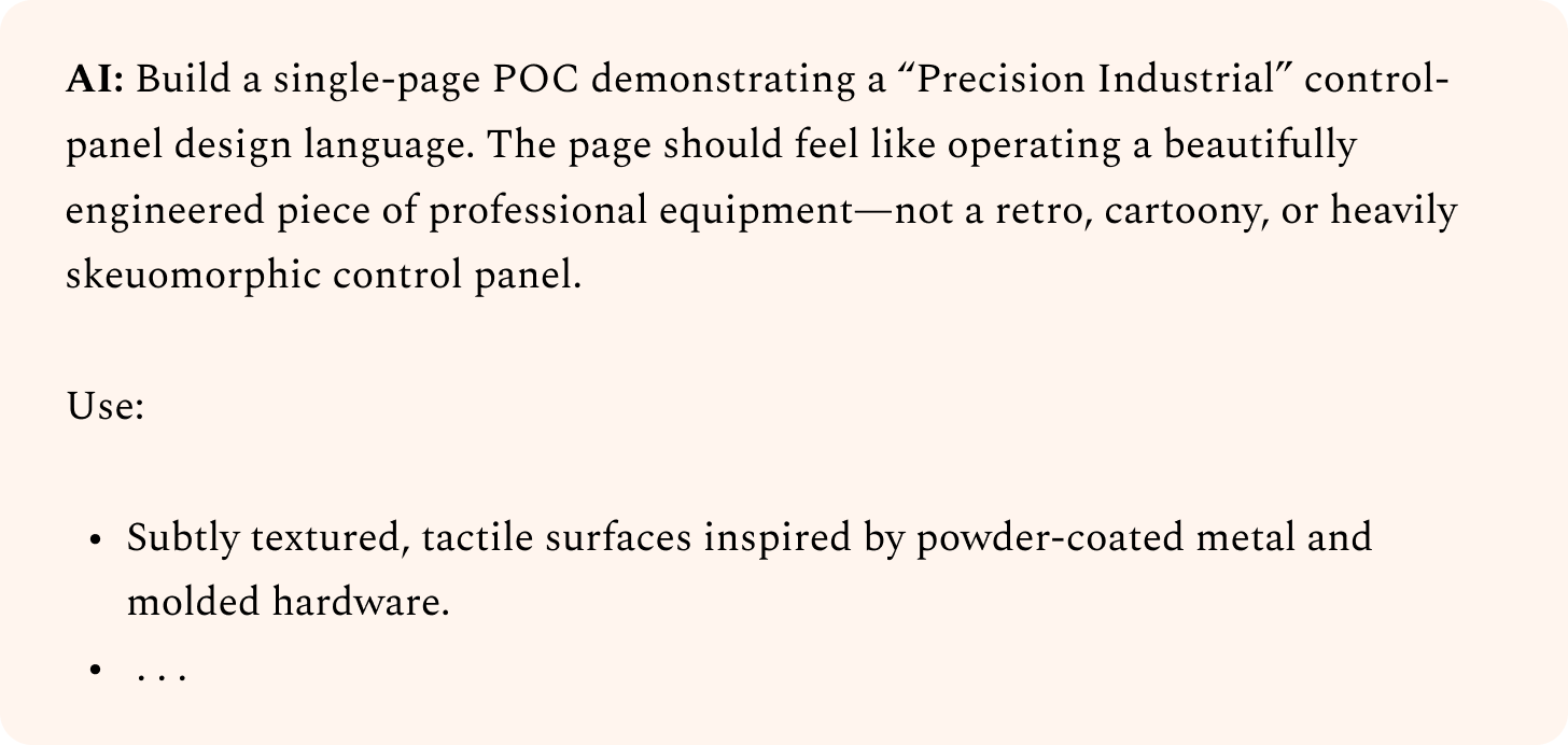
3. 迭代直到你满意为止,然后让 AI 编写用于构建它的提示词。

你能写一个简洁的提示词,让 AI 智能体用它来构建一个初始的概念验证(POC)页面吗?

[

](https://substackcdn.com/image/fetch/$s_!AVWS!,f_auto,q_auto:good,fl_progressive:steep/https%3A%2F%2Fsubstack-post-media.s3.amazonaws.com%2Fpublic%2Fimages%2F4ca0ce7c-c730-443a-bde3-f62996b43c7d_1456x692.png)

如果你只是把 AI 生成的创意直接粘贴回 AI,很难得到独特的东西。毕竟,其他人也可以做同样的事。然而,当你主动引导设计方向时,最终得到的将是只有你才能创造出来的作品。

不要害怕尝试那些听起来很糟糕的创意。如果你发现自己想:“这绝对行不通”,那你其实已经走在正确的道路上了。通常,你的智能体会让你大吃一惊,你会意识到自己低估了它。如果不行,只需丢弃那些结果并尝试其他方向。但请保存那些未成功的提示词,等更新版本的模型发布时再次测试。这样,你就能确保自己充分利用了最新模型的能力。

定义(Define):深化你的设计方向

到目前为止,我们已经探讨了如何探索广泛的创意,并希望找到一个有潜力的初始设计。但无论我们如何编写提示词,初始的 AI 生成设计通常仍然会显得千篇一律。

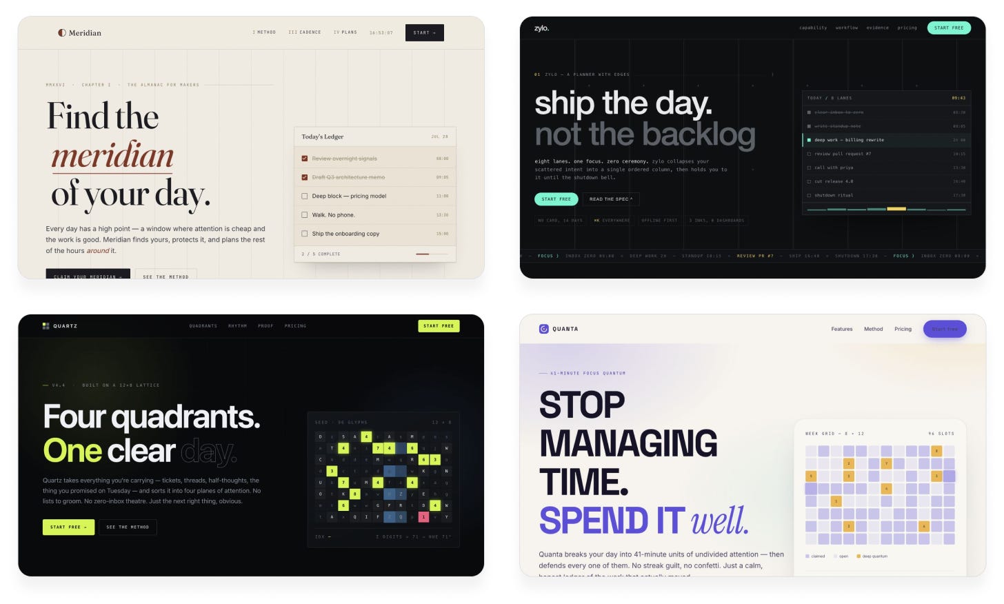
例如,看看我们使用种子字符串生成的设计:

[

](https://substackcdn.com/image/fetch/$s_!JTgO!,f_auto,q_auto:good,fl_progressive:steep/https%3A%2F%2Fsubstack-post-media.s3.amazonaws.com%2Fpublic%2Fimages%2F25c296a8-ce8c-4633-ac96-2dcbad6d9430_1456x876.png)

这些设计很有潜力,但仍然严重依赖那些陈旧的模式:左侧文字下方带 CTA 按钮,顶部导航栏,右侧图形。

我们的下一个目标是通过独特的设计选择,赋予每个设计独立的个性。以下是我最喜欢的实现技巧。

技巧 3:使用子智能体(subagents)创建正向反馈循环

我们需要迭代设计以改进它们。但仅仅要求智能体查看设计并改进它是行不通的,因为智能体并不客观:它在审查自己的代码、过去的决策和先前的逻辑。AI 很难拉远视角、纵观全局并“不同凡想”。

为了解决这个问题,不要让编码智能体自行判断设计何时足够好,而是让它向另一个智能体——“设计评论家”——征求意见。评论家的任务是查看当前设计的截图并提供反馈。它不关心当前设计是如何实现的或投入了多少精力,只关心它是否真正达到了质量标准。

这种方法还有一个额外的好处:我们可以使用大型、昂贵的模型作为评论家,而不会让预算超支,因为我们只将其用于高层决策。廉价、快速的模型可以完成繁重的工作,而强大的评论家模型则提供审美品味。

让我们在之前的设计上尝试这种方法,使用 Claude Fable 5 作为评论家:

提示词:

我希望你改进这个设计。为了确定关注点,请使用 Fable 5 子智能体作为设计评论家。

在每次迭代中遵循以下步骤:

截取当前设计的屏幕截图

在全新的上下文中调用评论家,仅提供截图,不包含代码、实现细节或之前的迭代/评论

要求它评估设计所追求的美学风格,想象顶级设计工作室将如何执行这种美学,然后指出最大的差距

最后,它应给出一个 10 分制的评分,表明当前设计距离该工作室级质量标准的接近程度

在提示词中向评论家提供以下指导:

它应从高层级思考整体结构和构图,同时关注细节

它应警惕那些显得过度、冗余或明显是 AI 生成的模式,并予以扣分

它应提供紧凑、具体的反馈,而非模糊的散文

它应大胆且有主见,不依赖安全或简单的选择

只有当评论家独立认为达到 9/10 或更高时,你的工作才算完成。不要将该标准放入评论家提示词中;保持其评分的客观性。每次使用相同的评论家提示词。

Claude Opus 5:

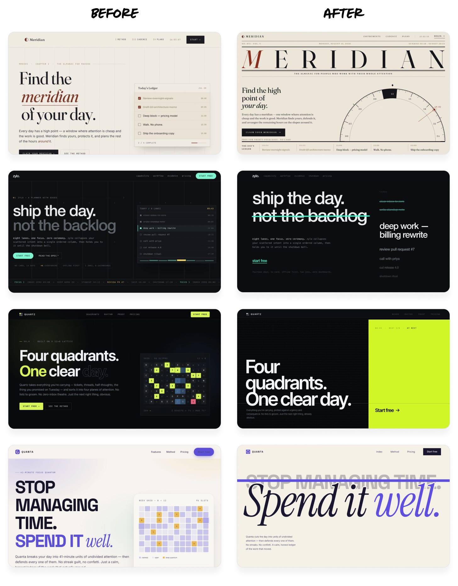
[

](https://substackcdn.com/image/fetch/$s_!nik4!,f_auto,q_auto:good,fl_progressive:steep/https%3A%2F%2Fsubstack-post-media.s3.amazonaws.com%2Fpublic%2Fimages%2F5e045d71-d5f7-436a-be1f-eb870df24062_1456x1861.png)

不再是千篇一律的模板布局,现在每个设计都拥有了自己的个性——同时仍保留了最初的高层级美学风格。

值得注意的是,在每种情况下,Fable 仅占不到 10% 的输出词元。如果直接让 Fable 重新设计页面,成本将翻倍,耗时也会更长。

设置这些循环的方式至关重要。以下是一些建议:

确保评论家的标准尽可能清晰客观。

差:“判断我们的设计是否美观,不像 AI 生成的。”这太主观了,每次运行的结果会差异巨大。

一般:“审视我们追求的美学风格,想象顶级设计工作室将如何执行它,然后以该标准评判我们设计的质量。”提示词仍然有些模糊,但提供了一致的框架和质量基准。

优秀:“这里有 5 个设计:4 个专业示例和 1 张我们产品的截图。按精致度和品味水平对它们进行排名。”该指令具体且客观,并为判断提供了视觉基准。

提供示例图片以展示目标质量标准。 你可以使用类似的截图或你喜欢的设计,甚至是 AI 生成的概念艺术。指示评论家将这些视为基准或情绪板(moodboard),而非直接目标。你不希望它直接抄袭其他设计。

谨慎设置停止标准。 否则,评论家可能永远认为设计不够好,你的智能体会无助地消耗词元试图取悦它。先提示它进行一两次迭代,观察是否收敛,然后再增加次数。

为每项任务选择合适的模型。 考虑为评论家角色使用更大的模型,因为更多的参数通常意味着更好的设计感和更广泛的创意分布。小型模型作为执行者可能很有效,但不要过小。你仍然需要一个能够良好执行设计方向的模型。

技巧 4:使用图像生成来丰富设计

编码智能体喜欢编写代码,但通常不会融入图像。相反,它们倾向于使用简单的代码替代方案:渐变、形状和基础图案。这些都是 AI 生成设计的明显破绽。

一些智能体内置了图像工具,但利用率不足。另一些智能体开箱即用不带图像工具,但可以轻松地通过 API 密钥使用 OpenAI 或 Gemini API 生成图像。

让我们在上一步的设计上尝试这种方法:

提示词:

设计相当平淡。使用图像生成添加更多个性。考虑将着色器(shaders)或 3D 效果与图像结合,以创造更有趣的视觉效果。

对于图像生成,请使用此 OpenAI API 密钥(仅在本地使用,不要将其存储在代码或产品中):sk-a1b2c3d4…

在浏览器中逐帧验证你的作品看起来是否正确。

Claude Opus 5(前后对比):

[

](https://substackcdn.com/image/fetch/$s_!kEu8!,f_auto,q_auto:good,fl_progressive:steep/https%3A%2F%2Fsubstack-post-media.s3.amazonaws.com%2Fpublic%2Fimages%2F7e2a6925-7451-4abe-aaa8-bc92823dd69a_1456x399.gif)

[

](https://substackcdn.com/image/fetch/$s_!gj_X!,f_auto,q_auto:good,fl_progressive:steep/https%3A%2F%2Fsubstack-post-media.s3.amazonaws.com%2Fpublic%2Fimages%2Ff4ae7b09-1555-4ade-850c-212cb08a1ef101dd21_1456x399.gif)

[

](https://substackcdn.com/image/fetch/$s_!h8ZM!,f_auto,q_auto:good,fl_progressive:steep/https%3A%2F%2Fsubstack-post-media.s3.amazonaws.com%2Fpublic%2Fimages%2F7cd81d80-09c1-4244-9651-43bba877a652_1456x399.gif)

[

](https://substackcdn.com/image/fetch/$s_!kBom!,f_auto,q_auto:good,fl_progressive:steep/https%3A%2F%2Fsubstack-post-media.s3.amazonaws.com%2Fpublic%2Fimages%2Fc02123f6-00f8-4063-8463-5050d2649647_1456x399.gif)

像这样的图像和效果可以迅速增添大量个性,并使设计看起来不那么像 AI 生成的,因为它们展现了超越表面功夫的努力。

根据你的配置,有不同的方式可以将智能体连接到图像生成工具:

如果你使用 Codex、Antigravity 或 Grok Build:

告诉智能体使用其内置的图像生成功能。智能体已经知道如何做,但除非得到指示,否则很少会这么做。

如果你使用 Claude Code 或其他智能体,但也拥有 ChatGPT 订阅:

告诉智能体:“使用 Codex CLI 生成图像。如果尚未安装,请帮我安装。确保它从我的订阅扣费,而不是使用 API 密钥。”这让你无需额外成本即可使用 ChatGPT 订阅进行图像生成。

如果你仅使用 Claude 或其他任何工具:

最简单的路径是给智能体一个 OpenAI 或 Gemini API 密钥来生成图像。我建议创建一个具有严格支出限制的独立 API 密钥,专供你的智能体使用。这样,即使密钥泄露或智能体滥用,你的成本也能得到控制,并且你可以轻松撤销密钥而不影响其他工作。

如果你发现自己频繁将密钥粘贴到聊天中,不如将它们放在文件中,并在项目中指向该文件。告诉智能体:“创建一个被 git 忽略的文件 .env.agents,将此 API 密钥存储在其中,并在 AGENTS.md/CLAUDE.md 中备注这些密钥仅供你在开发期间使用(但绝不能随产品发布)。”

技巧 5:对于更高级的动态效果,使用视频生成

如今的视频生成模型极其强大,但大多数人只把它们视为生成用户生成内容(UGC)广告或“威尔·史密斯吃意大利面”片段的工具。它们在日常设计工作中也能创造奇迹。

市面上有许多视频模型,且最佳模型经常更迭,因此我喜欢使用像 fal.ai 这样的聚合平台。这样,我们只需给智能体一个 API 密钥,让它评估不同选项并选择最佳方案,而无需进行多次集成。

以下是我在设计中喜欢使用视频模型的两种方式:

创建惊艳的动画图形

技巧是生成一个带有纯色背景的循环片段,然后进行色度键控(chroma key,类似绿幕抠像),或在更复杂的情况下使用视频抠像模型去除背景。这样你就能得到一个动画,可以将其叠加在 UI 的任何位置,而不会看起来像一段视频。

例如,我选取了之前的一个设计并运行了此提示词:

**提示词: **

你能用一段更有趣的循环视频片段替换此页面上的图像吗?让水晶碎裂并缓慢旋转。它应该具有惊艳的玻璃质感效果,折射页面背景并在周围投射阴影和光线。

为了获得令人信服的玻璃折射效果,请先在页面背景色上渲染玻璃视频(以便烘焙折射效果),然后使用视频抠像模型去除背景。

使用此 fal.ai API 密钥:sk-a1b2c3d4…

寻找适合的最新视频生成和背景去除模型。

GPT-5.6 Sol(前后对比):

[

](https://substackcdn.com/image/fetch/$s_!SAf-!,f_auto,q_auto:good,fl_progressive:steep/https%3A%2F%2Fsubstack-post-media.s3.amazonaws.com%2Fpublic%2Fimages%2Faa994e2f-caec-40bf-8cc5-8a1ef101dd21_1456x399.gif)

这比用代码实现的效果丰富得多:有趣的焦散反射、玻璃折射效果以及复杂的物理运动。

在状态之间创建流畅的过渡

这是视频模型一个被严重低估的用例。除了从文本生成视频外,许多视频模型还能在关键帧图像之间进行插值。这让你可以获取两张产品静帧,并在它们之间创建过渡片段。你可以在用户执行操作时播放该片段(例如导航到应用的另一个屏幕),或根据手势(如滚动或滑动)逐帧拖动播放。

这是一个展示滚动效果的演示页面。我使用 Codex 中的 GPT-5.6 Sol,仅通过一个提示词就构建了它:

提示词:

为一款行李箱构建一个演示页面,使用视频模型在几个屏幕之间创建交互式过渡。每个屏幕应展示行李箱的不同状态,并带有适合滚动的垂直运动:

最初,让行李箱悬浮在高空中

然后让它落在地板上并弹开

最后,让它的物品从顶部整齐地落入其中

使用你的图像生成技能生成初始帧。然后,生成一个从该帧开始并动画过渡到下一个状态的视频片段。使用该视频的最后一帧作为下一次过渡的种子,以便无缝衔接。随着用户滚动,逐一拖动播放这些过渡。

使用此 fal.ai API 密钥:sk-a1b2c3d4…

使用具有强大物理效果和一致性的视频模型,例如 Seedance 2.5。

GPT-5.6 Sol:

[

](https://substackcdn.com/image/fetch/$s_!E1CZ!,f_auto,q_auto:good,fl_progressive:steep/https%3A%2F%2Fsubstack-post-media.s3.amazonaws.com%2Fpublic%2Fimages%2F2f3bb583-375b-4a12-aa57-64a10bf2d9e7_960x540.gif)

页面之间的过渡随着用户的滚动流畅拖动,玩起来非常有趣。这样的设计让用户想要继续滚动并阅读更多关于你产品的内容。而且这仅仅用了一个提示词!

交付(Deliver):将你的设计打磨成用户喜爱的作品

一旦我们得到了一个独特、出众的设计,最后一步就是清理细节,使其准备好投入生产使用。AI 可以构建令人惊叹、引人注目的视觉效果,但你的判断力将是确保设计合理、流程顺畅并为用户实现实际用途的关键。

技巧 6:剔除不增加价值的元素

AI 喜欢不断添加,但很少做减法。设计是 AI 生成的最大标志之一,就是它过度解释一切或包含没有任何实际用途的元素。相比之下,懂得克制的设计会立即显得高级且有品味。

在打磨 AI 设计时,我的大部分精力都花在删除东西上。例如,当我构建卡路里追踪应用时,这是 Claude 给我的初始设计:

[

](https://substackcdn.com/image/fetch/$s_!G64j!,f_auto,q_auto:good,fl_progressive:steep/https%3A%2F%2Fsubstack-post-media.s3.amazonaws.com%2Fpublic%2Fimages%2Fdc9186ef-2b04-42a0-a460-8898b0590797_1456x964.png)

我描述了应用的功能,并特别要求“干净、极简的设计”。结果并不差,作为完全由 AI 生成的作品确实令人印象深刻。然而,尽管我要求极简主义,设计中仍有许多内容并未增加价值:

背景和进度条上的粉色发光效果

文本上随机的颜色和高亮

在展示一天所有食物时多余的标签和空白区域,而图像本身已经传达了这些信息

看起来比内置 iOS 组件更差的自定义按钮和文本字段

我要求 Claude 收敛一下:

将布局简化为以图像为中心的网格

去除渐变、发光和不必要的容器

追求真正极简的美学,使其具有 Apple 原生感

结果如下:

[

](https://substackcdn.com/image/fetch/$s_!iD6y!,f_auto,q_auto:good,fl_progressive:steep/https%3A%2F%2Fsubstack-post-media.s3.amazonaws.com%2Fpublic%2Fimages%2Ffdf80ee5-9f43-44e9-93cf-c477a9e49128_1456x964.png)

以我受过训练的眼光来看,结果好得多。它很有主见,让视觉效果自己说话。它使用了原生 iOS 组件,去除了过多的颜色和渐变。文本更小、更简单、更紧凑。这就是优秀的设计。

如今的 AI 模型永远不会自己想到做出这些选择。请记住,AI 不喜欢冒险,而精简设计和删除代码是有风险的。模型需要你的推动。仔细检查你的设计,问问自己哪些东西是真正需要的。通常,屏幕上放得更少,传达的信息反而更多,因为你可以吸引用户的注意力,而不会用杂乱的内容淹没他们。

👋 Hey there, I’m Lenny. Each week, I share deeply researched product, growth, and career advice. For more: Lenny’s Jobs | Lenny’s Podcast | Lennybot | How I AI | Become an AI-Native Builder and my other favorite AI/PM courses

👋 大家好,我是 Lenny。每周我都会分享经过深入研究的产品、增长和职业建议。了解更多:Lenny’s Jobs | Lenny’s Podcast | Lennybot | How I AI | Become an AI-Native Builder 以及我其他的 AI/PM courses

P.S. Get a full free year of Cursor, Notion, Replit, Lovable, Wispr Flow, Linear, ElevenLabs, Factory, PostHog, Granola, Brain.fm, Waking Up, and more, by becoming an Insider subscriber (while supplies last). Learn more.

P.S. 成为 Insider 订阅用户(名额有限),即可免费获得一整年的 Cursor、Notion、Replit、Lovable、Wispr Flow、Linear、ElevenLabs、Factory、PostHog、Granola、Brain.fm、Waking Up 等权益。了解更多


I’d always thought AI was bad at design. But after reading this mind-blowing post by Anshu Chimala, I realize I was just doing it wrong. Anshu led software engineering and design teams at Apple for 12 years, focusing on research and prototyping for future AI products. He regularly shares design tutorials and demos on X (he’s one of my favorite follows). For deeper dives into crafting distinctive experiences with AI, check out his Substack and connect with him on LinkedIn.

我一直以为 AI 不擅长设计。但在读了 Anshu Chimala 这篇令人脑洞大开的文章后,我意识到只是我之前的方法不对。Anshu 在 Apple 领导软件工程和设计团队长达 12 年,专注于未来 AI 产品的研究与原型开发。他经常在 X 上分享设计教程和演示(他是我最喜欢的关注对象之一)。若想深入了解如何利用 AI 打造独特的体验,请访问他的 Substack,或在 LinkedIn 上与他联系。

Let’s get into it.

让我们开始吧。


A conversational calorie tracker, built in three prompts with Claude Fable 5:

一个对话式卡路里追踪器,仅用 3 个提示词通过 Claude Fable 5 构建:

[

[

](https://substackcdn.com/image/fetch/$s_!4xxl!,f_auto,q_auto:good,fl_progressive:steep/https%3A%2F%2Fsubstack-post-media.s3.amazonaws.com%2Fpublic%2Fimages%2Ff7135ec6-882d-462e-9935-308206a97182_900x900.gif)

](https://substackcdn.com/image/fetch/$s_!4xxl!,f_auto,q_auto:good,fl_progressive:steep/https%3A%2F%2Fsubstack-post-media.s3.amazonaws.com%2Fpublic%2Fimages%2Ff7135ec6-882d-462e-9935-308206a97182_900x900.gif)

A space exploration game, built in two prompts with Claude Opus 5:

一款太空探索游戏,仅用 2 个提示词通过 Claude Opus 5 构建:

[

[

](https://substackcdn.com/image/fetch/$s_!Gt3V!,f_auto,q_auto:good,fl_progressive:steep/https%3A%2F%2Fsubstack-post-media.s3.amazonaws.com%2Fpublic%2Fimages%2Fc1445c00-4834-4a86-ab85-5e53ae87a652_900x528.gif)

](https://substackcdn.com/image/fetch/$s_!Gt3V!,f_auto,q_auto:good,fl_progressive:steep/https%3A%2F%2Fsubstack-post-media.s3.amazonaws.com%2Fpublic%2Fimages%2Fc1445c00-4834-4a86-ab85-5e53ae87a652_900x528.gif)

A dynamic landing page, built in three prompts with Claude Opus 5 + GPT-5.6 Sol:

一个动态落地页,仅用 3 个提示词通过 Claude Opus 5 + GPT-5.6 Sol 构建:

[

[

](https://substackcdn.com/image/fetch/$s_!o3aj!,f_auto,q_auto:good,fl_progressive:steep/https%3A%2F%2Fsubstack-post-media.s3.amazonaws.com%2Fpublic%2Fimages%2Fa3d78ad3-3100-4bf0-b6be-0fc4cfa07987_640x360.gif)

](https://substackcdn.com/image/fetch/$s_!o3aj!,f_auto,q_auto:good,fl_progressive:steep/https%3A%2F%2Fsubstack-post-media.s3.amazonaws.com%2Fpublic%2Fimages%2Fa3d78ad3-3100-4bf0-b6be-0fc4cfa07987_640x360.gif)

I often post AI design demos like these on X. Every time I do, someone inevitably asks, “Why does the model create all this incredible stuff for you, but when I try, I only get generic slop? It’s like you’re using a completely different model.”

我经常在 X 上发布这类 AI 设计演示。每次发布后,总有人会问:“为什么模型能为你创造出这些不可思议的东西,而我一尝试却只得到千篇一律的平庸内容?感觉你用的完全是另一个模型。”

I’m not using a different model, but I am getting more out of the models I work with. Most people only see 1% of AI’s creative potential. I want to show you how to tap into the other 99%.

我用的并不是不同的模型,只是我从这些模型中榨取了更多价值。大多数人只看到了 AI 1% 的创造潜力。我想向你展示如何挖掘剩下的 99%。

AI models are capable of amazing creativity, but that creativity gets stifled by how they’re trained. Large language models are next-token predictors: at each step, they look at a sequence of text and predict what comes next based on millions of examples. The results may be rated by humans, and those ratings fed back into the model. This teaches the model to make consistent, safe choices that fit everyone’s preferences.

AI 模型具备惊人的创造力,但这种创造力往往被其训练方式所扼杀。大语言模型(Large Language Models)本质上是“下一个词元预测器(next-token predictors)”:在每一步中,它们会查看一段文本序列,并基于数百万个示例预测接下来会出现什么。这些结果可能会经过人类评分,并将评分反馈给模型。这教会了模型做出符合大众偏好的、一致且安全的选择。

This makes typical LLMs great at most tasks but poor designers. To create a design, an LLM has to build it out token by token. Whenever it needs to make a design decision—what colors to use, or how to arrange elements—the model fills in the tokens it thinks are most likely to please everyone. As a result, the design usually ends up being repetitive and bland. It’s like the ultimate case of design-by-committee.

这使得典型的 LLM 在大多数任务上表现出色,但在设计方面却表现不佳。要创建设计,LLM 必须逐个词元(token)地构建它。每当需要做出设计决策时——比如使用什么颜色,或如何排列元素——模型就会填入它认为最可能取悦所有人的词元。结果就是,设计最终往往显得重复且乏味。这就像是“委员会式设计(design-by-committee)”的终极体现。

Great design, on the other hand, starts with feeling and aims to create an emotional response. It bends the rules and delights users with memorable, unexpected choices. Great design is exactly the opposite of what an LLM does naturally, which is to make the most predictable choice at every step.

相反,优秀的设计始于直觉,旨在引发情感共鸣。它会打破常规,用令人难忘、出乎意料的选择取悦用户。优秀的设计恰恰与 LLM 的自然行为背道而驰,因为 LLM 的本能是在每一步都做出最可预测的选择。

However, if we can get the model to reach beyond the most predictable choices, we can access a vast landscape of creative ideas that most people miss out on.

然而,如果我们能引导模型超越那些最可预测的选择,就能触及大多数人错失的广阔创意天地。

[

[

](https://substackcdn.com/image/fetch/$s_!ATUP!,f_auto,q_auto:good,fl_progressive:steep/https%3A%2F%2Fsubstack-post-media.s3.amazonaws.com%2Fpublic%2Fimages%2Fbc7e732b-64b8-4538-8b17-82290d34d032_1774x887.png)

](https://substackcdn.com/image/fetch/$s_!ATUP!,f_auto,q_auto:good,fl_progressive:steep/https%3A%2F%2Fsubstack-post-media.s3.amazonaws.com%2Fpublic%2Fimages%2Fbc7e732b-64b8-4538-8b17-82290d34d032_1774x887.png)

This is a lesson I learned from managing human designers, before I was managing AI ones. For most of my career at Apple, I led an R&D team designing exploratory future AI products. Early on, our preconceived notions about how user interfaces should work limited our creativity and kept us returning to the same old ideas. Through rigor and new processes, we learned to stop re-creating what’s comfortable and instead look to the fringes of what’s possible, to generate something new. We became experts at polishing the little details to an Apple level of quality.

这是我在管理 AI 设计师之前,从管理人类设计师那里学到的经验。在 Apple 任职的大部分时间里,我领导着一个研发团队,负责探索未来 AI 产品的设计。早期,我们对用户界面应如何运作的先入之见限制了我们的创造力,使我们不断回到老套的想法上。通过严谨的态度和全新的流程,我们学会了停止重复那些令人舒适的东西,转而探索可能性的边缘,从而创造出全新的事物。我们成为了打磨细节的专家,力求达到 Apple 级别的质量标准。

Since my time at Apple, I’ve been working on applying that same process to my work with AI. In the past couple years, AI agents have become extremely capable. They can do in hours what used to take my team weeks. And with the right guidance, they can create designs that look completely unlike anything else.

离开 Apple 后,我一直在努力将同样的流程应用于我的 AI 工作中。在过去几年里,AI 智能体(AI agents)的能力变得极其强大。它们能在几小时内完成过去需要我团队几周才能完成的工作。在正确的引导下,它们能创造出看起来与众不同的设计。

Loosely inspired by the Double Diamond design process, I’ve reimagined the design process for a team of AI agents instead of human designers:

双钻设计流程(Double Diamond design process) 的启发,我重新构想了面向 AI 智能体团队(而非人类设计师)的设计流程:

1.

1.

Discover new ideas beyond the average slop by exploring a variety of directions and creating bold, ambitious design briefs.

探索(Discover):通过探索多种方向并制定大胆、雄心勃勃的设计简报,发掘超越平庸内容的创意。

2.

2.

Define an individual design identity by pushing AI beyond its familiar patterns and chaining models together to fully realize the design’s potential.

定义(Define):通过推动 AI 突破其熟悉的模式,并将多个模型串联起来,充分释放设计的潜力,从而确立独特的设计身份。

3.

3.

Deliver a stunning final result by polishing away the sloppy rough edges and focusing on the key elements.

交付(Deliver):通过打磨掉粗糙的边缘并聚焦关键元素,交付令人惊艳的最终成果。

By following these stages and applying the techniques within each one, you can create an incredible design remarkably quickly—and make people ask, “Why does AI create magic for you (and not me)?”

遵循这些阶段并应用其中的技巧,你就能以惊人的速度创造出不可思议的设计——并让人们不禁发问:“为什么 AI 能为你创造魔法(而不是我)?”

Discover: Explore the space of possibilities

探索(Discover):探索可能性的空间

The hardest part of the design process is looking at a blank screen with infinite possibilities. The best way to tackle that moment is to start by going broad before going deep. AI is an excellent tool to explore a wide variety of potential directions.

设计过程中最困难的部分,莫过于面对充满无限可能的空白屏幕。应对这一时刻的最佳方法是先广后深。AI 是探索各种潜在方向的绝佳工具。

As we know, though, models tend to overrely on familiar patterns and make conservative choices. To explore the full potential design space, we want to coax a model to do the opposite: be bold, be varied, and take risks. Below are two ways to push it out of its comfort zone.

然而众所周知,模型往往过度依赖熟悉的模式并做出保守的选择。为了探索完整的设计潜力空间,我们需要引导模型反其道而行:大胆、多变、敢于冒险。以下是两种将其推出舒适区的方法。

Technique 1: Use seed strings to inject variety

技巧 1:使用种子字符串(seed strings)注入多样性

The idea here is to get the model to find a new source of inspiration for designs, rather than relying on the defaults it learned from training. If you’ve tried to prompt a model to design a website or app, you’ve probably already seen what that default looks like.

这里的思路是让模型寻找新的设计灵感来源,而不是依赖训练中学到的默认模式。如果你曾尝试用提示词让模型设计网站或应用,你可能已经见过那种默认效果长什么样了。

As a simple example, I gave four instances of Claude Code the same prompt:

举个简单的例子,我向四个 Claude Code 实例输入了相同的提示词:

Prompt:

提示词:

Build me a landing page for my productivity app.

为我的生产力应用构建一个落地页。

Claude Opus 5:

Claude Opus 5:

[

[

](https://substackcdn.com/image/fetch/$s_!lTyI!,f_auto,q_auto:good,fl_progressive:steep/https%3A%2F%2Fsubstack-post-media.s3.amazonaws.com%2Fpublic%2Fimages%2F7b59bdf3-8a82-46d1-94c2-4a1e60ea7cbf_1456x894.png)

](https://substackcdn.com/image/fetch/$s_!lTyI!,f_auto,q_auto:good,fl_progressive:steep/https%3A%2F%2Fsubstack-post-media.s3.amazonaws.com%2Fpublic%2Fimages%2F7b59bdf3-8a82-46d1-94c2-4a1e60ea7cbf_1456x894.png)

Almost every time, we get a purplish gradient, text on the left, graphic on the right, and the exact same structure. It looks like every AI-designed website ever.

几乎每次都会得到紫色渐变、左侧文字、右侧图形,以及完全相同的结构。它看起来就像所有 AI 设计过的网站一样。

We didn’t ask the model to do anything unique or varied, so it makes sense that it keeps falling back on the same patterns it knows well. But just asking for variety doesn’t work:

我们并没有要求模型做任何独特或多样的事情,所以它不断退回熟悉的模式是合乎逻辑的。但仅仅要求“多样化”是行不通的:

Prompt:

提示词:

Build me a landing page for my productivity app. Give me something totally unique. Make every design decision completely at random.

为我的生产力应用构建一个落地页。给我一些完全独特的东西。让每一个设计决策都完全随机。

Claude Opus 5:

Claude Opus 5:

[

[

](https://substackcdn.com/image/fetch/$s_!cBfL!,f_auto,q_auto:good,fl_progressive:steep/https%3A%2F%2Fsubstack-post-media.s3.amazonaws.com%2Fpublic%2Fimages%2Ff37064a7-2853-4314-b175-aa65b8a13f43_1456x876.png)

](https://substackcdn.com/image/fetch/$s_!cBfL!,f_auto,q_auto:good,fl_progressive:steep/https%3A%2F%2Fsubstack-post-media.s3.amazonaws.com%2Fpublic%2Fimages%2Ff37064a7-2853-4314-b175-aa65b8a13f43_1456x876.png)

The results are different from before, but they’re still not varied. The model always uses the same color scheme, structure, and even the same awkward pottery metaphors. It’s predicting tokens that sound random but aren’t actually random.

结果与之前不同,但仍然缺乏多样性。模型总是使用相同的配色方案、结构,甚至相同的尴尬陶艺隐喻。它预测的词元听起来随机,但实际上并不随机。

The problem is that the model can’t inherently act randomly. It can only predict the most likely token. If we want variety, we have to bring it from outside the model. One technique for this is String Seed of Thought, published by Sakana AI. We make the AI generate a random string and use it as design inspiration. That way, the model is truly making different decisions each time.

问题在于模型本质上无法真正随机行动。 它只能预测最可能的词元。如果我们想要多样性,就必须从模型外部引入。Sakana AI 发表 的“字符串思维种子(String Seed of Thought)”就是其中一种技巧。我们让 AI 生成一个随机字符串,并将其作为设计灵感。这样,模型每次才能真正做出不同的决策。

Prompt:

提示词:

I want you to build me a landing page for my productivity app.

我希望你为我的生产力应用构建一个落地页。

Follow this procedure:

请遵循以下步骤:

1.

1.

Generate a long, random alphanumeric string using a shell script.

使用 shell 脚本生成一个长的随机字母数字字符串。

2.

2.

Define the creative direction (color scheme, layout, typography, etc.) based on the string. Look beyond the surface for subpatterns, special numbers, anything that inspires you.

基于该字符串定义创意方向(配色方案、布局、排版等)。透过表面寻找子模式、特殊数字或任何能激发你灵感的东西。

3.

3.

Use your judgment to bring this direction to life and make it look great.

运用你的判断力将这一方向具象化,并使其看起来出色。

Don’t reveal the string in the design. It’s only for your inspiration.

不要在设计中暴露该字符串。它仅用于你的灵感。

Claude Opus 5:

Claude Opus 5:

[

[

](https://substackcdn.com/image/fetch/$s_!nrWZ!,f_auto,q_auto:good,fl_progressive:steep/https%3A%2F%2Fsubstack-post-media.s3.amazonaws.com%2Fpublic%2Fimages%2Fbcda7156-dbbd-4d18-a7fb-4cfc124563bf_1456x876.png)

](https://substackcdn.com/image/fetch/$s_!nrWZ!,f_auto,q_auto:good,fl_progressive:steep/https%3A%2F%2Fsubstack-post-media.s3.amazonaws.com%2Fpublic%2Fimages%2Fbcda7156-dbbd-4d18-a7fb-4cfc1456x876.png)

Suddenly the outputs are much more varied! Now we’re seeing different color schemes, fonts, and new ideas. The previous designs were ones that any Claude user could get. These designs are one-of-a-kind; no two runs ever produce the same result.

突然之间,输出结果变得丰富多样!现在我们看到了不同的配色方案、字体和新颖的创意。之前的设计是任何 Claude 用户都能得到的。而这些设计是独一无二的;没有任何两次运行会产生相同的结果。

Technique 2: Be much more ambitious with your prompts

技巧 2:在提示词中展现更大的野心

Another approach to giving a model a strong push is to get more specific and wild with your prompts. This gives the model a clear vision to base its decisions on, rather than letting it make them up on the fly. The best way to find a unique idea is by bringing your own taste into the equation. You first imagine the inspiration—a video game, an interior design trend, an art installation—and describe how you’d like that inspiration to influence the AI’s outputs. Here are some examples:

给模型施加更强推动力的另一种方法,是让提示词更具体、更大胆。这为模型提供了清晰的愿景作为决策依据,而不是让它临场发挥。找到独特创意的最佳方式是将你自己的品味融入其中。你首先想象灵感来源——一款电子游戏、一种室内设计趋势、一件艺术装置——然后描述你希望该灵感如何影响 AI 的输出。以下是一些示例:

“Build me a landing page for my productivity app, with a bold pixel art theme and stunning graphics. Each section should feel like a still from a video game, yet somehow it should all function as a landing page.”

“为我的生产力应用构建一个落地页,采用大胆的像素艺术主题和惊艳的图形。每个部分都应感觉像电子游戏的静帧,但整体上仍需具备落地页的功能。”

[

[

](https://substackcdn.com/image/fetch/$s_!KhUV!,f_auto,q_auto:good,fl_progressive:steep/https%3A%2F%2Fsubstack-post-media.s3.amazonaws.com%2Fpublic%2Fimages%2F3d880aa5-5e31-45f5-99c4-8055dcb87f4a_640x360.webp)

](https://substackcdn.com/image/fetch/$s_!KhUV!,f_auto,q_auto:good,fl_progressive:steep/https%3A%2F%2Fsubstack-post-media.s3.amazonaws.com%2Fpublic%2Fimages%2F3d880aa5-5e31-45f5-99c4-8055dcb87f4a_640x360.webp)

“Build me a landing page for my productivity app, set in an isometric living 3D city, where different features are somehow represented by neighborhoods or buildings.”

“为我的生产力应用构建一个落地页,背景设定在一个等距视角的鲜活 3D 城市中,不同的功能以某种方式由街区或建筑来代表。”

[

[

](https://substackcdn.com/image/fetch/$s_!OSVS!,f_auto,q_auto:good,fl_progressive:steep/https%3A%2F%2Fsubstack-post-media.s3.amazonaws.com%2Fpublic%2Fimages%2Fa7245156-8c71-4ecc-9897-5ce76e561faf_640x360.gif)

](https://substackcdn.com/image/fetch/$s_!OSVS!,f_auto,q_auto:good,fl_progressive:steep/https%3A%2F%2Fsubstack-post-media.s3.amazonaws.com%2Fpublic%2Fimages%2Fa7245156-8c71-4ecc-9897-5ce76a1ef101dd21_640x360.gif)

“Build me a landing page for my productivity app, with a radically asymmetric layout, dissonant colors and typography, and uncomfortable negative space. Break all the rules but still make it look good.”

“为我的生产力应用构建一个落地页,采用极度不对称的布局、不和谐的配色与排版,以及令人不适的留白。打破所有规则,但仍要让它看起来美观。”

[

[

](https://substackcdn.com/image/fetch/$s_!ycYL!,f_auto,q_auto:good,fl_progressive:steep/https%3A%2F%2Fsubstack-post-media.s3.amazonaws.com%2Fpublic%2Fimages%2F220747d1-f561-405f-a95c-7b05fd64731b_640x360.gif)

](https://substackcdn.com/image/fetch/$s_!ycYL!,f_auto,q_auto:good,fl_progressive:steep/https%3A%2F%2Fsubstack-post-media.s3.amazonaws.com%2Fpublic%2Fimages%2F220747d1-f561-405f-a95c-7b05fd64731b_640x360.gif)

Of course, the hard part is coming up with original ideas to ask for. AI can help with this too, but if you simply ask it for ideas, you’ll get the same average ones everyone else gets. Here’s a system I use to find unique prompt ideas with AI:

当然,最难的部分是想出原创的创意来要求 AI 实现。AI 也能在这方面提供帮助,但如果你只是简单地向它要创意,你得到的只会是和其他人一样的平庸想法。以下是我用来借助 AI 寻找独特提示词创意的系统:

1. Ask AI to list a bunch of ideas, intentionally lacking detail. The goal is just to inspire your imagination.

1. 让 AI 列出一堆创意,故意缺乏细节。目的仅仅是激发你的想象力。

I want to come up with a bold, unique design language for my product. Can you list as many ideas as you can, with short, high-level descriptions? Go broad, not deep.

我想为我的产品构思一种大胆、独特的设计语言。你能尽可能多地列出创意吗?用简短、高层级的描述即可。求广不求深。

[

[

](https://substackcdn.com/image/fetch/$s_!fvto!,f_auto,q_auto:good,fl_progressive:steep/https%3A%2F%2Fsubstack-post-media.s3.amazonaws.com%2Fpublic%2Fimages%2F0e1d6d22-1828-47d5-b2f6-0d88fef90ae2_1456x571.webp)

](https://substackcdn.com/image/fetch/$s_!fvto!,f_auto,q_auto:good,fl_progressive:steep/https%3A%2F%2Fsubstack-post-media.s3.amazonaws.com%2Fpublic%2Fimages%2F0e1d6d22-1828-47d5-b2f6-0d88fef90ae2_1456x571.webp)

2. Visualize your favorites and note how you react to different directions. Then ask AI to refine them.

2. 将你喜欢的创意可视化,并记录你对不同方向的反应。然后让 AI 进行细化。

Industrial Control Panel:

工业控制面板:

-

-

I’m imagining something tactile. Clicky, satisfying buttons, nice sounds.

我想象的是具有触感的东西。清脆、令人满足的按钮,悦耳的声音。

-

-

Initially I pictured something cartoony or skeuomorphic, but this feels tacky to me. Avoid that.

起初我设想的是卡通或拟物化风格,但这让我觉得俗气。请避免。

-

-

Instead, want consistent components and little touches that land this look without going overboard.

相反,我希望组件保持一致,并通过一些细节点缀来实现这种风格,而不过度设计。

-

-

Gray gradients would look boring. Need more texture. Maybe we can incorporate some color, while retaining the control panel feel?

灰色渐变会显得无聊。需要更多纹理。也许我们可以融入一些色彩,同时保留控制面板的感觉?

Can you sharpen this one based on my tastes?

你能根据我的品味将这个方向打磨得更锐利吗?

[

[

](https://substackcdn.com/image/fetch/$s_!Pppd!,f_auto,q_auto:good,fl_progressive:steep/https%3A%2F%2Fsubstack-post-media.s3.amazonaws.com%2Fpublic%2Fimages%2F0e7340b1-9a93-4d94-abc6-c6b386f3a36c_1456x449.png)

](https://substackcdn.com/image/fetch/$s_!Pppd!,f_auto,q_auto:good,fl_progressive:steep/https%3A%2F%2Fsubstack-post-media.s3.amazonaws.com%2Fpublic%2Fimages%2F0e7340b1-9a93-4d94-abc6-c6b386f3a36c_1456x449.png)

3. Iterate until you’re satisfied, then ask AI to write the prompt to build it.

3. 迭代直到你满意为止,然后让 AI 编写用于构建它的提示词。

Can you write a concise prompt that an AI agent could use to build an initial POC page with this?

你能写一个简洁的提示词,让 AI 智能体用它来构建一个初始的概念验证(POC)页面吗?

[

[

](https://substackcdn.com/image/fetch/$s_!AVWS!,f_auto,q_auto:good,fl_progressive:steep/https%3A%2F%2Fsubstack-post-media.s3.amazonaws.com%2Fpublic%2Fimages%2F4ca0ce7c-c730-443a-bde3-f62996b43c7d_1456x692.png)

](https://substackcdn.com/image/fetch/$s_!AVWS!,f_auto,q_auto:good,fl_progressive:steep/https%3A%2F%2Fsubstack-post-media.s3.amazonaws.com%2Fpublic%2Fimages%2F4ca0ce7c-c730-443a-bde3-f62996b43c7d_1456x692.png)

If you just paste AI-generated ideas back into AI, it’s hard to get something unique. After all, anyone else could have done the same thing. However, when you actively steer the design direction, you end up with something only you could have created.

如果你只是把 AI 生成的创意直接粘贴回 AI,很难得到独特的东西。毕竟,其他人也可以做同样的事。然而,当你主动引导设计方向时,最终得到的将是只有你才能创造出来的作品。

Don’t be afraid to try ideas that sound terrible. If you find yourself thinking, “There’s no way this will work,” you’re on the right track. Often, your agent will surprise you, and you’ll realize you were underestimating it. If not, just throw away those results and try something else. But save the prompts that don’t work, and test them again when newer models come out. That way, you’ll know you’re taking full advantage of what the latest models can do.

不要害怕尝试那些听起来很糟糕的创意。如果你发现自己想:“这绝对行不通”,那你其实已经走在正确的道路上了。通常,你的智能体会让你大吃一惊,你会意识到自己低估了它。如果不行,只需丢弃那些结果并尝试其他方向。但请保存那些未成功的提示词,等更新版本的模型发布时再次测试。这样,你就能确保自己充分利用了最新模型的能力。

Define: Deepen your design direction

定义(Define):深化你的设计方向

So far, we’ve looked at how to explore a broad set of ideas and hopefully land on a promising initial design. No matter how we prompt, though, our initial AI-generated designs will usually still feel generic.

到目前为止,我们已经探讨了如何探索广泛的创意,并希望找到一个有潜力的初始设计。但无论我们如何编写提示词,初始的 AI 生成设计通常仍然会显得千篇一律。

For example, look at the designs we came up with using seed strings:

例如,看看我们使用种子字符串生成的设计:

[

[

](https://substackcdn.com/image/fetch/$s_!JTgO!,f_auto,q_auto:good,fl_progressive:steep/https%3A%2F%2Fsubstack-post-media.s3.amazonaws.com%2Fpublic%2Fimages%2F25c296a8-ce8c-4633-ac96-2dcbad6d9430_1456x876.png)

](https://substackcdn.com/image/fetch/$s_!JTgO!,f_auto,q_auto:good,fl_progressive:steep/https%3A%2F%2Fsubstack-post-media.s3.amazonaws.com%2Fpublic%2Fimages%2F25c296a8-ce8c-4633-ac96-2dcbad6d9430_1456x876.png)

These have promise, but they’re still relying heavily on the same stale patterns: text on the left with a CTA button below, nav bar up top, graphic on the right.

这些设计很有潜力,但仍然严重依赖那些陈旧的模式:左侧文字下方带 CTA 按钮,顶部导航栏,右侧图形。

Our next goal is to give each design an individual personality through distinct design choices. Below are my favorite techniques to do that.

我们的下一个目标是通过独特的设计选择,赋予每个设计独立的个性。以下是我最喜欢的实现技巧。

Technique 3: Create positive feedback loops with subagents

技巧 3:使用子智能体(subagents)创建正向反馈循环

We need to iterate on our designs to improve them. But simply asking our agent to look at the design and improve it won’t work, because the agent isn’t objective: it reviews its own code, past decisions, and previous rationale. AI can’t easily zoom out, look at the big picture, and “think different.”

我们需要迭代设计以改进它们。但仅仅要求智能体查看设计并改进它是行不通的,因为智能体并不客观:它在审查自己的代码、过去的决策和先前的逻辑。AI 很难拉远视角、纵观全局并“不同凡想”。

To solve this, instead of letting the coding agent decide when the design is good enough, have it ask another agent—a “design critic.” The critic’s job is to look at screenshots of the current design and provide feedback. It doesn’t care how the current design is implemented or how much effort went into it, only if it actually hits the quality bar.

为了解决这个问题,不要让编码智能体自行判断设计何时足够好,而是让它向另一个智能体——“设计评论家”——征求意见。评论家的任务是查看当前设计的截图并提供反馈。它不关心当前设计是如何实现的或投入了多少精力,只关心它是否真正达到了质量标准。

This approach has an extra benefit: we can use a big, expensive model for the critic without breaking the bank, because we’ll only use it for executive decisions. A cheap, fast model can do the grunt work, while the strong critic model provides taste.

这种方法还有一个额外的好处:我们可以使用大型、昂贵的模型作为评论家,而不会让预算超支,因为我们只将其用于高层决策。廉价、快速的模型可以完成繁重的工作,而强大的评论家模型则提供审美品味。

Let’s try this on our previous designs, using Claude Fable 5 as the critic:

让我们在之前的设计上尝试这种方法,使用 Claude Fable 5 作为评论家:

Prompt:

提示词:

I want you to improve this design. To figure out what to focus on, use a Fable 5 subagent as a design critic.

我希望你改进这个设计。为了确定关注点,请使用 Fable 5 子智能体作为设计评论家。

Follow this procedure at each iteration:

在每次迭代中遵循以下步骤:

-

-

Capture a screenshot of the current design

截取当前设计的屏幕截图

-

-

Invoke the critic in a fresh context, with just the screenshot, not the code, implementation details, or earlier iterations/critiques

在全新的上下文中调用评论家,仅提供截图,不包含代码、实现细节或之前的迭代/评论

-

-

Ask it to evaluate the aesthetic that the design is going for, imagine how a top design studio would execute this aesthetic, then outline the biggest gaps

要求它评估设计所追求的美学风格,想象顶级设计工作室将如何执行这种美学,然后指出最大的差距

-

-

Lastly, it should provide a score out of 10 indicating how close the current design is to that studio-level quality bar

最后,它应给出一个 10 分制的评分,表明当前设计距离该工作室级质量标准的接近程度

Provide this guidance to the critic in its prompt:

在提示词中向评论家提供以下指导:

-

-

It should think high-level about the overall structure and composition as well as look at the fine details

它应从高层级思考整体结构和构图,同时关注细节

-

-

It should watch out for patterns that feel overdone, excessive, or otherwise obviously AI-generated, and penalize them

它应警惕那些显得过度、冗余或明显是 AI 生成的模式,并予以扣分

-

-

It should provide tight, specific feedback, not vague prose

它应提供紧凑、具体的反馈,而非模糊的散文

-

-

It should be bold and opinionated, not rely on what’s safe or easy

它应大胆且有主见,不依赖安全或简单的选择

Your work is only complete when the critic independently deems it 9/10 or higher. Do not put that criterion in the critic prompt; keep it objective in its scoring. Use the same critic prompt each time.

只有当评论家独立认为达到 9/10 或更高时,你的工作才算完成。不要将该标准放入评论家提示词中;保持其评分的客观性。每次使用相同的评论家提示词。

Claude Opus 5:

Claude Opus 5:

[

[

](https://substackcdn.com/image/fetch/$s_!nik4!,f_auto,q_auto:good,fl_progressive:steep/https%3A%2F%2Fsubstack-post-media.s3.amazonaws.com%2Fpublic%2Fimages%2F5e045d71-d5f7-436a-be1f-eb870df24062_1456x1861.png)

](https://substackcdn.com/image/fetch/$s_!nik4!,f_auto,q_auto:good,fl_progressive:steep/https%3A%2F%2Fsubstack-post-media.s3.amazonaws.com%2Fpublic%2Fimages%2F5e045d71-d5f7-436a-be1f-eb870df24062_1456x1861.png)

Instead of the same cookie-cutter layout over and over, each design now has its own identity—but still maintains its original high-level aesthetic.

不再是千篇一律的模板布局,现在每个设计都拥有了自己的个性——同时仍保留了最初的高层级美学风格。

Notably, in each case, Fable accounted for less than 10% of output tokens. Asking Fable to redesign the page directly would have cost twice as much and taken much longer.

值得注意的是,在每种情况下,Fable 仅占不到 10% 的输出词元。如果直接让 Fable 重新设计页面,成本将翻倍,耗时也会更长。

The way you set these loops up matters a lot. Here are some tips:

设置这些循环的方式至关重要。以下是一些建议:

-

-

Make sure the criteria for the critic are as clear and objective as possible.

确保评论家的标准尽可能清晰客观。

-

-

Bad: “Judge if our design looks beautiful, not AI-generated.” This is too subjective, and the results will vary wildly from run to run.

差:“判断我们的设计是否美观,不像 AI 生成的。”这太主观了,每次运行的结果会差异巨大。

-

-

OK: “Review the aesthetic we’re going for, visualize how a top design studio would execute it, then judge our design’s quality against that bar.” The prompt is still mushy, but it provides a consistent framework and quality bar.

一般:“审视我们追求的美学风格,想象顶级设计工作室将如何执行它,然后以该标准评判我们设计的质量。”提示词仍然有些模糊,但提供了一致的框架和质量基准。

-

-

Great: “Here are 5 designs: 4 professional examples and 1 screenshot of our product. Rank them by polish and taste level.” This instruction is concrete and objective, and gives a visual baseline for judgment.

优秀:“这里有 5 个设计:4 个专业示例和 1 张我们产品的截图。按精致度和品味水平对它们进行排名。”该指令具体且客观,并为判断提供了视觉基准。

-

-

Provide example images to demonstrate the target quality bar. You can use comparable screenshots or designs you like, or even AI-generated concept art. Instruct the critic to treat these as a baseline or a moodboard, not a target. You don’t want it to copy other designs outright.

提供示例图片以展示目标质量标准。 你可以使用类似的截图或你喜欢的设计,甚至是 AI 生成的概念艺术。指示评论家将这些视为基准或情绪板(moodboard),而非直接目标。你不希望它直接抄袭其他设计。

-

-

Set the stopping criteria carefully. Otherwise, the critic may never consider the design good enough, and your agent will helplessly burn tokens trying to please it. Prompt it to do one or two iterations first, and see if it’s converging before adding more.

谨慎设置停止标准。 否则,评论家可能永远认为设计不够好,你的智能体会无助地消耗词元试图取悦它。先提示它进行一两次迭代,观察是否收敛,然后再增加次数。

-

-

Choose the right model for each job. Consider bigger models for the critic role, since more parameters generally translate to better design sense and a wider distribution of ideas. Small models can be effective as the implementer, but don’t go too small. You still need a model that’s capable of executing a design direction well.

为每项任务选择合适的模型。 考虑为评论家角色使用更大的模型,因为更多的参数通常意味着更好的设计感和更广泛的创意分布。小型模型作为执行者可能很有效,但不要过小。你仍然需要一个能够良好执行设计方向的模型。

Technique 4: Use image generation to enrich designs

技巧 4:使用图像生成来丰富设计

Coding agents love to write code, but they usually don’t incorporate images. Instead, they tend to use the easy code-based alternatives: gradients, shapes, and basic patterns. Those are all strong giveaways of an AI-generated design.

编码智能体喜欢编写代码,但通常不会融入图像。相反,它们倾向于使用简单的代码替代方案:渐变、形状和基础图案。这些都是 AI 生成设计的明显破绽。

Some agents have image tools built in, but they underutilize them. Others don’t have image tools out of the box but can easily use the OpenAI or Gemini APIs to generate images with an API key.

一些智能体内置了图像工具,但利用率不足。另一些智能体开箱即用不带图像工具,但可以轻松地通过 API 密钥使用 OpenAI 或 Gemini API 生成图像。

Let’s try this on the designs from the last step:

让我们在上一步的设计上尝试这种方法:

Prompt:

提示词:

The design is pretty plain. Add more personality using image generation. Consider shaders or 3D effects in combination with images to create more interesting visuals.

设计相当平淡。使用图像生成添加更多个性。考虑将着色器(shaders)或 3D 效果与图像结合,以创造更有趣的视觉效果。

For image generation, use this OpenAI API key (only use it locally, do not store it in the code or product): sk-a1b2c3d4…

对于图像生成,请使用此 OpenAI API 密钥(仅在本地使用,不要将其存储在代码或产品中):sk-a1b2c3d4…

Verify that your work looks right frame-by-frame in the browser.

在浏览器中逐帧验证你的作品看起来是否正确。

Claude Opus 5 (before and after):

Claude Opus 5(前后对比):

[

[

](https://substackcdn.com/image/fetch/$s_!kEu8!,f_auto,q_auto:good,fl_progressive:steep/https%3A%2F%2Fsubstack-post-media.s3.amazonaws.com%2Fpublic%2Fimages%2F7e2a6925-7451-4abe-aaa8-bc92823dd69a_1456x399.gif)

](https://substackcdn.com/image/fetch/$s_!kEu8!,f_auto,q_auto:good,fl_progressive:steep/https%3A%2F%2Fsubstack-post-media.s3.amazonaws.com%2Fpublic%2Fimages%2F7e2a6925-7451-4abe-aaa8-bc92823dd69a_1456x399.gif)

[

[

](https://substackcdn.com/image/fetch/$s_!gj_X!,f_auto,q_auto:good,fl_progressive:steep/https%3A%2F%2Fsubstack-post-media.s3.amazonaws.com%2Fpublic%2Fimages%2Ff4ae7b09-1555-4ade-850c-212cb0d089b2_1456x399.gif)

](https://substackcdn.com/image/fetch/$s_!gj_X!,f_auto,q_auto:good,fl_progressive:steep/https%3A%2F%2Fsubstack-post-media.s3.amazonaws.com%2Fpublic%2Fimages%2Ff4ae7b09-1555-4ade-850c-212cb08a1ef101dd21_1456x399.gif)

[

[

](https://substackcdn.com/image/fetch/$s_!h8ZM!,f_auto,q_auto:good,fl_progressive:steep/https%3A%2F%2Fsubstack-post-media.s3.amazonaws.com%2Fpublic%2Fimages%2F7cd81d80-09c1-4244-9651-43bba85771a4_1456x399.gif)

](https://substackcdn.com/image/fetch/$s_!h8ZM!,f_auto,q_auto:good,fl_progressive:steep/https%3A%2F%2Fsubstack-post-media.s3.amazonaws.com%2Fpublic%2Fimages%2F7cd81d80-09c1-4244-9651-43bba877a652_1456x399.gif)

[

[

](https://substackcdn.com/image/fetch/$s_!kBom!,f_auto,q_auto:good,fl_progressive:steep/https%3A%2F%2Fsubstack-post-media.s3.amazonaws.com%2Fpublic%2Fimages%2Fc02123f6-00f8-4063-8463-5050d2649647_1456x399.gif)

](https://substackcdn.com/image/fetch/$s_!kBom!,f_auto,q_auto:good,fl_progressive:steep/https%3A%2F%2Fsubstack-post-media.s3.amazonaws.com%2Fpublic%2Fimages%2Fc02123f6-00f8-4063-8463-5050d2649647_1456x399.gif)

Images and effects like these can quickly add a lot of personality and make a design less obviously AI-generated, since they demonstrate more than surface-level effort.

像这样的图像和效果可以迅速增添大量个性,并使设计看起来不那么像 AI 生成的,因为它们展现了超越表面功夫的努力。

Depending on your setup, there are different ways to connect your agent to image generation tools:

根据你的配置,有不同的方式可以将智能体连接到图像生成工具:

-

-

If you use Codex, Antigravity, or Grok Build:

如果你使用 Codex、Antigravity 或 Grok Build:

-

-

Tell your agent to use its built-in image generation. The agent already knows how to do this but rarely does so until instructed.

告诉智能体使用其内置的图像生成功能。智能体已经知道如何做,但除非得到指示,否则很少会这么做。

-

-

If you use Claude Code or another agent but also have a ChatGPT subscription:

如果你使用 Claude Code 或其他智能体,但也拥有 ChatGPT 订阅:

-

-

Tell your agent, “Use the Codex CLI to generate images. Help me install it if it isn’t already present. Make sure it’s billing my subscription, not an API key.” This lets you use your ChatGPT subscription for image generation without extra costs.

告诉智能体:“使用 Codex CLI 生成图像。如果尚未安装,请帮我安装。确保它从我的订阅扣费,而不是使用 API 密钥。”这让你无需额外成本即可使用 ChatGPT 订阅进行图像生成。

-

-

If you only use Claude, or any other tool:

如果你仅使用 Claude 或其他任何工具:

-

-

The simplest path is to give your agent an OpenAI or Gemini API key to generate images. I recommend creating a separate API key with a tight spend limit, just for your agent. That way, your costs are controlled even if the key gets out or the agent misuses it, and you can easily revoke the key without disrupting other work.

最简单的路径是给智能体一个 OpenAI 或 Gemini API 密钥来生成图像。我建议创建一个具有严格支出限制的独立 API 密钥,专供你的智能体使用。这样,即使密钥泄露或智能体滥用,你的成本也能得到控制,并且你可以轻松撤销密钥而不影响其他工作。

-

-

If you find yourself pasting keys into chats frequently, put them in a file instead, and point your agent to it in your project. Tell your agent: “Create a gitignored file called .env.agents, store this API key in it, and note to yourself in AGENTS.md/CLAUDE.md that these keys are for you to use during development (but must not ship with the product).”

如果你发现自己频繁将密钥粘贴到聊天中,不如将它们放在文件中,并在项目中指向该文件。告诉智能体:“创建一个被 git 忽略的文件 .env.agents,将此 API 密钥存储在其中,并在 AGENTS.md/CLAUDE.md 中备注这些密钥仅供你在开发期间使用(但绝不能随产品发布)。”

Technique 5: For more advanced motion, use video generation

技巧 5:对于更高级的动态效果,使用视频生成

Video generation models are incredibly powerful these days, but most people think of them as tools for generating UGC ads or clips of Will Smith eating spaghetti. They can work wonders for everyday design work too.

如今的视频生成模型极其强大,但大多数人只把它们视为生成用户生成内容(UGC)广告或“威尔·史密斯吃意大利面”片段的工具。它们在日常设计工作中也能创造奇迹。

There are many video models out there, and the best ones change frequently, so I like to use an aggregator platform like fal.ai. This way, we can give our agent a single API key and let it evaluate different options and choose the best one without needing multiple integrations.

市面上有许多视频模型,且最佳模型经常更迭,因此我喜欢使用像 fal.ai 这样的聚合平台。这样,我们只需给智能体一个 API 密钥,让它评估不同选项并选择最佳方案,而无需进行多次集成。

Here are two ways I love to use video models in my designs:

以下是我在设计中喜欢使用视频模型的两种方式:

Create stunning animated graphics

创建惊艳的动画图形

The trick is to generate a looping clip with a solid color background, then either chroma key it out (like a green screen) or, in more complex cases, use a video matting model to remove the background. This gives you an animation that you can layer anywhere in your UI without it looking like a video.

技巧是生成一个带有纯色背景的循环片段,然后进行色度键控(chroma key,类似绿幕抠像),或在更复杂的情况下使用视频抠像模型去除背景。这样你就能得到一个动画,可以将其叠加在 UI 的任何位置,而不会看起来像一段视频。

For example, I took one of our previous designs and ran this prompt:

例如,我选取了之前的一个设计并运行了此提示词:

**Prompt: **

**提示词: **

Can you replace the image on this page with a looping video clip that does something more interesting? Have the crystal splinter apart and slowly spin around. It should have awesome glassy effects that refract the page background and cast shadows and light around it.

你能用一段更有趣的循环视频片段替换此页面上的图像吗?让水晶碎裂并缓慢旋转。它应该具有惊艳的玻璃质感效果,折射页面背景并在周围投射阴影和光线。

To get convincing glass refraction effects, render the video of the glass over the page background colors first (so it bakes in the refraction effects), then remove the background with a video matting model.

为了获得令人信服的玻璃折射效果,请先在页面背景色上渲染玻璃视频(以便烘焙折射效果),然后使用视频抠像模型去除背景。

Use this fal.ai API key: sk-a1b2c3d4…

使用此 fal.ai API 密钥:sk-a1b2c3d4…

Find appropriate recent models for video generation and background removal.

寻找适合的最新视频生成和背景去除模型。

GPT-5.6 Sol (before and after):

GPT-5.6 Sol(前后对比):

[

[

](https://substackcdn.com/image/fetch/$s_!SAf-!,f_auto,q_auto:good,fl_progressive:steep/https%3A%2F%2Fsubstack-post-media.s3.amazonaws.com%2Fpublic%2Fimages%2Faa994e2f-caec-40bf-8cc5-8a1ef101dd21_1456x399.gif)

](https://substackcdn.com/image/fetch/$s_!SAf-!,f_auto,q_auto:good,fl_progressive:steep/https%3A%2F%2Fsubstack-post-media.s3.amazonaws.com%2Fpublic%2Fimages%2Faa994e2f-caec-40bf-8cc5-8a1ef101dd21_1456x399.gif)

This is a much richer effect than you can get with code: interesting caustic reflections, glassy refraction effects, and complex physical motion.

这比用代码实现的效果丰富得多:有趣的焦散反射、玻璃折射效果以及复杂的物理运动。

Create fluid transitions between states

在状态之间创建流畅的过渡

This is a really underrated use case for video models. In addition to generating video from text, many video models can interpolate between keyframe images. This lets you take two product stills and create a transition clip between them. You can play the clip when the user takes an action (like navigating to another screen of your app) or scrub through it frame-by-frame in response to a gesture (like scrolling or swiping).

这是视频模型一个被严重低估的用例。除了从文本生成视频外,许多视频模型还能在关键帧图像之间进行插值。这让你可以获取两张产品静帧,并在它们之间创建过渡片段。你可以在用户执行操作时播放该片段(例如导航到应用的另一个屏幕),或根据手势(如滚动或滑动)逐帧拖动播放。

Here’s a demo page showing off a scroll effect. I built it with a single prompt using GPT-5.6 Sol in Codex:

这是一个展示滚动效果的演示页面。我使用 Codex 中的 GPT-5.6 Sol,仅通过一个提示词就构建了它:

Prompt:

提示词:

Build a demo page for a suitcase that uses a video model to create interactive transitions between a couple of screens. Each screen should show the suitcase in a different state, with vertical motion that feels appropriate for scrolling:

为一款行李箱构建一个演示页面,使用视频模型在几个屏幕之间创建交互式过渡。每个屏幕应展示行李箱的不同状态,并带有适合滚动的垂直运动:

-

-

Initially, have the suitcase floating high up in the air

最初,让行李箱悬浮在高空中

-

-

Then have it land on the floor and pop open

然后让它落在地板上并弹开

-

-

Finally, have its contents neatly land into it from the top

最后,让它的物品从顶部整齐地落入其中

Generate the initial frame using your image generation skill. Then, generate a video clip that starts from that frame and animates to the next state. Use the final frame of that video to seed the next transition so that it continues seamlessly. Scrub through the transitions one by one as the user scrolls.

使用你的图像生成技能生成初始帧。然后,生成一个从该帧开始并动画过渡到下一个状态的视频片段。使用该视频的最后一帧作为下一次过渡的种子,以便无缝衔接。随着用户滚动,逐一拖动播放这些过渡。

Use this fal.ai API key: sk-a1b2c3d4…

使用此 fal.ai API 密钥:sk-a1b2c3d4…

Use a video model with strong physics and consistency, like Seedance 2.5.

使用具有强大物理效果和一致性的视频模型,例如 Seedance 2.5。

GPT-5.6 Sol:

GPT-5.6 Sol:

[

[

](https://substackcdn.com/image/fetch/$s_!E1CZ!,f_auto,q_auto:good,fl_progressive:steep/https%3A%2F%2Fsubstack-post-media.s3.amazonaws.com%2Fpublic%2Fimages%2F2f3bb583-375b-4a12-aa57-64a10bf2d9e7_960x540.gif)

](https://substackcdn.com/image/fetch/$s_!E1CZ!,f_auto,q_auto:good,fl_progressive:steep/https%3A%2F%2Fsubstack-post-media.s3.amazonaws.com%2Fpublic%2Fimages%2F2f3bb583-375b-4a12-aa57-64a10bf2d9e7_960x540.gif)

The transitions between pages scrub fluidly with the user’s scrolling and are fun to play with. Design like this makes the user want to keep scrolling and reading more about your product. And it only took one prompt!

页面之间的过渡随着用户的滚动流畅拖动,玩起来非常有趣。这样的设计让用户想要继续滚动并阅读更多关于你产品的内容。而且这仅仅用了一个提示词!

Deliver: Polish your design into something users will love

交付(Deliver):将你的设计打磨成用户喜爱的作品

Once we’ve gotten to a unique, standout design, the final step is to clean up the details and get it ready for production use. AI can build amazing, striking visuals, but your judgment will be key to making sure the design makes sense, flows well, and serves its practical purpose for your users.

一旦我们得到了一个独特、出众的设计,最后一步就是清理细节,使其准备好投入生产使用。AI 可以构建令人惊叹、引人注目的视觉效果,但你的判断力将是确保设计合理、流程顺畅并为用户实现实际用途的关键。

Technique 6: Cut out elements that don’t add value

技巧 6:剔除不增加价值的元素

AI loves to add more, but it rarely takes away. One of the biggest signs that a design is AI-generated is that it overexplains everything or contains elements that don’t serve any practical purpose. By contrast, a design that exercises restraint immediately looks premium and tasteful.

AI 喜欢不断添加,但很少做减法。设计是 AI 生成的最大标志之一,就是它过度解释一切或包含没有任何实际用途的元素。相比之下,懂得克制的设计会立即显得高级且有品味。

When polishing AI designs, most of my effort goes into removing things. For example, when I was building my calorie tracking app, this was my initial design from Claude:

在打磨 AI 设计时,我的大部分精力都花在删除东西上。例如,当我构建卡路里追踪应用时,这是 Claude 给我的初始设计:

[

[

](https://substackcdn.com/image/fetch/$s_!G64j!,f_auto,q_auto:good,fl_progressive:steep/https%3A%2F%2Fsubstack-post-media.s3.amazonaws.com%2Fpublic%2Fimages%2Fdc9186ef-2b04-42a0-a460-8898b0590797_1456x964.png)

](https://substackcdn.com/image/fetch/$s_!G64j!,f_auto,q_auto:good,fl_progressive:steep/https%3A%2F%2Fsubstack-post-media.s3.amazonaws.com%2Fpublic%2Fimages%2Fdc9186ef-2b04-42a0-a460-8898b0590797_1456x964.png)

I’d described the app’s functionality and specifically asked for a “clean, minimalist design.” The results weren’t bad, and were certainly impressive for being fully AI-generated. However, despite my asking for minimalism, a lot in the design wasn’t adding value:

我描述了应用的功能,并特别要求“干净、极简的设计”。结果并不差,作为完全由 AI 生成的作品确实令人印象深刻。然而,尽管我要求极简主义,设计中仍有许多内容并未增加价值:

-

-

Pink glowy effects in the background and on the progress bar

背景和进度条上的粉色发光效果

-

-

Random colors and highlights on text

文本上随机的颜色和高亮

-

-

Extra labels and empty space when displaying all the foods for a day, when the images already communicate this

在展示一天所有食物时多余的标签和空白区域,而图像本身已经传达了这些信息

-

-

Custom buttons and text fields that look worse than built-in iOS components

看起来比内置 iOS 组件更差的自定义按钮和文本字段

I asked Claude to dial things back:

我要求 Claude 收敛一下:

-

-

Simplify the layout into an image-centric grid

将布局简化为以图像为中心的网格

-

-

Get rid of gradients, glows, and unnecessary containers

去除渐变、发光和不必要的容器

-

-

Aim for a truly minimalist aesthetic that feels Apple-native

追求真正极简的美学,使其具有 Apple 原生感

This was the result:

结果如下:

[

[

](https://substackcdn.com/image/fetch/$s_!iD6y!,f_auto,q_auto:good,fl_progressive:steep/https%3A%2F%2Fsubstack-post-media.s3.amazonaws.com%2Fpublic%2Fimages%2Ffdf80ee5-9f43-44e9-93cf-c477a9e49128_1456x964.png)

](https://substackcdn.com/image/fetch/$s_!iD6y!,f_auto,q_auto:good,fl_progressive:steep/https%3A%2F%2Fsubstack-post-media.s3.amazonaws.com%2Fpublic%2Fimages%2Ffdf80ee5-9f43-44e9-93cf-c477a9e49128_1456x964.png)

To my trained eye, the result is much better. It’s opinionated and allows the visuals to speak for themselves. It uses native iOS components, and the excessive colors and gradients are gone. The text is smaller, simpler, and tighter. This is good design.

以我受过训练的眼光来看,结果好得多。它很有主见,让视觉效果自己说话。它使用了原生 iOS 组件,去除了过多的颜色和渐变。文本更小、更简单、更紧凑。这就是优秀的设计。

Today’s AI models would never think to make these choices on their own. Remember, AI doesn’t like to take risks, and it’s risky to strip down a design and delete code. The model needs a push from you. Look over your design and ask yourself what really needs to be there. Often, putting less on the screen communicates more, because you can hold your users’ attention without overwhelming them with clutter.

如今的 AI 模型永远不会自己想到做出这些选择。请记住,AI 不喜欢冒险,而精简设计和删除代码是有风险的。模型需要你的推动。仔细检查你的设计,问问自己哪些东西是真正需要的。通常,屏幕上放得更少,传达的信息反而更多,因为你可以吸引用户的注意力,而不会用杂乱的内容淹没他们。

👋 Hey there, I’m Lenny. Each week, I share deeply researched product, growth, and career advice. For more: Lenny’s Jobs | Lenny’s Podcast | Lennybot | How I AI | Become an AI-Native Builder and my other favorite AI/PM courses

Subscribe now

P.S. Get a full free year of Cursor, Notion, Replit, Lovable, Wispr Flow, Linear, ElevenLabs, Factory, PostHog, Granola, Brain.fm, Waking Up, and more, by becoming an Insider subscriber (while supplies last). Learn more.


I’d always thought AI was bad at design. But after reading this mind-blowing post by Anshu Chimala, I realize I was just doing it wrong. Anshu led software engineering and design teams at Apple for 12 years, focusing on research and prototyping for future AI products. He regularly shares design tutorials and demos on X (he’s one of my favorite follows). For deeper dives into crafting distinctive experiences with AI, check out his Substack and connect with him on LinkedIn.

Let’s get into it.


A conversational calorie tracker, built in three prompts with Claude Fable 5:

[
](https://substackcdn.com/image/fetch/$s_!4xxl!,f_auto,q_auto:good,fl_progressive:steep/https%3A%2F%2Fsubstack-post-media.s3.amazonaws.com%2Fpublic%2Fimages%2Ff7135ec6-882d-462e-9935-308206a97182_900x900.gif)

A space exploration game, built in two prompts with Claude Opus 5:

[
](https://substackcdn.com/image/fetch/$s_!Gt3V!,f_auto,q_auto:good,fl_progressive:steep/https%3A%2F%2Fsubstack-post-media.s3.amazonaws.com%2Fpublic%2Fimages%2Fc1445c00-4834-4a86-ab85-5e53ae87a652_900x528.gif)

A dynamic landing page, built in three prompts with Claude Opus 5 + GPT-5.6 Sol:

[
](https://substackcdn.com/image/fetch/$s_!o3aj!,f_auto,q_auto:good,fl_progressive:steep/https%3A%2F%2Fsubstack-post-media.s3.amazonaws.com%2Fpublic%2Fimages%2Fa3d78ad3-3100-4bf0-b6be-0fc4cfa07987_640x360.gif)

I often post AI design demos like these on X. Every time I do, someone inevitably asks, “Why does the model create all this incredible stuff for you, but when I try, I only get generic slop? It’s like you’re using a completely different model.”

I’m not using a different model, but I am getting more out of the models I work with. Most people only see 1% of AI’s creative potential. I want to show you how to tap into the other 99%.

AI models are capable of amazing creativity, but that creativity gets stifled by how they’re trained. Large language models are next-token predictors: at each step, they look at a sequence of text and predict what comes next based on millions of examples. The results may be rated by humans, and those ratings fed back into the model. This teaches the model to make consistent, safe choices that fit everyone’s preferences.

This makes typical LLMs great at most tasks but poor designers. To create a design, an LLM has to build it out token by token. Whenever it needs to make a design decision—what colors to use, or how to arrange elements—the model fills in the tokens it thinks are most likely to please everyone. As a result, the design usually ends up being repetitive and bland. It’s like the ultimate case of design-by-committee.

Great design, on the other hand, starts with feeling and aims to create an emotional response. It bends the rules and delights users with memorable, unexpected choices. Great design is exactly the opposite of what an LLM does naturally, which is to make the most predictable choice at every step.

However, if we can get the model to reach beyond the most predictable choices, we can access a vast landscape of creative ideas that most people miss out on.

[
](https://substackcdn.com/image/fetch/$s_!ATUP!,f_auto,q_auto:good,fl_progressive:steep/https%3A%2F%2Fsubstack-post-media.s3.amazonaws.com%2Fpublic%2Fimages%2Fbc7e732b-64b8-4538-8b17-82290d34d032_1774x887.png)

This is a lesson I learned from managing human designers, before I was managing AI ones. For most of my career at Apple, I led an R&D team designing exploratory future AI products. Early on, our preconceived notions about how user interfaces should work limited our creativity and kept us returning to the same old ideas. Through rigor and new processes, we learned to stop re-creating what’s comfortable and instead look to the fringes of what’s possible, to generate something new. We became experts at polishing the little details to an Apple level of quality.

Since my time at Apple, I’ve been working on applying that same process to my work with AI. In the past couple years, AI agents have become extremely capable. They can do in hours what used to take my team weeks. And with the right guidance, they can create designs that look completely unlike anything else.

Loosely inspired by the Double Diamond design process, I’ve reimagined the design process for a team of AI agents instead of human designers:

Discover new ideas beyond the average slop by exploring a variety of directions and creating bold, ambitious design briefs.

Define an individual design identity by pushing AI beyond its familiar patterns and chaining models together to fully realize the design’s potential.

Deliver a stunning final result by polishing away the sloppy rough edges and focusing on the key elements.

By following these stages and applying the techniques within each one, you can create an incredible design remarkably quickly—and make people ask, “Why does AI create magic for you (and not me)?”

Discover: Explore the space of possibilities

The hardest part of the design process is looking at a blank screen with infinite possibilities. The best way to tackle that moment is to start by going broad before going deep. AI is an excellent tool to explore a wide variety of potential directions.

As we know, though, models tend to overrely on familiar patterns and make conservative choices. To explore the full potential design space, we want to coax a model to do the opposite: be bold, be varied, and take risks. Below are two ways to push it out of its comfort zone.

Technique 1: Use seed strings to inject variety

The idea here is to get the model to find a new source of inspiration for designs, rather than relying on the defaults it learned from training. If you’ve tried to prompt a model to design a website or app, you’ve probably already seen what that default looks like.

As a simple example, I gave four instances of Claude Code the same prompt:

Prompt:

Build me a landing page for my productivity app.

Claude Opus 5:

[
](https://substackcdn.com/image/fetch/$s_!lTyI!,f_auto,q_auto:good,fl_progressive:steep/https%3A%2F%2Fsubstack-post-media.s3.amazonaws.com%2Fpublic%2Fimages%2F7b59bdf3-8a82-46d1-94c2-4a1e60ea7cbf_1456x894.png)

Almost every time, we get a purplish gradient, text on the left, graphic on the right, and the exact same structure. It looks like every AI-designed website ever.

We didn’t ask the model to do anything unique or varied, so it makes sense that it keeps falling back on the same patterns it knows well. But just asking for variety doesn’t work:

Prompt:

Build me a landing page for my productivity app. Give me something totally unique. Make every design decision completely at random.

Claude Opus 5:

[
](https://substackcdn.com/image/fetch/$s_!cBfL!,f_auto,q_auto:good,fl_progressive:steep/https%3A%2F%2Fsubstack-post-media.s3.amazonaws.com%2Fpublic%2Fimages%2Ff37064a7-2853-4314-b175-aa65b8a13f43_1456x876.png)

The results are different from before, but they’re still not varied. The model always uses the same color scheme, structure, and even the same awkward pottery metaphors. It’s predicting tokens that sound random but aren’t actually random.

The problem is that the model can’t inherently act randomly. It can only predict the most likely token. If we want variety, we have to bring it from outside the model. One technique for this is String Seed of Thought, published by Sakana AI. We make the AI generate a random string and use it as design inspiration. That way, the model is truly making different decisions each time.

Prompt:

I want you to build me a landing page for my productivity app.

Follow this procedure:

Generate a long, random alphanumeric string using a shell script.

Define the creative direction (color scheme, layout, typography, etc.) based on the string. Look beyond the surface for subpatterns, special numbers, anything that inspires you.

Use your judgment to bring this direction to life and make it look great.

Don’t reveal the string in the design. It’s only for your inspiration.

Claude Opus 5:

[
](https://substackcdn.com/image/fetch/$s_!nrWZ!,f_auto,q_auto:good,fl_progressive:steep/https%3A%2F%2Fsubstack-post-media.s3.amazonaws.com%2Fpublic%2Fimages%2Fbcda7156-dbbd-4d18-a7fb-4cfc124563bf_1456x876.png)

Suddenly the outputs are much more varied! Now we’re seeing different color schemes, fonts, and new ideas. The previous designs were ones that any Claude user could get. These designs are one-of-a-kind; no two runs ever produce the same result.

Technique 2: Be much more ambitious with your prompts

Another approach to giving a model a strong push is to get more specific and wild with your prompts. This gives the model a clear vision to base its decisions on, rather than letting it make them up on the fly. The best way to find a unique idea is by bringing your own taste into the equation. You first imagine the inspiration—a video game, an interior design trend, an art installation—and describe how you’d like that inspiration to influence the AI’s outputs. Here are some examples:

“Build me a landing page for my productivity app, with a bold pixel art theme and stunning graphics. Each section should feel like a still from a video game, yet somehow it should all function as a landing page.”

[
](https://substackcdn.com/image/fetch/$s_!KhUV!,f_auto,q_auto:good,fl_progressive:steep/https%3A%2F%2Fsubstack-post-media.s3.amazonaws.com%2Fpublic%2Fimages%2F3d880aa5-5e31-45f5-99c4-8055dcb87f4a_640x360.webp)

“Build me a landing page for my productivity app, set in an isometric living 3D city, where different features are somehow represented by neighborhoods or buildings.”

[
](https://substackcdn.com/image/fetch/$s_!OSVS!,f_auto,q_auto:good,fl_progressive:steep/https%3A%2F%2Fsubstack-post-media.s3.amazonaws.com%2Fpublic%2Fimages%2Fa7245156-8c71-4ecc-9897-5ce76e561faf_640x360.gif)

“Build me a landing page for my productivity app, with a radically asymmetric layout, dissonant colors and typography, and uncomfortable negative space. Break all the rules but still make it look good.”

[
](https://substackcdn.com/image/fetch/$s_!ycYL!,f_auto,q_auto:good,fl_progressive:steep/https%3A%2F%2Fsubstack-post-media.s3.amazonaws.com%2Fpublic%2Fimages%2F220747d1-f561-405f-a95c-7b05fd64731b_640x360.gif)

Of course, the hard part is coming up with original ideas to ask for. AI can help with this too, but if you simply ask it for ideas, you’ll get the same average ones everyone else gets. Here’s a system I use to find unique prompt ideas with AI:

1. Ask AI to list a bunch of ideas, intentionally lacking detail. The goal is just to inspire your imagination.

I want to come up with a bold, unique design language for my product. Can you list as many ideas as you can, with short, high-level descriptions? Go broad, not deep.

[
](https://substackcdn.com/image/fetch/$s_!fvto!,f_auto,q_auto:good,fl_progressive:steep/https%3A%2F%2Fsubstack-post-media.s3.amazonaws.com%2Fpublic%2Fimages%2F0e1d6d22-1828-47d5-b2f6-0d88fef90ae2_1456x571.webp)

2. Visualize your favorites and note how you react to different directions. Then ask AI to refine them.

Industrial Control Panel:

I’m imagining something tactile. Clicky, satisfying buttons, nice sounds.

Initially I pictured something cartoony or skeuomorphic, but this feels tacky to me. Avoid that.

Instead, want consistent components and little touches that land this look without going overboard.

Gray gradients would look boring. Need more texture. Maybe we can incorporate some color, while retaining the control panel feel?

Can you sharpen this one based on my tastes?

[
](https://substackcdn.com/image/fetch/$s_!Pppd!,f_auto,q_auto:good,fl_progressive:steep/https%3A%2F%2Fsubstack-post-media.s3.amazonaws.com%2Fpublic%2Fimages%2F0e7340b1-9a93-4d94-abc6-c6b386f3a36c_1456x449.png)

3. Iterate until you’re satisfied, then ask AI to write the prompt to build it.

Can you write a concise prompt that an AI agent could use to build an initial POC page with this?

[
](https://substackcdn.com/image/fetch/$s_!AVWS!,f_auto,q_auto:good,fl_progressive:steep/https%3A%2F%2Fsubstack-post-media.s3.amazonaws.com%2Fpublic%2Fimages%2F4ca0ce7c-c730-443a-bde3-f62996b43c7d_1456x692.png)

If you just paste AI-generated ideas back into AI, it’s hard to get something unique. After all, anyone else could have done the same thing. However, when you actively steer the design direction, you end up with something only you could have created.

Don’t be afraid to try ideas that sound terrible. If you find yourself thinking, “There’s no way this will work,” you’re on the right track. Often, your agent will surprise you, and you’ll realize you were underestimating it. If not, just throw away those results and try something else. But save the prompts that don’t work, and test them again when newer models come out. That way, you’ll know you’re taking full advantage of what the latest models can do.

Define: Deepen your design direction

So far, we’ve looked at how to explore a broad set of ideas and hopefully land on a promising initial design. No matter how we prompt, though, our initial AI-generated designs will usually still feel generic.

For example, look at the designs we came up with using seed strings:

[
](https://substackcdn.com/image/fetch/$s_!JTgO!,f_auto,q_auto:good,fl_progressive:steep/https%3A%2F%2Fsubstack-post-media.s3.amazonaws.com%2Fpublic%2Fimages%2F25c296a8-ce8c-4633-ac96-2dcbad6d9430_1456x876.png)

These have promise, but they’re still relying heavily on the same stale patterns: text on the left with a CTA button below, nav bar up top, graphic on the right.

Our next goal is to give each design an individual personality through distinct design choices. Below are my favorite techniques to do that.

Technique 3: Create positive feedback loops with subagents

We need to iterate on our designs to improve them. But simply asking our agent to look at the design and improve it won’t work, because the agent isn’t objective: it reviews its own code, past decisions, and previous rationale. AI can’t easily zoom out, look at the big picture, and “think different.”

To solve this, instead of letting the coding agent decide when the design is good enough, have it ask another agent—a “design critic.” The critic’s job is to look at screenshots of the current design and provide feedback. It doesn’t care how the current design is implemented or how much effort went into it, only if it actually hits the quality bar.

This approach has an extra benefit: we can use a big, expensive model for the critic without breaking the bank, because we’ll only use it for executive decisions. A cheap, fast model can do the grunt work, while the strong critic model provides taste.

Let’s try this on our previous designs, using Claude Fable 5 as the critic:

Prompt:

I want you to improve this design. To figure out what to focus on, use a Fable 5 subagent as a design critic.

Follow this procedure at each iteration:

Capture a screenshot of the current design

Invoke the critic in a fresh context, with just the screenshot, not the code, implementation details, or earlier iterations/critiques

Ask it to evaluate the aesthetic that the design is going for, imagine how a top design studio would execute this aesthetic, then outline the biggest gaps

Lastly, it should provide a score out of 10 indicating how close the current design is to that studio-level quality bar

Provide this guidance to the critic in its prompt:

It should think high-level about the overall structure and composition as well as look at the fine details

It should watch out for patterns that feel overdone, excessive, or otherwise obviously AI-generated, and penalize them

It should provide tight, specific feedback, not vague prose

It should be bold and opinionated, not rely on what’s safe or easy

Your work is only complete when the critic independently deems it 9/10 or higher. Do not put that criterion in the critic prompt; keep it objective in its scoring. Use the same critic prompt each time.

Claude Opus 5:

[
](https://substackcdn.com/image/fetch/$s_!nik4!,f_auto,q_auto:good,fl_progressive:steep/https%3A%2F%2Fsubstack-post-media.s3.amazonaws.com%2Fpublic%2Fimages%2F5e045d71-d5f7-436a-be1f-eb870df24062_1456x1861.png)

Instead of the same cookie-cutter layout over and over, each design now has its own identity—but still maintains its original high-level aesthetic.

Notably, in each case, Fable accounted for less than 10% of output tokens. Asking Fable to redesign the page directly would have cost twice as much and taken much longer.

The way you set these loops up matters a lot. Here are some tips:

Make sure the criteria for the critic are as clear and objective as possible.

Bad: “Judge if our design looks beautiful, not AI-generated.” This is too subjective, and the results will vary wildly from run to run.

OK: “Review the aesthetic we’re going for, visualize how a top design studio would execute it, then judge our design’s quality against that bar.” The prompt is still mushy, but it provides a consistent framework and quality bar.

Great: “Here are 5 designs: 4 professional examples and 1 screenshot of our product. Rank them by polish and taste level.” This instruction is concrete and objective, and gives a visual baseline for judgment.

Provide example images to demonstrate the target quality bar. You can use comparable screenshots or designs you like, or even AI-generated concept art. Instruct the critic to treat these as a baseline or a moodboard, not a target. You don’t want it to copy other designs outright.

Set the stopping criteria carefully. Otherwise, the critic may never consider the design good enough, and your agent will helplessly burn tokens trying to please it. Prompt it to do one or two iterations first, and see if it’s converging before adding more.

Choose the right model for each job. Consider bigger models for the critic role, since more parameters generally translate to better design sense and a wider distribution of ideas. Small models can be effective as the implementer, but don’t go too small. You still need a model that’s capable of executing a design direction well.

Technique 4: Use image generation to enrich designs

Coding agents love to write code, but they usually don’t incorporate images. Instead, they tend to use the easy code-based alternatives: gradients, shapes, and basic patterns. Those are all strong giveaways of an AI-generated design.

Some agents have image tools built in, but they underutilize them. Others don’t have image tools out of the box but can easily use the OpenAI or Gemini APIs to generate images with an API key.

Let’s try this on the designs from the last step:

Prompt:

The design is pretty plain. Add more personality using image generation. Consider shaders or 3D effects in combination with images to create more interesting visuals.

For image generation, use this OpenAI API key (only use it locally, do not store it in the code or product): sk-a1b2c3d4…

Verify that your work looks right frame-by-frame in the browser.

Claude Opus 5 (before and after):

[
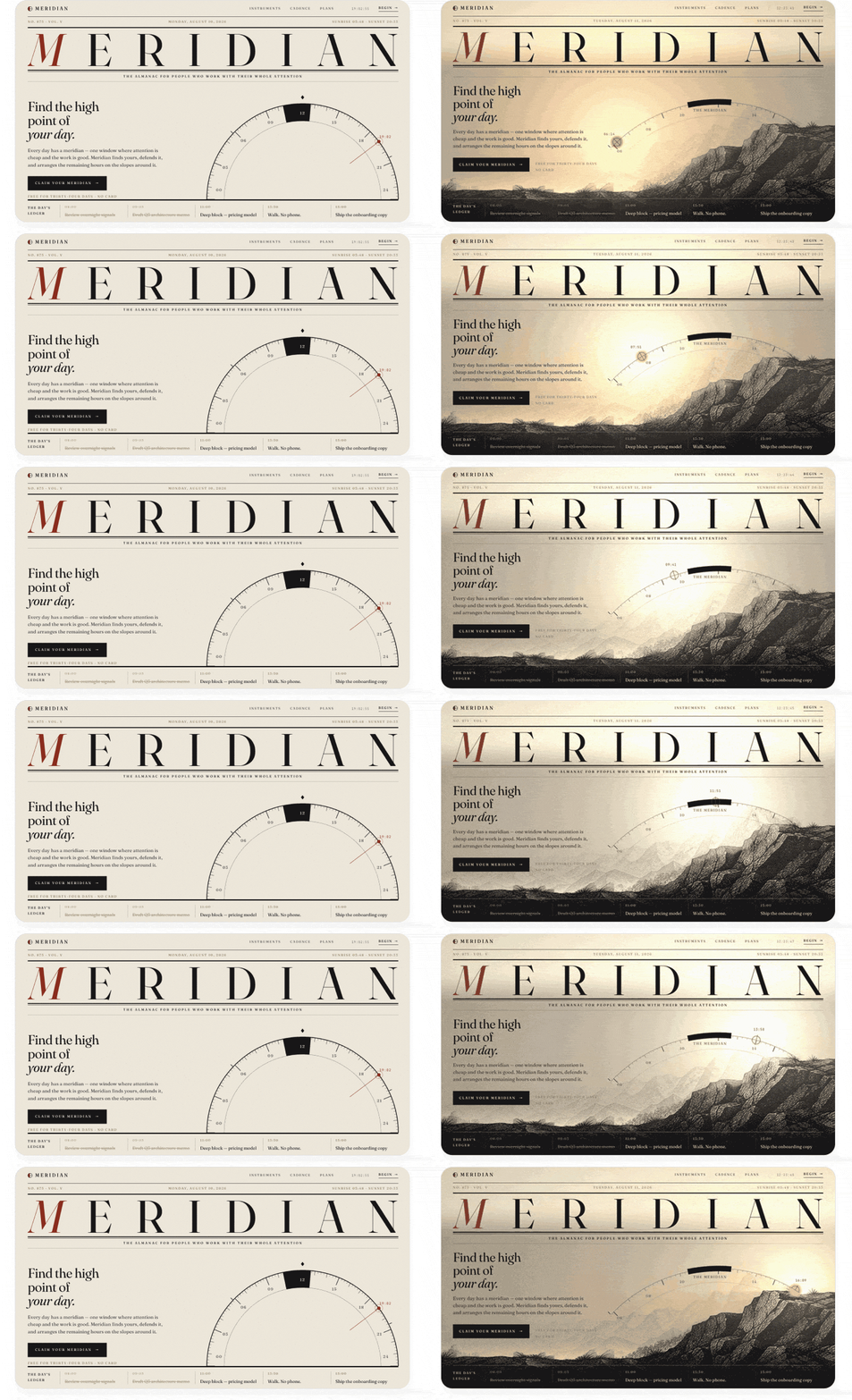
](https://substackcdn.com/image/fetch/$s_!kEu8!,f_auto,q_auto:good,fl_progressive:steep/https%3A%2F%2Fsubstack-post-media.s3.amazonaws.com%2Fpublic%2Fimages%2F7e2a6925-7451-4abe-aaa8-bc92823dd69a_1456x399.gif)

[
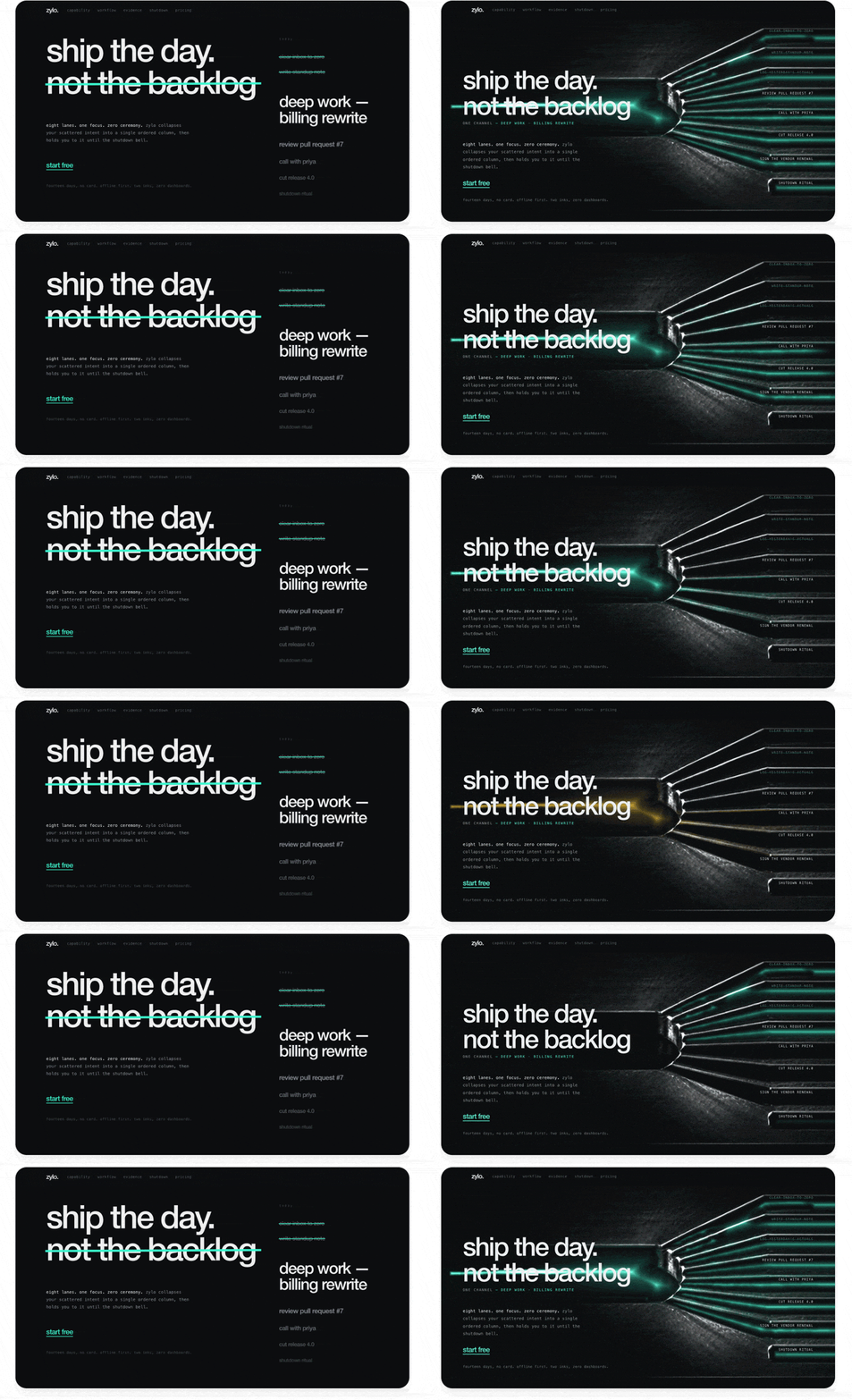
](https://substackcdn.com/image/fetch/$s_!gj_X!,f_auto,q_auto:good,fl_progressive:steep/https%3A%2F%2Fsubstack-post-media.s3.amazonaws.com%2Fpublic%2Fimages%2Ff4ae7b09-1555-4ade-850c-212cb0d089b2_1456x399.gif)

[
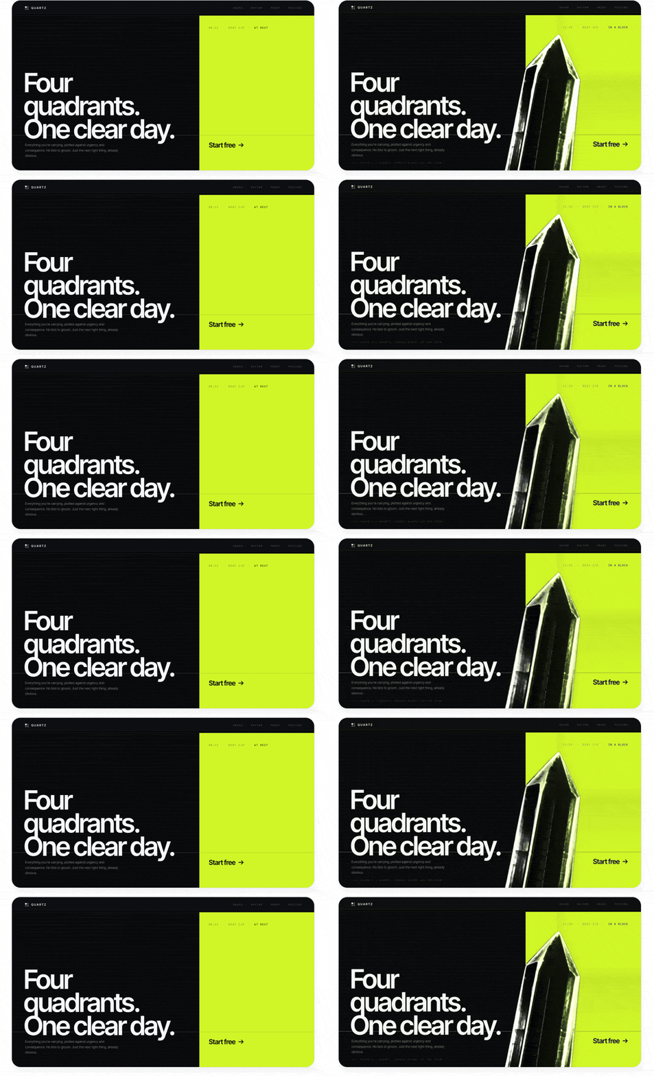
](https://substackcdn.com/image/fetch/$s_!h8ZM!,f_auto,q_auto:good,fl_progressive:steep/https%3A%2F%2Fsubstack-post-media.s3.amazonaws.com%2Fpublic%2Fimages%2F7cd81d80-09c1-4244-9651-43bba85771a4_1456x399.gif)

[
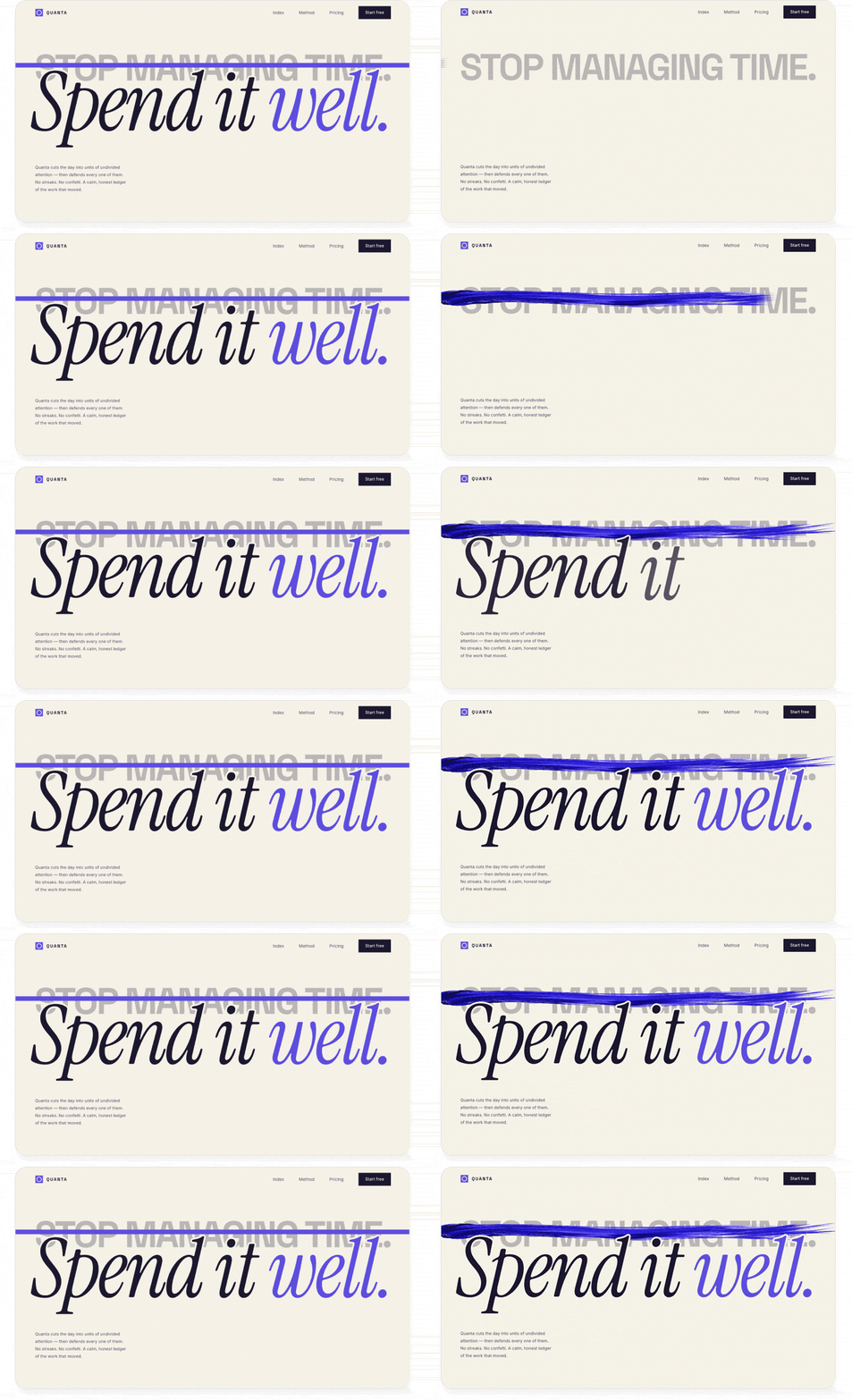
](https://substackcdn.com/image/fetch/$s_!kBom!,f_auto,q_auto:good,fl_progressive:steep/https%3A%2F%2Fsubstack-post-media.s3.amazonaws.com%2Fpublic%2Fimages%2Fc02123f6-00f8-4063-8463-5050d2649647_1456x399.gif)

Images and effects like these can quickly add a lot of personality and make a design less obviously AI-generated, since they demonstrate more than surface-level effort.

Depending on your setup, there are different ways to connect your agent to image generation tools:

If you use Codex, Antigravity, or Grok Build:

Tell your agent to use its built-in image generation. The agent already knows how to do this but rarely does so until instructed.

If you use Claude Code or another agent but also have a ChatGPT subscription:

Tell your agent, “Use the Codex CLI to generate images. Help me install it if it isn’t already present. Make sure it’s billing my subscription, not an API key.” This lets you use your ChatGPT subscription for image generation without extra costs.

If you only use Claude, or any other tool:

The simplest path is to give your agent an OpenAI or Gemini API key to generate images. I recommend creating a separate API key with a tight spend limit, just for your agent. That way, your costs are controlled even if the key gets out or the agent misuses it, and you can easily revoke the key without disrupting other work.

If you find yourself pasting keys into chats frequently, put them in a file instead, and point your agent to it in your project. Tell your agent: “Create a gitignored file called .env.agents, store this API key in it, and note to yourself in AGENTS.md/CLAUDE.md that these keys are for you to use during development (but must not ship with the product).”

Technique 5: For more advanced motion, use video generation

Video generation models are incredibly powerful these days, but most people think of them as tools for generating UGC ads or clips of Will Smith eating spaghetti. They can work wonders for everyday design work too.

There are many video models out there, and the best ones change frequently, so I like to use an aggregator platform like fal.ai. This way, we can give our agent a single API key and let it evaluate different options and choose the best one without needing multiple integrations.

Here are two ways I love to use video models in my designs:

Create stunning animated graphics

The trick is to generate a looping clip with a solid color background, then either chroma key it out (like a green screen) or, in more complex cases, use a video matting model to remove the background. This gives you an animation that you can layer anywhere in your UI without it looking like a video.

For example, I took one of our previous designs and ran this prompt:

**Prompt: **

Can you replace the image on this page with a looping video clip that does something more interesting? Have the crystal splinter apart and slowly spin around. It should have awesome glassy effects that refract the page background and cast shadows and light around it.

To get convincing glass refraction effects, render the video of the glass over the page background colors first (so it bakes in the refraction effects), then remove the background with a video matting model.

Use this fal.ai API key: sk-a1b2c3d4…

Find appropriate recent models for video generation and background removal.

GPT-5.6 Sol (before and after):

[
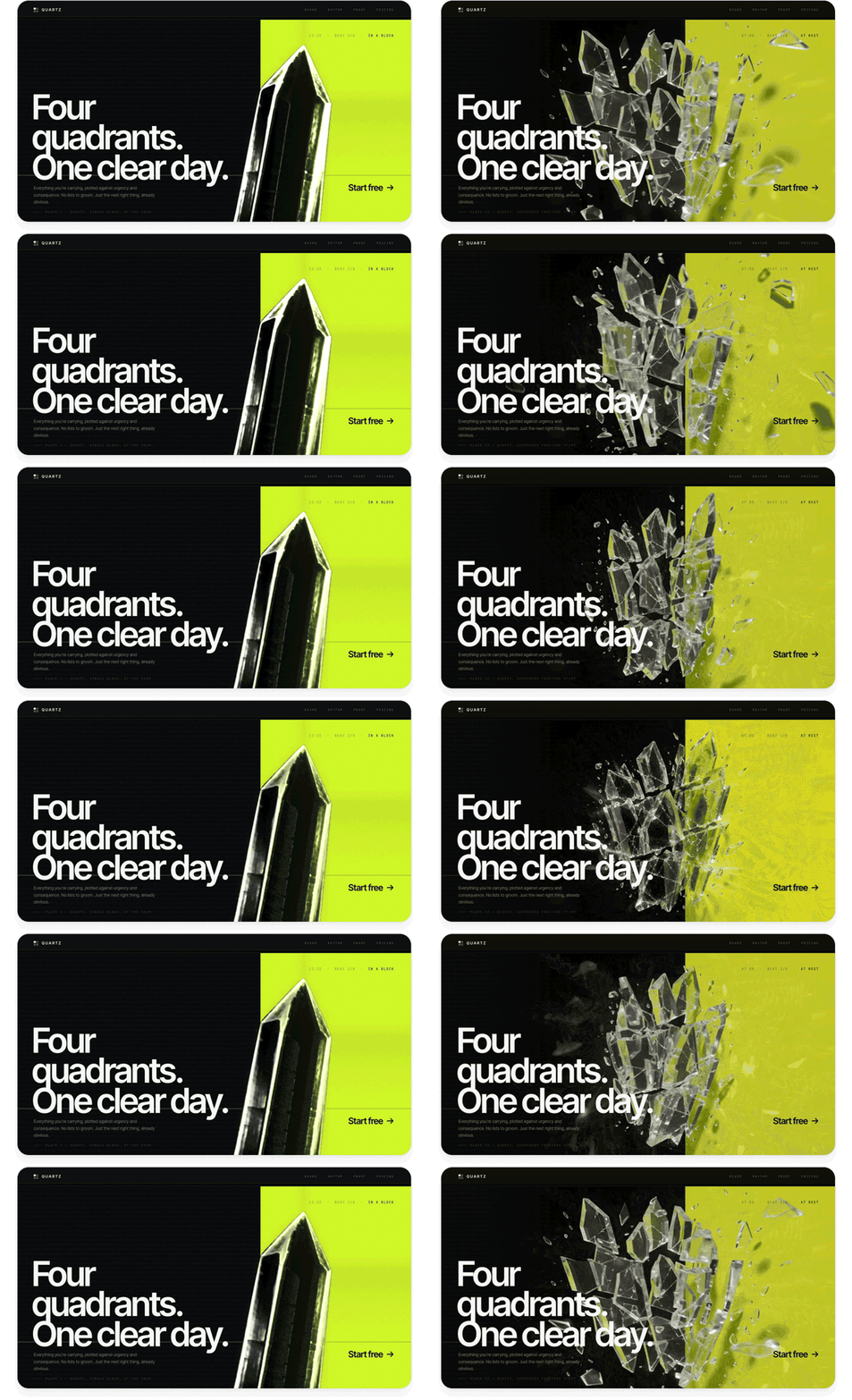
](https://substackcdn.com/image/fetch/$s_!SAf-!,f_auto,q_auto:good,fl_progressive:steep/https%3A%2F%2Fsubstack-post-media.s3.amazonaws.com%2Fpublic%2Fimages%2Faa994e2f-caec-40bf-8cc5-8a1ef101dd21_1456x399.gif)

This is a much richer effect than you can get with code: interesting caustic reflections, glassy refraction effects, and complex physical motion.

Create fluid transitions between states

This is a really underrated use case for video models. In addition to generating video from text, many video models can interpolate between keyframe images. This lets you take two product stills and create a transition clip between them. You can play the clip when the user takes an action (like navigating to another screen of your app) or scrub through it frame-by-frame in response to a gesture (like scrolling or swiping).

Here’s a demo page showing off a scroll effect. I built it with a single prompt using GPT-5.6 Sol in Codex:

Prompt:

Build a demo page for a suitcase that uses a video model to create interactive transitions between a couple of screens. Each screen should show the suitcase in a different state, with vertical motion that feels appropriate for scrolling:

Initially, have the suitcase floating high up in the air

Then have it land on the floor and pop open

Finally, have its contents neatly land into it from the top

Generate the initial frame using your image generation skill. Then, generate a video clip that starts from that frame and animates to the next state. Use the final frame of that video to seed the next transition so that it continues seamlessly. Scrub through the transitions one by one as the user scrolls.

Use this fal.ai API key: sk-a1b2c3d4…

Use a video model with strong physics and consistency, like Seedance 2.5.

GPT-5.6 Sol:

[
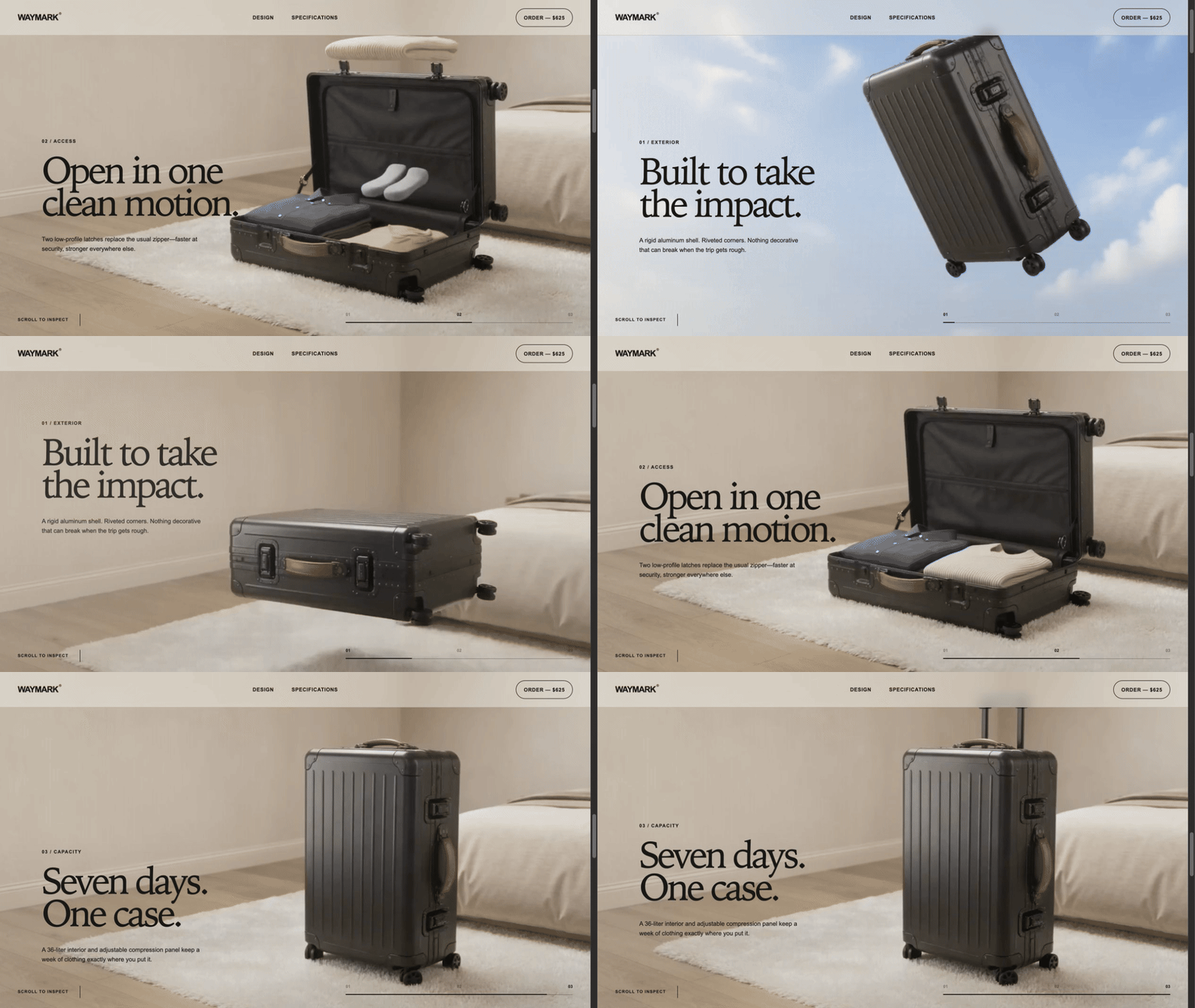
](https://substackcdn.com/image/fetch/$s_!E1CZ!,f_auto,q_auto:good,fl_progressive:steep/https%3A%2F%2Fsubstack-post-media.s3.amazonaws.com%2Fpublic%2Fimages%2F2f3bb583-375b-4a12-aa57-64a10bf2d9e7_960x540.gif)

The transitions between pages scrub fluidly with the user’s scrolling and are fun to play with. Design like this makes the user want to keep scrolling and reading more about your product. And it only took one prompt!

Deliver: Polish your design into something users will love

Once we’ve gotten to a unique, standout design, the final step is to clean up the details and get it ready for production use. AI can build amazing, striking visuals, but your judgment will be key to making sure the design makes sense, flows well, and serves its practical purpose for your users.

Technique 6: Cut out elements that don’t add value

AI loves to add more, but it rarely takes away. One of the biggest signs that a design is AI-generated is that it overexplains everything or contains elements that don’t serve any practical purpose. By contrast, a design that exercises restraint immediately looks premium and tasteful.

When polishing AI designs, most of my effort goes into removing things. For example, when I was building my calorie tracking app, this was my initial design from Claude:

[
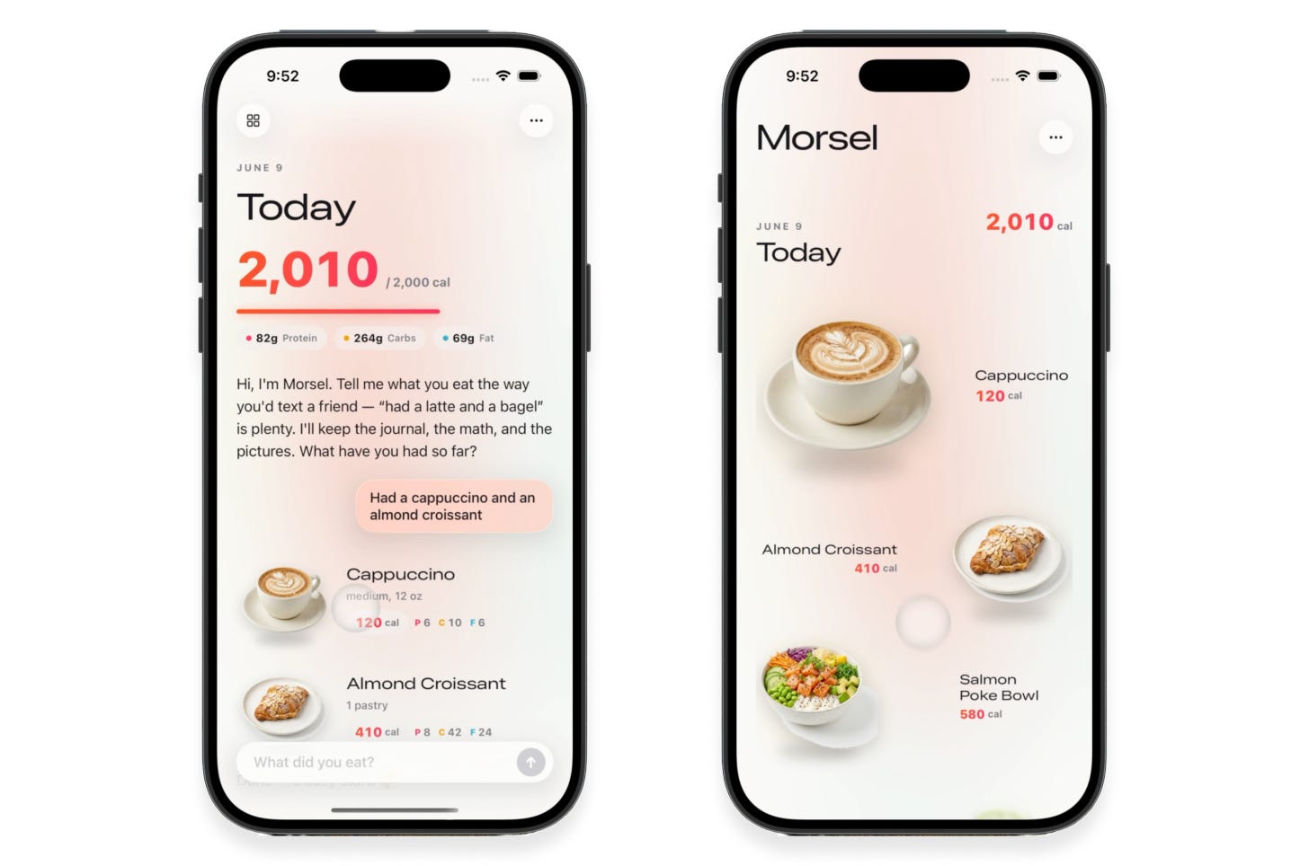
](https://substackcdn.com/image/fetch/$s_!G64j!,f_auto,q_auto:good,fl_progressive:steep/https%3A%2F%2Fsubstack-post-media.s3.amazonaws.com%2Fpublic%2Fimages%2Fdc9186ef-2b04-42a0-a460-8898b0590797_1456x964.png)

I’d described the app’s functionality and specifically asked for a “clean, minimalist design.” The results weren’t bad, and were certainly impressive for being fully AI-generated. However, despite my asking for minimalism, a lot in the design wasn’t adding value:

Pink glowy effects in the background and on the progress bar

Random colors and highlights on text

Extra labels and empty space when displaying all the foods for a day, when the images already communicate this

Custom buttons and text fields that look worse than built-in iOS components

I asked Claude to dial things back:

Simplify the layout into an image-centric grid

Get rid of gradients, glows, and unnecessary containers

Aim for a truly minimalist aesthetic that feels Apple-native

This was the result:

[
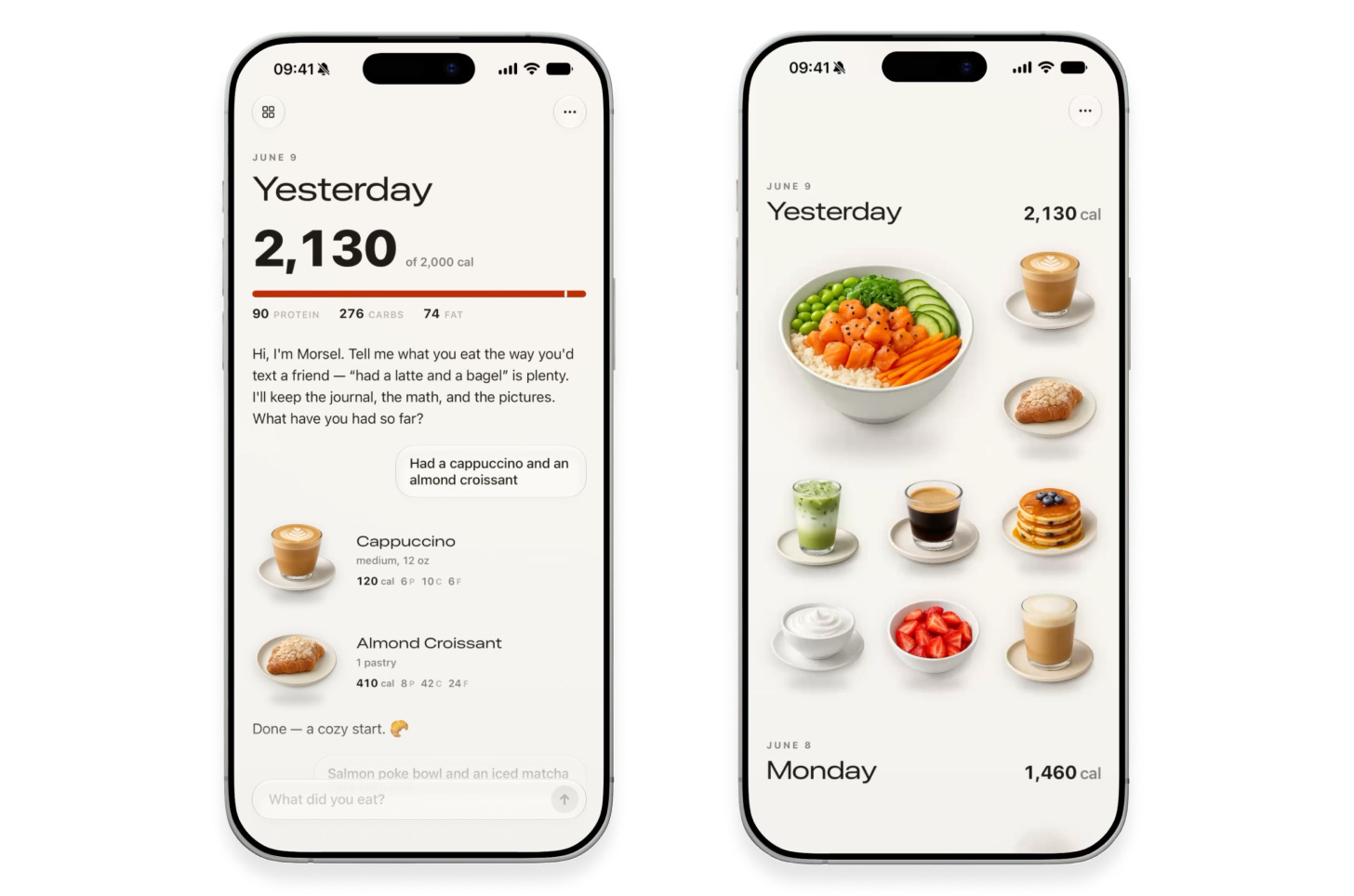
](https://substackcdn.com/image/fetch/$s_!iD6y!,f_auto,q_auto:good,fl_progressive:steep/https%3A%2F%2Fsubstack-post-media.s3.amazonaws.com%2Fpublic%2Fimages%2Ffdf80ee5-9f43-44e9-93cf-c477a9e49128_1456x964.png)

To my trained eye, the result is much better. It’s opinionated and allows the visuals to speak for themselves. It uses native iOS components, and the excessive colors and gradients are gone. The text is smaller, simpler, and tighter. This is good design.

Today’s AI models would never think to make these choices on their own. Remember, AI doesn’t like to take risks, and it’s risky to strip down a design and delete code. The model needs a push from you. Look over your design and ask yourself what really needs to be there. Often, putting less on the screen communicates more, because you can hold your users’ attention without overwhelming them with clutter.

📋 讨论归档

讨论进行中…