返回列表
🪞 Uota学 · 💬 讨论题

深色模式切换:两个状态足矣

永久可见的主题切换控件必须摒弃暴露底层数据模型的三态设计,转而采用仅在用户交互时评估的“覆盖-回退”双态机制,以彻底消除预防性选项带来的认知摩擦。
打开原文 ↗

2026-08-07 原文链接 ↗
阅读简报
双语对照
完整翻译
原文
讨论归档

核心观点

  • 模型泄露是交互冗余的根源:将底层技术状态直接映射为UI选项必然强迫用户为未发生的场景做决策,这直接违背了以用户即时目标为中心的设计铁律。
  • 双态控件足以隐式表达三态逻辑:通过“首次点击存储覆盖值、再次点击且与系统一致时清除覆盖值”的惰性回退机制,双态开关能完整覆盖系统跟随与用户自定义需求,且无需增加界面复杂度。
  • 环境变化绝不自动清除用户偏好:系统主题自动切换时若恰好与用户覆盖值重合,强行清理存储值会隐蔽地剥夺用户控制权,状态评估必须严格限定在用户主动交互的瞬间。
  • 常驻控件与设置面板需严格场景隔离:页头永久控件仅服务于即时修复视觉不适的急性需求,而独立设置面板才适合承载长期策略配置的三态选项,混淆两者必然导致界面熵增。

跟我们的关联

  • 对 Uota 意味着产品界面设计必须从技术状态暴露转向用户意图过滤,下一步应在所有常驻配置控件中强制推行目标过滤式UI框架,直接砍掉所有预防性选项。
  • 对 ATou 意味着AI Agent的参数面板绝不能直接抛出底层模型变量,下一步需将复杂参数封装为意图开关,仅在用户明确反馈不适时才暴露高级调参入口。
  • 对 Neta 意味着新用户激活流程中的偏好设置属于慢性配置,下一步应将语言与通知等选项默认跟随系统,改为痛点触发机制,以直接降低首屏认知负荷并提升转化率。

讨论引子

  • 当系统自动切换主题导致用户覆盖值意外生效时,双态控件造成的控制感缺失是否真的只需一键修复,还是构成了更深层的产品信任损耗?
  • 在缺乏独立设置面板的轻量级应用中,如何在不引入三态控件的前提下,有效满足用户首次访问时的长期偏好设定需求?

深色模式切换:两个状态足矣 • Lea Verou

首页 博客 咨询 规范 开源 演讲 著作 报道 关于

深色模式切换:两个状态足矣

本页内容

是的,底层模型必须包含三个状态,但其中总有一个与用户的实际目标无关。用户不会去寻找他们当前并未遇到的问题的解决方案。很多对双状态切换开关的憎恶,其实是基于糟糕的实现。

UX, 易用性, 产品设计, 深色模式

一个设计良好的双状态切换开关实际上可以表达所有三个数据模型状态。

直到最近,如果你观察大多数带有主题切换开关[1]除非另有说明,这指的是位于页头或(极少情况下)页脚的永久可见的切换开关,而不是独立设置面板中的主题设置。的网站,你会发现有三个选项:浅色、深色和跟随系统。

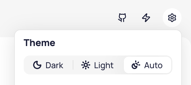
三态深色模式切换开关示例。从左到右(LTR)阅读顺序:Ant Design、Red Hat Design System、Web Awesome、Excalidraw、Taiga、Astro、Hero UI。

庆幸的是,如今趋势已转向更简单的双状态切换开关,但三态开关仍然极其普遍。

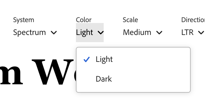
双状态深色模式切换开关示例。从左到右(LTR)阅读顺序:Vitepress、Material Design、Adobe Spectrum、Radix、ShadCN。

其理由听起来似乎有理:“跟随系统”的意图不同于“浅色”或“深色”!一个是策略(无论操作系统如何设置,就照做),另一个是值(永远是深色,我不在乎操作系统如何设置)。用户当然应该能够表达这种意图!

然而,现实中的用户通常不会为了表达“保持现状”的意图而去寻找深色模式切换开关,他们只在需要改变时才会寻找。

想想用户浏览网站时的目标(这与独立的设置页面不同,后者三个状态是可以的)。例如,在文档网站上,他们可能是来查阅资料的。在落地页上,他们可能试图评估产品是否满足需求。在媒体网站上,他们可能是来阅读新闻的。在图形应用中,他们想画点什么。

有一件事是确定的:调整主题并不是他们的主要目标[2]这是关于用户的。是的,网站开发者可能有测试主题的目标,但我们优化 UI 是为了被使用,而不是为了被调试。。要进入调整主题的心态,肯定是因为有什么地方不对劲。当看起来一切正常时,用户会继续他们的实际目标,而不会去思考主题。

三态控件解决的是一个很大程度上虚构的用户目标,这在真实用户中极为罕见,并不足以成为增加三态切换开关的复杂度和 UX 摩擦的理由。

更糟糕的是,它强迫用户在那些不会产生可见差异的选项之间做出决定,这违反了反馈原则。

是的,三态切换开关很普遍。但这并不意味着它们是好的。本文解释了原因,以及如何做得更好。

三态切换开关是实现驱动的 UI

最常见的 UX 错误之一就是围绕底层数据模型而非用户目标来设计 UI。优秀的界面会抽象掉底层模型,暴露一个与用户目标一致的模型(除非两者恰好重合,但这很罕见)。

这里的用户目标是设定特定的水流和温度。底层模型处理的是热水和冷水的量。猜猜哪个水龙头更容易使用?

三态深色模式切换开关正是这种情况;暴露所有三个状态是数据模型泄露到了 UI 中。

是的,底层实现中绝对应该有三个状态!但在任何特定时刻,其中有一个对最终用户来说是无关紧要的。

用户无法针对他们当前并未遇到的问题有意义地表达意图。

深色模式切换开关是一种临时的舒适度调整。就用户目标而言,只有两个真实状态:

  • 网站看起来没问题。用户继续他们的实际目标,根本不会寻找切换开关。
  • 网站太亮或太暗,让人不舒服。用户想要修复它。

你正在床上阅读,页面像闪光弹一样刺眼,你点击了切换开关。你在户外使用笔记本电脑,深色主题在阳光下无法阅读,你点击了切换开关。这是情境性的、即时的,通常关乎你所处的环境,而不是对配色方案的深思熟虑的长期立场。

第三个状态假设了这样一种使用场景:用户访问一个看起来完全正常的网站,却仍然寻找深色模式切换开关,以确保它在未来继续看起来正常。用户确实会做各种奇怪的事情,所以我不会断言这种情况从未发生,但这并不是由真实用户目标驱动的自然用户交互。即使是我交谈过的三态切换开关最坚定的支持者,要么承认他们从未这样做过,要么举出一些极其罕见、奇怪的一次性边缘案例。

我试图在社交媒体上提问,但无论我多么努力地斟酌措辞,问题总是被误解,导致数据噪音太大,无法使用。

除了误解问题并谈论那些他们想要覆盖操作系统主题的时候,还有开发者回答关于调试用例(而不是他们的实际用户行为),或者人们谈论那次他们不小心点击了那个选项。甚至有人得出结论说,因为他们几乎总是希望网站继承操作系统设置,所以他们应该投“经常”票!😵‍💫

话虽如此,我认为除了学术好奇心之外,这并不那么重要,因为一个设计良好的双状态控件实际上可以表达所有三个状态——用户只需要在第一次变得相关时应用覆盖即可。

但这有什么坏处呢?

有人可能会争辩说,当然,第三个状态并不经常需要,但把它放在那里供那一个需要的用户使用,肯定没什么坏处,对吧?

但是,更复杂的 UI 是有代价的。它增加了与控件交互的认知负荷,并迫使你做出某些 UI 设计决策。

双状态切换开关可以非常紧凑:只需一个图标,点击时切换为另一个图标。

有些网站确实采用这种方式,使用循环切换三个状态的三态切换开关。例如 Docusaurus:

但总的来说,其操作便利性不如双状态切换开关,因此它很少见也就不足为奇了(Docusaurus 是我能找到的唯一例子)。

有些三态控件采用三个图标并排,这使占用的屏幕空间增加了两倍。

Red Hat、Hero UI、Excalidraw 和 Tailwind 并排显示三个图标。

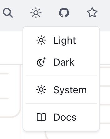
其他的为了平衡清晰度和空间,采用了下拉菜单:

Ant Design、Web Awesome 和 Taiga UI 采用了这种方式。Web Awesome 是唯一一个(!)实际显示系统默认值解析结果的产品,值得加分。

这提高了可学习性,却牺牲了效率,因为它将单次点击交互变成了两步过程。

实际感知到的摩擦实际上比多一次点击更糟糕。感知摩擦不仅仅是用户操作的函数,还取决于做出决定所需的心理努力,较大的 UI 变化(例如打开下拉菜单)比小的变化(例如点击切换开关)在认知上更昂贵,因为用户需要感知和解释更大的区域。

如果不是三个状态,那该是什么样?

指导使用三态控件的本意是好的,但往往基于将良好的三态控件与糟糕的双态控件进行对比。例如在 Bramus 的这篇文章中:

此外,我见过的许多实现没有考虑“系统”值。通过省略此选项,站点一旦被调整,就永远无法再次响应系统偏好,因为总是应用了一个覆盖值。

确实,一个糟糕的双状态切换开关比三态的更糟。它使得系统模式一旦被调整就无法访问,使选择变得不可逆,违反了用户控制和自由的可用性原则。一个优秀的双状态切换开关应该能够表达所有三个状态。

其理念是底层模型仍然是三个状态,但在任何给定时间只显示两个:

选项 显示为 存储值
系统默认值 当前解析值(例如太阳或月亮) None
覆盖值 当前解析值的相反值(例如月亮或太阳) light 或 dark

当你第一次按下它时,它会切换到你当前看到的相反状态,并存储字面值(light 或 dark)。当你下一次按下它时,它会切换回系统默认值,并删除存储的值。

最后这一点是许多双状态切换开关弄错的地方。存储一个恰好匹配系统偏好的值,会在没有退出机制的情况下,悄悄地将临时调整转换为永久固定。

另一个常见的错误是在系统偏好改变时过于急切地删除存储的值,即使用户已经明确设置了覆盖。

这种评估必须仅在用户交互时进行。

这一点很重要,因为许多用户将其操作系统设置为根据一天中的时间自动在浅色和深色模式之间切换,主动删除存储的值将使他们无法真正固定主题。

如果存储的覆盖值后来恰好与系统偏好一致——是因为操作系统变了,而不是因为用户做了什么——你保留它。

这看起来像是一个疏忽——它们现在是一样的,为什么不清理一下?因为清理会基于用户未引起且看不到的事件,悄悄地将明确的选择降级为默认值。

交互演示

这是一个你可以交互操作的具体场景(在单独页面上查看):

  • 你的操作系统处于浅色模式,站点未存储任何内容,因此页面跟随系统。翻转操作系统控件以反向运行此流程。
  • 你进行切换。目标是深色,这与操作系统的设置不同,因此站点存储了一个覆盖值。页面变为深色。
  • 你的操作系统切换到深色。覆盖值现在与之匹配,但仍被保留。没有任何可见变化,这是正确的。
  • 你的操作系统切换回浅色。页面保持深色,因为覆盖值仍然有效。
  • 你进行切换。目标是浅色,这与操作系统的设置一致,因此覆盖值被移除。页面再次跟随操作系统。
  • 轮到你了。两个控件都是实时的,从这里开始没有任何脚本。以任何顺序驱动它们,观察什么——以及什么没有——最终进入 localStorage。

但如果用户感到困惑怎么办?

我在讨论这个问题时听到的一个论点是“但如果用户在操作系统为浅色时选择了浅色,然后操作系统切换到深色,他们不会因为网站没有保留他们的选择而感到困惑吗?”

在可用性讨论中,人们假设其他人(不是他们自己)会感到“困惑”,这有点让我反感,但我们暂且讨论一下。

这正是那个场景:

  • 你的操作系统处于浅色模式,未存储任何内容。
  • 你切换到深色,这被存储为覆盖值。
  • 你再次切换,意图是固定浅色。它与操作系统匹配,因此覆盖值被移除——你实际上得到了系统默认值。
  • 你的操作系统切换到深色,页面跟随。这不是你的本意!
  • 但修复只需单击一下:浅色不再与操作系统匹配,所以这次它是一个覆盖值,因此被固定,所以这最多只能发生一次。

请记住,此控件与访问网站的真正用户目标完全无关。即使他们的意图是固定浅色而不是恢复到系统(浅色),他们也只会在两者分歧时(即操作系统切换到深色)才会注意到。此时,修复只需单击一下。这是一个如此简单的修复,以至于没有必要再纠结下去。

并不是说这种情况从未发生,但在我看来,为了支持三态控件而做出这种权衡是不合理的。三态控件引入了永久的 UI 复杂性,以防止一个一次性的、易于修复的问题。

此外,颜色外观不仅仅是颜色分量的纯函数,还受周围环境和其他因素的影响。即使网站只实现了两种模式,浅色模式在浅色操作系统与深色操作系统下看起来也可能略有不同,因此将其作为覆盖值选择是一个知情决定。

标题和图标可以使状态更清晰(例如,工具提示说“切换回浅色(系统默认)”,而不是“切换到浅色”,或者图标上有一个小屏幕图标,而不仅仅是太阳或月亮)。但这需要用户测试来验证它们是否真的是一种改进。我担心的是,一旦你区分了系统(浅色)和浅色,它(讽刺地)可能会成为引导用户寻找他们以前未曾考虑过的第三状态的事物。

即使有一个天才的 UI 可以同时暴露三个状态而不增加任何认知负荷或摩擦(我对它可能的样子有一些想法),我也不相信这是一个值得解决的问题,感觉非常像 UX 版本的过早优化

什么时候三态控件是合适的?

尽管我整篇文章都在反对三态切换开关,但它们实际上有合理的用例。

这是我知道的两个案例,但请随时在评论中推荐更多!

1. 位于独立设置面板中的配色方案设置

这篇文章主要针对页头或页脚中永久可见的切换开关。

与其他设置一起位于设置面板中的设置是一个根本不同的使用场景:

  • 用户已经处于对未来做决策的模式中
  • 期望并非每个设置都必须产生即时反馈
  • 有更多的屏幕空间来解释这三个状态。

持久控件的双态切换开关正成为常态,而设置面板中的三态(正确地)称王,这并非偶然。

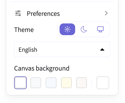
Bluesky 的外观设置面板。这里的三态是可以的。另一方面,当“深色模式”选项不产生任何效果时仍将其显示在下方……

Google 日历。很喜欢这些图标,如果能实际指示系统当前解析为什么就好了。

我不是要赞扬后 X 时代的 Twitter,但用两个双态切换开关代替一个三态开关是一个非常有趣的设计选择。UX 还不够好,但如果做得好,我认为当你有屏幕空间时,这可能是两全其美的方案。

2. 当配色方案根据系统设置有不同的实现时

这整篇文章假设的是常见情况,即网站只有两种配色方案:浅色和深色,并且在深色操作系统下的浅色模式与浅色操作系统下的浅色模式没有区别。Vadim Makeev 有一个有趣的想法:配色方案应该考虑底层操作系统设置。深色操作系统下的浅色模式应该不那么亮,浅色操作系统下的深色模式应该不那么暗,以减少网站与系统其余部分之间的对比度。

我没见过多少 UI 这样做,CSS 也没有让这变得更容易(light-dark() 非常围绕二元性设计),但如果你真的这样做了,我的朋友,你就赢得了你的三个状态,想怎么显眼地展示它们就怎么展示,这不适用于你!

编辑:我联系了 Vadim,问他是否见过任何遵循他指导的 UI。他是这样说的:

不幸的是,我还没见过任何网站使用这个想法。我想说我们目前的工具非常有限。一旦我们想要覆盖 prefer-color-scheme,整个 light-dark() 的便利性就崩塌了。

这又是 CSS 函数将解决的另一个问题(没有什么能阻止我们创建一个它的 2-4 参数版本)。

通用版本

深色模式切换开关是一个很好的案例研究,但背后的教训更大:

用户不会去寻找他们当前并未遇到的问题的解决方案。

三态切换开关是低信噪比 API 的 GUI 版本,它要求你传递几十个本可以有合理默认值的参数,强迫你对尚未遇到且不相关的问题做出决定。

不要用与当前情况无关的选项淹没用户。未来可能变得相关的选项,应该在未来呈现,而不是预先呈现。

并非状态机中的每个状态都值得拥有可见的 UI。

最终,一切都归结为同一个原则: 尊重用户精力。

感谢 Chris Lilley 和 Jake Archibald 审阅了本文的早期草稿。

2footnotes

除非另有说明,这指的是位于页头或(极少情况下)页脚的永久可见的切换开关,而不是独立设置面板中的主题设置。 ↩︎

-

这是关于用户的。是的,网站开发者可能有测试主题的目标,但我们优化 UI 是为了被使用,而不是为了被调试。 ↩︎

喜欢这篇文章吗?

想要更多类似内容?随缘打赏

有所共鸣?与我合作

报告页面错误

UX, 易用性, 产品设计, 深色模式

Dark mode toggles: two states are enough • Lea Verou

Home Blog Consulting Specs Open Source Speaking Publications Press About

深色模式切换:两个状态足矣 • Lea Verou

首页 博客 咨询 规范 开源 演讲 著作 报道 关于

Dark mode toggles: two states are enough

On this page

Yes, the underlying model must have three states, but one is always irrelevant to the actual user goal. Users do not seek out solutions to problems they don’t currently have. A lot of the hate towards two-state toggles is based on poor implementations.

UX, Usability, Product Design, Dark Mode

A good two-state toggle can actually express all three data model states.

Until recently, if you looked at most websites with a theme toggle[1]Unless otherwise noted, this refers to a permanently visible toggle in the header or (rarely) footer, not a theme setting in a separate settings panel. , you’d find three options: Light, Dark, and System.
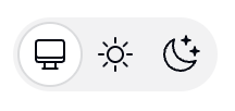
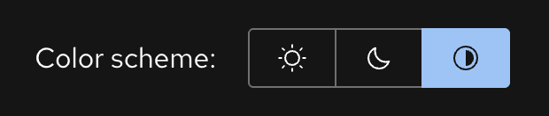
Examples of tri-state dark mode toggles. In (LTR) reading direction: Ant Design, Red Hat Design System, Web Awesome, Excalidraw, Taiga, Astro, Hero UI.

Thankfully, these days the trend has shifted towards a simpler two-state toggle, but tri-state ones are still incredibly common.

Examples of two-state dark mode toggles. In (LTR) reading direction: Vitepress, Material Design, Adobe Spectrum, Radix, ShadCN.

The rationale sounds plausible: “System” is a different intent than “Light” or “Dark”! One is a policy (whatever my OS says, do that) The other is a value (dark, forever, I don’t care what my OS says.) Surely, users should be able to express that intent!

Except, real users don’t generally seek out dark mode toggles to express intent for things to stay as they are, they seek them out when things need to change.

Think of the user goal when browsing a website (as opposed to a separate Settings page, where three states are fine). E.g. on a documentation site, they may be there to look something up. On a landing page, they may be trying to evaluate whether the product is suitable for their needs. On a media site, they may be there to read the news. On a graphics app, they want to draw something.

One thing is for certain: tweaking the theme is not their primary goal [2]This is about users. Yes, the developers of the site may have a goal of testing the theme, but we optimize UIs for being used, not getting debugged. . To get in the mindset of tweaking the theme, something needs to be off. When things look right, users just move on with their actual goal instead of thinking about the theme.

The tri-state control is solving a largely imaginary user goal that is extremely rare among real users, and does not justify the additional complication and UX friction of a three-state toggle.

Worse, it forces the user to decide between choices that produce no visible difference, breaking the principle of feedback.

Yes, tri-state toggles are common. That doesn’t make them good. This essay explains why, and how to do better.

深色模式切换:两个状态足矣

本页内容

是的,底层模型必须包含三个状态,但其中总有一个与用户的实际目标无关。用户不会去寻找他们当前并未遇到的问题的解决方案。很多对双状态切换开关的憎恶,其实是基于糟糕的实现。

UX, 易用性, 产品设计, 深色模式

一个设计良好的双状态切换开关实际上可以表达所有三个数据模型状态。

直到最近,如果你观察大多数带有主题切换开关[1]除非另有说明,这指的是位于页头或(极少情况下)页脚的永久可见的切换开关,而不是独立设置面板中的主题设置。的网站,你会发现有三个选项:浅色、深色和跟随系统。

三态深色模式切换开关示例。从左到右(LTR)阅读顺序:Ant Design、Red Hat Design System、Web Awesome、Excalidraw、Taiga、Astro、Hero UI。

庆幸的是,如今趋势已转向更简单的双状态切换开关,但三态开关仍然极其普遍。

双状态深色模式切换开关示例。从左到右(LTR)阅读顺序:Vitepress、Material Design、Adobe Spectrum、Radix、ShadCN。

其理由听起来似乎有理:“跟随系统”的意图不同于“浅色”或“深色”!一个是策略(无论操作系统如何设置,就照做),另一个是值(永远是深色,我不在乎操作系统如何设置)。用户当然应该能够表达这种意图!

然而,现实中的用户通常不会为了表达“保持现状”的意图而去寻找深色模式切换开关,他们只在需要改变时才会寻找。

想想用户浏览网站时的目标(这与独立的设置页面不同,后者三个状态是可以的)。例如,在文档网站上,他们可能是来查阅资料的。在落地页上,他们可能试图评估产品是否满足需求。在媒体网站上,他们可能是来阅读新闻的。在图形应用中,他们想画点什么。

有一件事是确定的:调整主题并不是他们的主要目标[2]这是关于用户的。是的,网站开发者可能有测试主题的目标,但我们优化 UI 是为了被使用,而不是为了被调试。。要进入调整主题的心态,肯定是因为有什么地方不对劲。当看起来一切正常时,用户会继续他们的实际目标,而不会去思考主题。

三态控件解决的是一个很大程度上虚构的用户目标,这在真实用户中极为罕见,并不足以成为增加三态切换开关的复杂度和 UX 摩擦的理由。

更糟糕的是,它强迫用户在那些不会产生可见差异的选项之间做出决定,这违反了反馈原则。

是的,三态切换开关很普遍。但这并不意味着它们是好的。本文解释了原因,以及如何做得更好。

Tri-state toggles are implementation-driven UI

One of the most common UX mistakes is designing UI around the underlying data model instead of user goals. Good interfaces abstract away the underlying model and expose a model that aligns with user goals (unless of course these happen to coincide, which is rare).

The user goal here is to set a specific flow and temperature. The underlying model works with amounts of hot and cold water. Guess which faucet is easier to use?

This is exactly the case with tri-state dark mode toggles; exposing all three states is data model leaking into the UI.

Yes, there should absolutely be three states in the underlying implementation! But at any given point, one of them is irrelevant to the end-user.

Users cannot meaningfully express intent about problems they don’t currently have.

A dark mode toggle is a temporary comfort adjustment. When it comes to user goals, there are only two real states:

  • The website looks ok. The user moves on with their actual goal and doesn’t look for the toggle at all.

  • The website is too bright or too dark to be comfortable. The user wants to fix it.

You’re reading in bed, the page is a flashbang, you hit the toggle. You’re on a laptop outside and the dark theme is unreadable in sunlight, you hit the toggle. It’s situational, it’s immediate, and it’s usually about the environment you’re in rather than a considered long-term stance on color schemes.

A third state assumes a usage scenario where a user visits a website that looks perfectly fine, and still looks for a dark mode toggle to ensure it can continue to look fine in the future. Users do all sorts of weird things, so I won’t assert that this never happens, but it is not a natural user interaction, fueled by a real user goal. Even the strongest proponents of tri-state toggles I have spoken with either admit they have never done this, or bring up some extremely rare, weird one-off edge cases.

I tried to ask on social media (Bsky, Twitter/X, Mastodon, GitHub), but no matter how hard I tried to word it well, the question kept getting so misunderstood that the data is too noisy to be useful.

Besides people misunderstanding the question and talking about these times where they want to override the OS theme, there were also developers answering about debugging use cases (rather than their actual user behavior), or people talking about that one time they accidentally clicked that option. There was even someone who concluded that because they want the site to inherit the OS setting almost always, they should vote “frequently”! 😵‍💫

That said, I don’t think it matters all that much beyond academic curiosity, as a good two state control can actually express all three states — users just need to apply the override the first time it becomes relevant.

三态切换开关是实现驱动的 UI

最常见的 UX 错误之一就是围绕底层数据模型而非用户目标来设计 UI。优秀的界面会抽象掉底层模型,暴露一个与用户目标一致的模型(除非两者恰好重合,但这很罕见)。

这里的用户目标是设定特定的水流和温度。底层模型处理的是热水和冷水的量。猜猜哪个水龙头更容易使用?

三态深色模式切换开关正是这种情况;暴露所有三个状态是数据模型泄露到了 UI 中。

是的,底层实现中绝对应该有三个状态!但在任何特定时刻,其中有一个对最终用户来说是无关紧要的。

用户无法针对他们当前并未遇到的问题有意义地表达意图。

深色模式切换开关是一种临时的舒适度调整。就用户目标而言,只有两个真实状态:

  • 网站看起来没问题。用户继续他们的实际目标,根本不会寻找切换开关。
  • 网站太亮或太暗,让人不舒服。用户想要修复它。

你正在床上阅读,页面像闪光弹一样刺眼,你点击了切换开关。你在户外使用笔记本电脑,深色主题在阳光下无法阅读,你点击了切换开关。这是情境性的、即时的,通常关乎你所处的环境,而不是对配色方案的深思熟虑的长期立场。

第三个状态假设了这样一种使用场景:用户访问一个看起来完全正常的网站,却仍然寻找深色模式切换开关,以确保它在未来继续看起来正常。用户确实会做各种奇怪的事情,所以我不会断言这种情况从未发生,但这并不是由真实用户目标驱动的自然用户交互。即使是我交谈过的三态切换开关最坚定的支持者,要么承认他们从未这样做过,要么举出一些极其罕见、奇怪的一次性边缘案例。

我试图在社交媒体上提问,但无论我多么努力地斟酌措辞,问题总是被误解,导致数据噪音太大,无法使用。

除了误解问题并谈论那些他们想要覆盖操作系统主题的时候,还有开发者回答关于调试用例(而不是他们的实际用户行为),或者人们谈论那次他们不小心点击了那个选项。甚至有人得出结论说,因为他们几乎总是希望网站继承操作系统设置,所以他们应该投“经常”票!😵‍💫

话虽如此,我认为除了学术好奇心之外,这并不那么重要,因为一个设计良好的双状态控件实际上可以表达所有三个状态——用户只需要在第一次变得相关时应用覆盖即可。

But what’s the harm?

One could argue that sure, the third state is not frequently needed, but surely it doesn’t hurt to have it there for the one user that will need it, right?

But a more complex UI has a cost. It increases cognitive load for interacting with the control and forces you towards certain UI design decisions.

A two-state toggle can be very compact: Just a single icon that switches to another when clicked.

Some websites do go that route with a tri-state toggle that cycles through three states. Docusaurus for example:

But generally, the ergonomics of that are poorer than for the two state toggle, so it is no surprise it’s rare (Docusaurus was the only example I could find).

Some tri-state controls go for three icons side by side, which triples the screen real estate used.

Red Hat, Hero UI, Excalidraw, and Tailwind display three icons side by side.

Others, in an attempt to balance clarity and real estate, resort to a dropdown:

Ant Design, Web Awesome, and Taiga UI go this route. Points for Web Awesome being the only one (!) to actually display what the system default resolves to.

That improves learnability, at the cost of efficiency, as it turns a single click interaction into a two-step process.

The actual perceived friction is actually worse than one extra click. Perceived friction is not a pure function of user actions, but also of the mental effort required to make a decision, and larger UI shifts (e.g. opening a dropdown) are more cognitively expensive than smaller ones (e.g. clicking a toggle) as the user needs to perceive and interpret a larger area.

但这有什么坏处呢?

有人可能会争辩说,当然,第三个状态并不经常需要,但把它放在那里供那一个需要的用户使用,肯定没什么坏处,对吧?

但是,更复杂的 UI 是有代价的。它增加了与控件交互的认知负荷,并迫使你做出某些 UI 设计决策。

双状态切换开关可以非常紧凑:只需一个图标,点击时切换为另一个图标。

有些网站确实采用这种方式,使用循环切换三个状态的三态切换开关。例如 Docusaurus:

但总的来说,其操作便利性不如双状态切换开关,因此它很少见也就不足为奇了(Docusaurus 是我能找到的唯一例子)。

有些三态控件采用三个图标并排,这使占用的屏幕空间增加了两倍。

Red Hat、Hero UI、Excalidraw 和 Tailwind 并排显示三个图标。

其他的为了平衡清晰度和空间,采用了下拉菜单:

Ant Design、Web Awesome 和 Taiga UI 采用了这种方式。Web Awesome 是唯一一个(!)实际显示系统默认值解析结果的产品,值得加分。

这提高了可学习性,却牺牲了效率,因为它将单次点击交互变成了两步过程。

实际感知到的摩擦实际上比多一次点击更糟糕。感知摩擦不仅仅是用户操作的函数,还取决于做出决定所需的心理努力,较大的 UI 变化(例如打开下拉菜单)比小的变化(例如点击切换开关)在认知上更昂贵,因为用户需要感知和解释更大的区域。

If not three states, then what?

Guidance towards using tri-state controls is well meaning, but often based on paring good tri-state controls against poor two-state ones. E.g. in this article by Bramus:

Above that many implementations I have seen don’t take the “System” value into account. By omitting this option, the sites will never be able to respond to the system preference again, as they always have an override applied.

Indeed, a bad two state toggle is worse than a tri-state one. It makes the system mode unreachable once tweaked, making the selection irreversible and violating the usability principle of user control and freedom. A good two-state should be able to express all three states.

The idea is that the underlying model is still three states, but only two are shown at any given time:

Option Shown as Stored value     System default Current resolved value (e.g. sun or moon) None   Override Opposite of current resolved value (e.g. moon or sun) light or dark

When you press it for the first time, it toggles to the opposite of what you’re currently seeing, and stores the literal value (light or dark). The next time you press it, it toggles back to the system default, and removes the stored value.

That last bit is the one many two-state toggles get wrong. Storing a value that happens to match the system preference silently converts a temporary adjustment into a permanent pin with no way out.

Another common mistake is being overzealous about removing the stored value when the system preference changes, even if the user has explicitly set an override.

This evaluation must only happen at user interaction.

This is important because many users have their OS set to automatically switch between light and dark mode based on time of day, and removing the stored value proactively would make it impossible for them to actually pin a theme.

If a stored override later happens to coincide with the system preference — because the OS changed, not because the user did anything — you keep it.

This looks like an oversight — they’re the same now, why not tidy up? Because tidying up silently downgrades an explicit choice into a default, based on an event the user didn’t cause and can’t see.

Interactive demonstration

Here’s a concrete scenario that you can navigate interactively (view on separate page):

  • Your OS is in light mode and the site has stored nothing, so the page follows along. Flip the OS control to run this the other way round.

  • You toggle. The target is dark, which is not what the OS says, so the site stores an override. The page goes dark.

  • Your OS switches to dark. The override now matches it but is still kept. Nothing visibly happens, which is correct.

  • Your OS switches back to light. The page stays dark, because the override is still active.

  • You toggle. The target is light, which is what the OS says, so the override is removed. The page follows the OS again.

  • Your turn. Both controls are live and nothing from here on is scripted. Drive them in any order and watch what does — and does not — end up in localStorage.

But what if users get confused?

An argument I heard when discussing this was “but if the user selects light when their OS is light, then the OS switches to dark, won’t they get confused that the website did not preserve their choice?”

People hypothesizing that other people, who are not them, will get “confused” is a bit of a pet peeve of mine in usability discussions, but let’s entertain it for a moment.

Here’s that exact scenario:

  • Your OS is in light mode and nothing is stored.

  • You toggle to dark, which is stored as an override.

  • You toggle again, meaning to pin light. It matches the OS, so the override is removed — you actually got the system default.

  • Your OS switches to dark and the page follows. Not what you meant!

  • But the fix is a single click: light no longer matches the OS, so this time it is an override, and thus pinned, so this can only happen at most once.

Remember, this control is entirely tangential to the actual user goal for visiting the website. Even if their intent were to pin light instead of reverting to System (light), this is something they would only notice once these diverge, i.e. the OS switches to dark. At that point, fixing it is a single click away. It’s such an easy fix, that there is no point in dwelling on it further.

It’s not that this never comes up, but making the tradeoff in favor of a tri-state control isn’t justifiable, IMO. A tri-state control introduces permanent UI complexity to prevent a one-time, easily fixable problem.

Additionally, color appearance is not just a pure function of color components, but also affected by surroundings and other factors. Even if a website implements only two modes, light mode may look slightly different in a light OS vs a dark OS, so selecting it as an override makes it an informed decision.

The title and icon could make the state clearer (e.g. the tooltip saying “Switch back to light (system default)” instead of “Switch to light” or the icon having a small screen icon instead of just a sun or moon). But those would need user testing to validate that they are an actual improvement. My concern is that once you distinguish System (light) from light, it (ironically) could become the thing that primes users to seek a third state that they previously had not considered.

Even if there is an ingenious UI that exposes three states at the same time without adding any cognitive load or friction (I have some ideas about what that might look like), I’m unconvinced this is a problem worth solving, and feels a lot like the UX version of premature optimization.

如果不是三个状态,那该是什么样?

指导使用三态控件的本意是好的,但往往基于将良好的三态控件与糟糕的双态控件进行对比。例如在 Bramus 的这篇文章中:

此外,我见过的许多实现没有考虑“系统”值。通过省略此选项,站点一旦被调整,就永远无法再次响应系统偏好,因为总是应用了一个覆盖值。

确实,一个糟糕的双状态切换开关比三态的更糟。它使得系统模式一旦被调整就无法访问,使选择变得不可逆,违反了用户控制和自由的可用性原则。一个优秀的双状态切换开关应该能够表达所有三个状态。

其理念是底层模型仍然是三个状态,但在任何给定时间只显示两个:

选项 显示为 存储值
系统默认值 当前解析值(例如太阳或月亮) None
覆盖值 当前解析值的相反值(例如月亮或太阳) light 或 dark

当你第一次按下它时,它会切换到你当前看到的相反状态,并存储字面值(light 或 dark)。当你下一次按下它时,它会切换回系统默认值,并删除存储的值。

最后这一点是许多双状态切换开关弄错的地方。存储一个恰好匹配系统偏好的值,会在没有退出机制的情况下,悄悄地将临时调整转换为永久固定。

另一个常见的错误是在系统偏好改变时过于急切地删除存储的值,即使用户已经明确设置了覆盖。

这种评估必须仅在用户交互时进行。

这一点很重要,因为许多用户将其操作系统设置为根据一天中的时间自动在浅色和深色模式之间切换,主动删除存储的值将使他们无法真正固定主题。

如果存储的覆盖值后来恰好与系统偏好一致——是因为操作系统变了,而不是因为用户做了什么——你保留它。

这看起来像是一个疏忽——它们现在是一样的,为什么不清理一下?因为清理会基于用户未引起且看不到的事件,悄悄地将明确的选择降级为默认值。

交互演示

这是一个你可以交互操作的具体场景(在单独页面上查看):

  • 你的操作系统处于浅色模式,站点未存储任何内容,因此页面跟随系统。翻转操作系统控件以反向运行此流程。
  • 你进行切换。目标是深色,这与操作系统的设置不同,因此站点存储了一个覆盖值。页面变为深色。
  • 你的操作系统切换到深色。覆盖值现在与之匹配,但仍被保留。没有任何可见变化,这是正确的。
  • 你的操作系统切换回浅色。页面保持深色,因为覆盖值仍然有效。
  • 你进行切换。目标是浅色,这与操作系统的设置一致,因此覆盖值被移除。页面再次跟随操作系统。
  • 轮到你了。两个控件都是实时的,从这里开始没有任何脚本。以任何顺序驱动它们,观察什么——以及什么没有——最终进入 localStorage。

但如果用户感到困惑怎么办?

我在讨论这个问题时听到的一个论点是“但如果用户在操作系统为浅色时选择了浅色,然后操作系统切换到深色,他们不会因为网站没有保留他们的选择而感到困惑吗?”

在可用性讨论中,人们假设其他人(不是他们自己)会感到“困惑”,这有点让我反感,但我们暂且讨论一下。

这正是那个场景:

  • 你的操作系统处于浅色模式,未存储任何内容。
  • 你切换到深色,这被存储为覆盖值。
  • 你再次切换,意图是固定浅色。它与操作系统匹配,因此覆盖值被移除——你实际上得到了系统默认值。
  • 你的操作系统切换到深色,页面跟随。这不是你的本意!
  • 但修复只需单击一下:浅色不再与操作系统匹配,所以这次它是一个覆盖值,因此被固定,所以这最多只能发生一次。

请记住,此控件与访问网站的真正用户目标完全无关。即使他们的意图是固定浅色而不是恢复到系统(浅色),他们也只会在两者分歧时(即操作系统切换到深色)才会注意到。此时,修复只需单击一下。这是一个如此简单的修复,以至于没有必要再纠结下去。

并不是说这种情况从未发生,但在我看来,为了支持三态控件而做出这种权衡是不合理的。三态控件引入了永久的 UI 复杂性,以防止一个一次性的、易于修复的问题。

此外,颜色外观不仅仅是颜色分量的纯函数,还受周围环境和其他因素的影响。即使网站只实现了两种模式,浅色模式在浅色操作系统与深色操作系统下看起来也可能略有不同,因此将其作为覆盖值选择是一个知情决定。

标题和图标可以使状态更清晰(例如,工具提示说“切换回浅色(系统默认)”,而不是“切换到浅色”,或者图标上有一个小屏幕图标,而不仅仅是太阳或月亮)。但这需要用户测试来验证它们是否真的是一种改进。我担心的是,一旦你区分了系统(浅色)和浅色,它(讽刺地)可能会成为引导用户寻找他们以前未曾考虑过的第三状态的事物。

即使有一个天才的 UI 可以同时暴露三个状态而不增加任何认知负荷或摩擦(我对它可能的样子有一些想法),我也不相信这是一个值得解决的问题,感觉非常像 UX 版本的过早优化

When is a tri-state control appropriate?

Although I spent the whole article arguing against tri-state toggles, there are actually valid use cases for them.

These are the two cases I’m aware of, but feel free to recommend more in the comments!

1. Color scheme setting that lives a separate settings panel

This article is primarily geared towards a permanently visible toggle in the header or footer.

A setting that lives alongside other settings in a settings panel is a fundamentally different usage scenario:

  • The user is already in the mode of making decisions about their future

  • The expectation is not that every setting must produce immediate feedback

  • There is a lot more screen real estate to explain three states.

It is no accident that while 2-state toggles are becoming the norm for persistent controls, tri-state is (rightly) king for settings panels.

Bluesky’s Appearance settings panel. The tri-state is fine here. Showing the “Dark mode” option below even when it produces no effect, on the other hand…

Google Calendar. Love the icons, it would be nice to actually indicate what System currently resolves to.

I’m not one to praise post-X Twitter, but having two two-state toggles instead of one tri-state is a very interesting design choice. The UX is not quite there, but if done well, I think it could be the best of both worlds when you have the screen real estate.

2. When color schemes are implemented differently depending on the system setting

This entire essay assumes the common case where a website only has two color schemes: light and dark, and there is no difference between light mode in a dark OS vs light mode in a light OS. Vadim Makeev had an interesting idea: color schemes should take the underlying OS setting into account. Light mode should be less bright in a dark OS and dark mode should be less dark in a light OS, to reduce the contrast between the website and the rest of the system.

I have not seen many UIs doing this, and CSS does not make it easier (light-dark() is very much designed around duality), but if you are actually doing this, you have earned your three states my friend, display them as prominently as you like, none of this applies to you!

Edit: I reached out to Vadim to ask if he had seen any UIs following his guidance. Here’s what he had to say:

Unfortunately, I haven’t seen any websites using this idea. I would say we’re pretty limited with tools currently to do so. The moment we want to override prefer-color-scheme, the whole light-dark() convenience is falling apart.

Yet another problem that CSS functions will solve (nothing preventing us from creating a 2-4 arg version of this).

什么时候三态控件是合适的?

尽管我整篇文章都在反对三态切换开关,但它们实际上有合理的用例。

这是我知道的两个案例,但请随时在评论中推荐更多!

1. 位于独立设置面板中的配色方案设置

这篇文章主要针对页头或页脚中永久可见的切换开关。

与其他设置一起位于设置面板中的设置是一个根本不同的使用场景:

  • 用户已经处于对未来做决策的模式中
  • 期望并非每个设置都必须产生即时反馈
  • 有更多的屏幕空间来解释这三个状态。

持久控件的双态切换开关正成为常态,而设置面板中的三态(正确地)称王,这并非偶然。

Bluesky 的外观设置面板。这里的三态是可以的。另一方面,当“深色模式”选项不产生任何效果时仍将其显示在下方……

Google 日历。很喜欢这些图标,如果能实际指示系统当前解析为什么就好了。

我不是要赞扬后 X 时代的 Twitter,但用两个双态切换开关代替一个三态开关是一个非常有趣的设计选择。UX 还不够好,但如果做得好,我认为当你有屏幕空间时,这可能是两全其美的方案。

2. 当配色方案根据系统设置有不同的实现时

这整篇文章假设的是常见情况,即网站只有两种配色方案:浅色和深色,并且在深色操作系统下的浅色模式与浅色操作系统下的浅色模式没有区别。Vadim Makeev 有一个有趣的想法:配色方案应该考虑底层操作系统设置。深色操作系统下的浅色模式应该不那么亮,浅色操作系统下的深色模式应该不那么暗,以减少网站与系统其余部分之间的对比度。

我没见过多少 UI 这样做,CSS 也没有让这变得更容易(light-dark() 非常围绕二元性设计),但如果你真的这样做了,我的朋友,你就赢得了你的三个状态,想怎么显眼地展示它们就怎么展示,这不适用于你!

编辑:我联系了 Vadim,问他是否见过任何遵循他指导的 UI。他是这样说的:

不幸的是,我还没见过任何网站使用这个想法。我想说我们目前的工具非常有限。一旦我们想要覆盖 prefer-color-scheme,整个 light-dark() 的便利性就崩塌了。

这又是 CSS 函数将解决的另一个问题(没有什么能阻止我们创建一个它的 2-4 参数版本)。

The general version

The dark mode toggle is a nice case study, but the underlying lesson is bigger:

Users do not seek out solutions to problems they don’t currently have.

The tri-state toggle is the GUI version of low signal-to-noise APIs that ask you to pass dozens of parameters that could have sensible defaults, forcing you to decide on problems you have not encountered and are not relevant.

Do not flood users with options that are irrelevant to their current situation. Options that might become relevant in the future, should be surfaced in that future, not pre-emptively.

Not every state of your state machine warrants visible UI.

Ultimately, everything boils down to the very same principle: Respect user effort.

Thanks to Chris Lilley and Jake Archibald for reviewing an earlier version of this draft

2footnotes

Unless otherwise noted, this refers to a permanently visible toggle in the header or (rarely) footer, not a theme setting in a separate settings panel. ↩︎

This is about users. Yes, the developers of the site may have a goal of testing the theme, but we optimize UIs for being used, not getting debugged. ↩︎

通用版本

深色模式切换开关是一个很好的案例研究,但背后的教训更大:

用户不会去寻找他们当前并未遇到的问题的解决方案。

三态切换开关是低信噪比 API 的 GUI 版本,它要求你传递几十个本可以有合理默认值的参数,强迫你对尚未遇到且不相关的问题做出决定。

不要用与当前情况无关的选项淹没用户。未来可能变得相关的选项,应该在未来呈现,而不是预先呈现。

并非状态机中的每个状态都值得拥有可见的 UI。

最终,一切都归结为同一个原则: 尊重用户精力。

感谢 Chris Lilley 和 Jake Archibald 审阅了本文的早期草稿。

2footnotes

除非另有说明,这指的是位于页头或(极少情况下)页脚的永久可见的切换开关,而不是独立设置面板中的主题设置。 ↩︎

-

这是关于用户的。是的,网站开发者可能有测试主题的目标,但我们优化 UI 是为了被使用,而不是为了被调试。 ↩︎

Enjoyed this post?

Want more like it? Pay what you want

Something resonated? Work with me

Report broken page

UX, Usability, Product Design, Dark Mode

喜欢这篇文章吗?

想要更多类似内容?随缘打赏

有所共鸣?与我合作

报告页面错误

UX, 易用性, 产品设计, 深色模式

Dark mode toggles: two states are enough • Lea Verou

Home Blog Consulting Specs Open Source Speaking Publications Press About

Dark mode toggles: two states are enough

On this page

Yes, the underlying model must have three states, but one is always irrelevant to the actual user goal. Users do not seek out solutions to problems they don’t currently have. A lot of the hate towards two-state toggles is based on poor implementations.

UX, Usability, Product Design, Dark Mode

A good two-state toggle can actually express all three data model states.

Until recently, if you looked at most websites with a theme toggle[1]Unless otherwise noted, this refers to a permanently visible toggle in the header or (rarely) footer, not a theme setting in a separate settings panel. , you’d find three options: Light, Dark, and System.
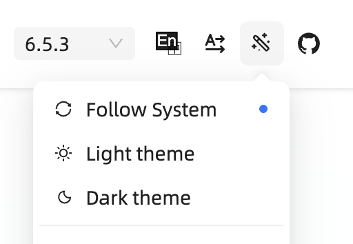
Examples of tri-state dark mode toggles. In (LTR) reading direction: Ant Design, Red Hat Design System, Web Awesome, Excalidraw, Taiga, Astro, Hero UI.

Thankfully, these days the trend has shifted towards a simpler two-state toggle, but tri-state ones are still incredibly common.
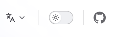
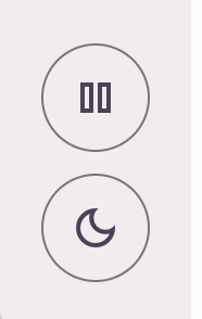
Examples of two-state dark mode toggles. In (LTR) reading direction: Vitepress, Material Design, Adobe Spectrum, Radix, ShadCN.

The rationale sounds plausible: “System” is a different intent than “Light” or “Dark”! One is a policy (whatever my OS says, do that) The other is a value (dark, forever, I don’t care what my OS says.) Surely, users should be able to express that intent!

Except, real users don’t generally seek out dark mode toggles to express intent for things to stay as they are, they seek them out when things need to change.

Think of the user goal when browsing a website (as opposed to a separate Settings page, where three states are fine). E.g. on a documentation site, they may be there to look something up. On a landing page, they may be trying to evaluate whether the product is suitable for their needs. On a media site, they may be there to read the news. On a graphics app, they want to draw something.

One thing is for certain: tweaking the theme is not their primary goal [2]This is about users. Yes, the developers of the site may have a goal of testing the theme, but we optimize UIs for being used, not getting debugged. . To get in the mindset of tweaking the theme, something needs to be off. When things look right, users just move on with their actual goal instead of thinking about the theme.

The tri-state control is solving a largely imaginary user goal that is extremely rare among real users, and does not justify the additional complication and UX friction of a three-state toggle.

Worse, it forces the user to decide between choices that produce no visible difference, breaking the principle of feedback.

Yes, tri-state toggles are common. That doesn’t make them good. This essay explains why, and how to do better.

Tri-state toggles are implementation-driven UI

One of the most common UX mistakes is designing UI around the underlying data model instead of user goals. Good interfaces abstract away the underlying model and expose a model that aligns with user goals (unless of course these happen to coincide, which is rare).
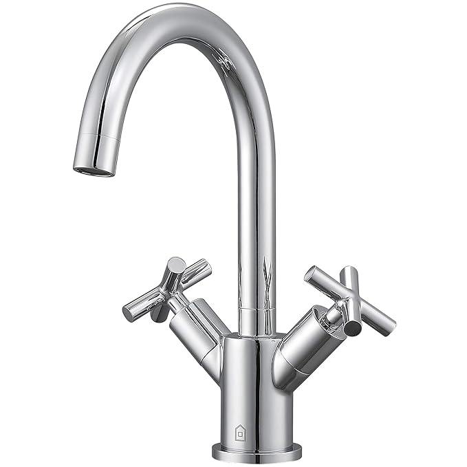
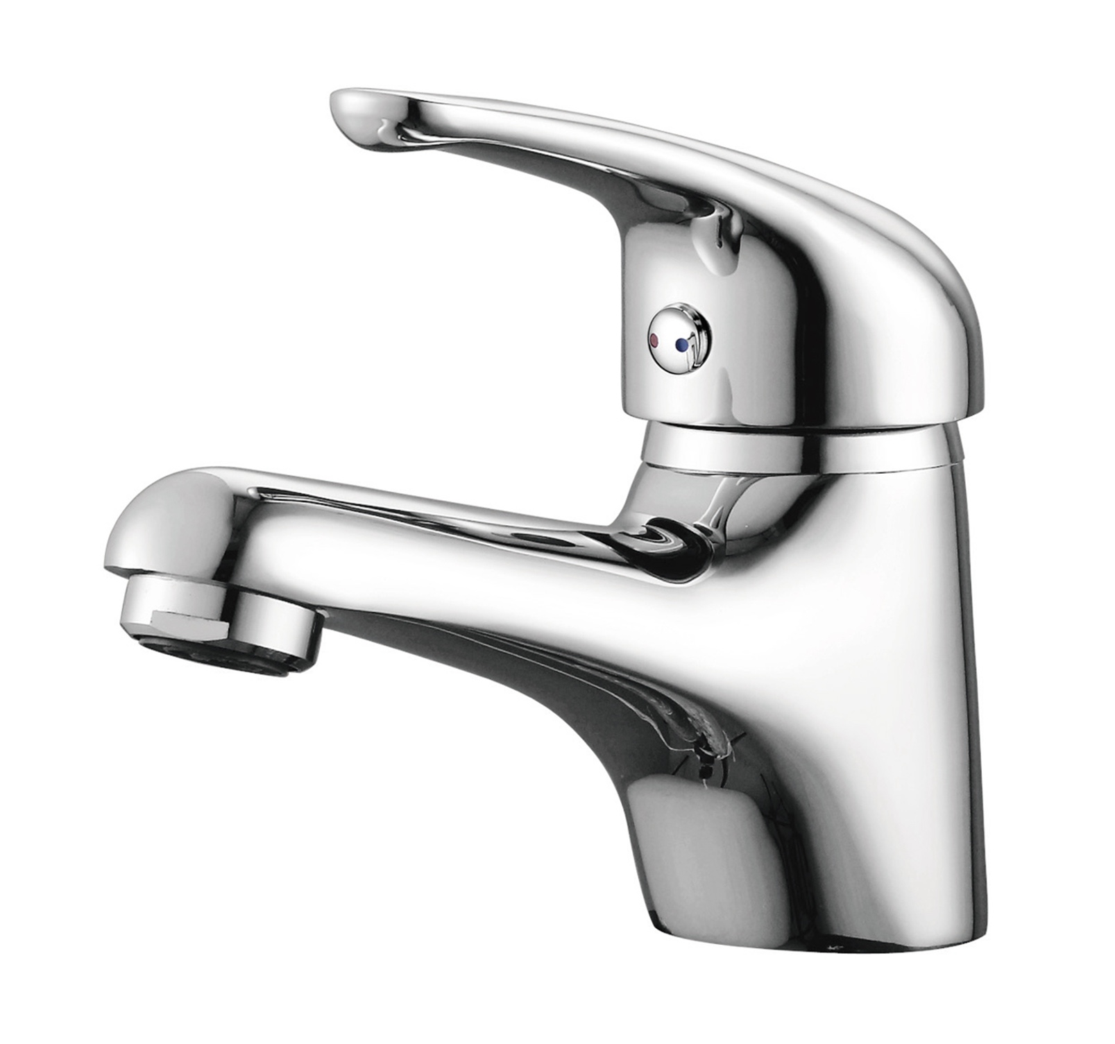
The user goal here is to set a specific flow and temperature. The underlying model works with amounts of hot and cold water. Guess which faucet is easier to use?

This is exactly the case with tri-state dark mode toggles; exposing all three states is data model leaking into the UI.

Yes, there should absolutely be three states in the underlying implementation! But at any given point, one of them is irrelevant to the end-user.

Users cannot meaningfully express intent about problems they don’t currently have.

A dark mode toggle is a temporary comfort adjustment. When it comes to user goals, there are only two real states:

  • The website looks ok. The user moves on with their actual goal and doesn’t look for the toggle at all.

  • The website is too bright or too dark to be comfortable. The user wants to fix it.

You’re reading in bed, the page is a flashbang, you hit the toggle. You’re on a laptop outside and the dark theme is unreadable in sunlight, you hit the toggle. It’s situational, it’s immediate, and it’s usually about the environment you’re in rather than a considered long-term stance on color schemes.

A third state assumes a usage scenario where a user visits a website that looks perfectly fine, and still looks for a dark mode toggle to ensure it can continue to look fine in the future. Users do all sorts of weird things, so I won’t assert that this never happens, but it is not a natural user interaction, fueled by a real user goal. Even the strongest proponents of tri-state toggles I have spoken with either admit they have never done this, or bring up some extremely rare, weird one-off edge cases.

I tried to ask on social media (Bsky, Twitter/X, Mastodon, GitHub), but no matter how hard I tried to word it well, the question kept getting so misunderstood that the data is too noisy to be useful.

Besides people misunderstanding the question and talking about these times where they want to override the OS theme, there were also developers answering about debugging use cases (rather than their actual user behavior), or people talking about that one time they accidentally clicked that option. There was even someone who concluded that because they want the site to inherit the OS setting almost always, they should vote “frequently”! 😵‍💫

That said, I don’t think it matters all that much beyond academic curiosity, as a good two state control can actually express all three states — users just need to apply the override the first time it becomes relevant.

But what’s the harm?

One could argue that sure, the third state is not frequently needed, but surely it doesn’t hurt to have it there for the one user that will need it, right?

But a more complex UI has a cost. It increases cognitive load for interacting with the control and forces you towards certain UI design decisions.

A two-state toggle can be very compact: Just a single icon that switches to another when clicked.

Some websites do go that route with a tri-state toggle that cycles through three states. Docusaurus for example:

But generally, the ergonomics of that are poorer than for the two state toggle, so it is no surprise it’s rare (Docusaurus was the only example I could find).

Some tri-state controls go for three icons side by side, which triples the screen real estate used.

Red Hat, Hero UI, Excalidraw, and Tailwind display three icons side by side.

Others, in an attempt to balance clarity and real estate, resort to a dropdown:

Ant Design, Web Awesome, and Taiga UI go this route. Points for Web Awesome being the only one (!) to actually display what the system default resolves to.

That improves learnability, at the cost of efficiency, as it turns a single click interaction into a two-step process.

The actual perceived friction is actually worse than one extra click. Perceived friction is not a pure function of user actions, but also of the mental effort required to make a decision, and larger UI shifts (e.g. opening a dropdown) are more cognitively expensive than smaller ones (e.g. clicking a toggle) as the user needs to perceive and interpret a larger area.

If not three states, then what?

Guidance towards using tri-state controls is well meaning, but often based on paring good tri-state controls against poor two-state ones. E.g. in this article by Bramus:

Above that many implementations I have seen don’t take the “System” value into account. By omitting this option, the sites will never be able to respond to the system preference again, as they always have an override applied.

Indeed, a bad two state toggle is worse than a tri-state one. It makes the system mode unreachable once tweaked, making the selection irreversible and violating the usability principle of user control and freedom. A good two-state should be able to express all three states.

The idea is that the underlying model is still three states, but only two are shown at any given time:

Option Shown as Stored value     System default Current resolved value (e.g. sun or moon) None   Override Opposite of current resolved value (e.g. moon or sun) light or dark

When you press it for the first time, it toggles to the opposite of what you’re currently seeing, and stores the literal value (light or dark). The next time you press it, it toggles back to the system default, and removes the stored value.

That last bit is the one many two-state toggles get wrong. Storing a value that happens to match the system preference silently converts a temporary adjustment into a permanent pin with no way out.

Another common mistake is being overzealous about removing the stored value when the system preference changes, even if the user has explicitly set an override.

This evaluation must only happen at user interaction.

This is important because many users have their OS set to automatically switch between light and dark mode based on time of day, and removing the stored value proactively would make it impossible for them to actually pin a theme.

If a stored override later happens to coincide with the system preference — because the OS changed, not because the user did anything — you keep it.

This looks like an oversight — they’re the same now, why not tidy up? Because tidying up silently downgrades an explicit choice into a default, based on an event the user didn’t cause and can’t see.

Interactive demonstration

Here’s a concrete scenario that you can navigate interactively (view on separate page):

  • Your OS is in light mode and the site has stored nothing, so the page follows along. Flip the OS control to run this the other way round.

  • You toggle. The target is dark, which is not what the OS says, so the site stores an override. The page goes dark.

  • Your OS switches to dark. The override now matches it but is still kept. Nothing visibly happens, which is correct.

  • Your OS switches back to light. The page stays dark, because the override is still active.

  • You toggle. The target is light, which is what the OS says, so the override is removed. The page follows the OS again.

  • Your turn. Both controls are live and nothing from here on is scripted. Drive them in any order and watch what does — and does not — end up in localStorage.

But what if users get confused?

An argument I heard when discussing this was “but if the user selects light when their OS is light, then the OS switches to dark, won’t they get confused that the website did not preserve their choice?”

People hypothesizing that other people, who are not them, will get “confused” is a bit of a pet peeve of mine in usability discussions, but let’s entertain it for a moment.

Here’s that exact scenario:

  • Your OS is in light mode and nothing is stored.

  • You toggle to dark, which is stored as an override.

  • You toggle again, meaning to pin light. It matches the OS, so the override is removed — you actually got the system default.

  • Your OS switches to dark and the page follows. Not what you meant!

  • But the fix is a single click: light no longer matches the OS, so this time it is an override, and thus pinned, so this can only happen at most once.

Remember, this control is entirely tangential to the actual user goal for visiting the website. Even if their intent were to pin light instead of reverting to System (light), this is something they would only notice once these diverge, i.e. the OS switches to dark. At that point, fixing it is a single click away. It’s such an easy fix, that there is no point in dwelling on it further.

It’s not that this never comes up, but making the tradeoff in favor of a tri-state control isn’t justifiable, IMO. A tri-state control introduces permanent UI complexity to prevent a one-time, easily fixable problem.

Additionally, color appearance is not just a pure function of color components, but also affected by surroundings and other factors. Even if a website implements only two modes, light mode may look slightly different in a light OS vs a dark OS, so selecting it as an override makes it an informed decision.

The title and icon could make the state clearer (e.g. the tooltip saying “Switch back to light (system default)” instead of “Switch to light” or the icon having a small screen icon instead of just a sun or moon). But those would need user testing to validate that they are an actual improvement. My concern is that once you distinguish System (light) from light, it (ironically) could become the thing that primes users to seek a third state that they previously had not considered.

Even if there is an ingenious UI that exposes three states at the same time without adding any cognitive load or friction (I have some ideas about what that might look like), I’m unconvinced this is a problem worth solving, and feels a lot like the UX version of premature optimization.

When is a tri-state control appropriate?

Although I spent the whole article arguing against tri-state toggles, there are actually valid use cases for them.

These are the two cases I’m aware of, but feel free to recommend more in the comments!

1. Color scheme setting that lives a separate settings panel

This article is primarily geared towards a permanently visible toggle in the header or footer.

A setting that lives alongside other settings in a settings panel is a fundamentally different usage scenario:

  • The user is already in the mode of making decisions about their future

  • The expectation is not that every setting must produce immediate feedback

  • There is a lot more screen real estate to explain three states.

It is no accident that while 2-state toggles are becoming the norm for persistent controls, tri-state is (rightly) king for settings panels.
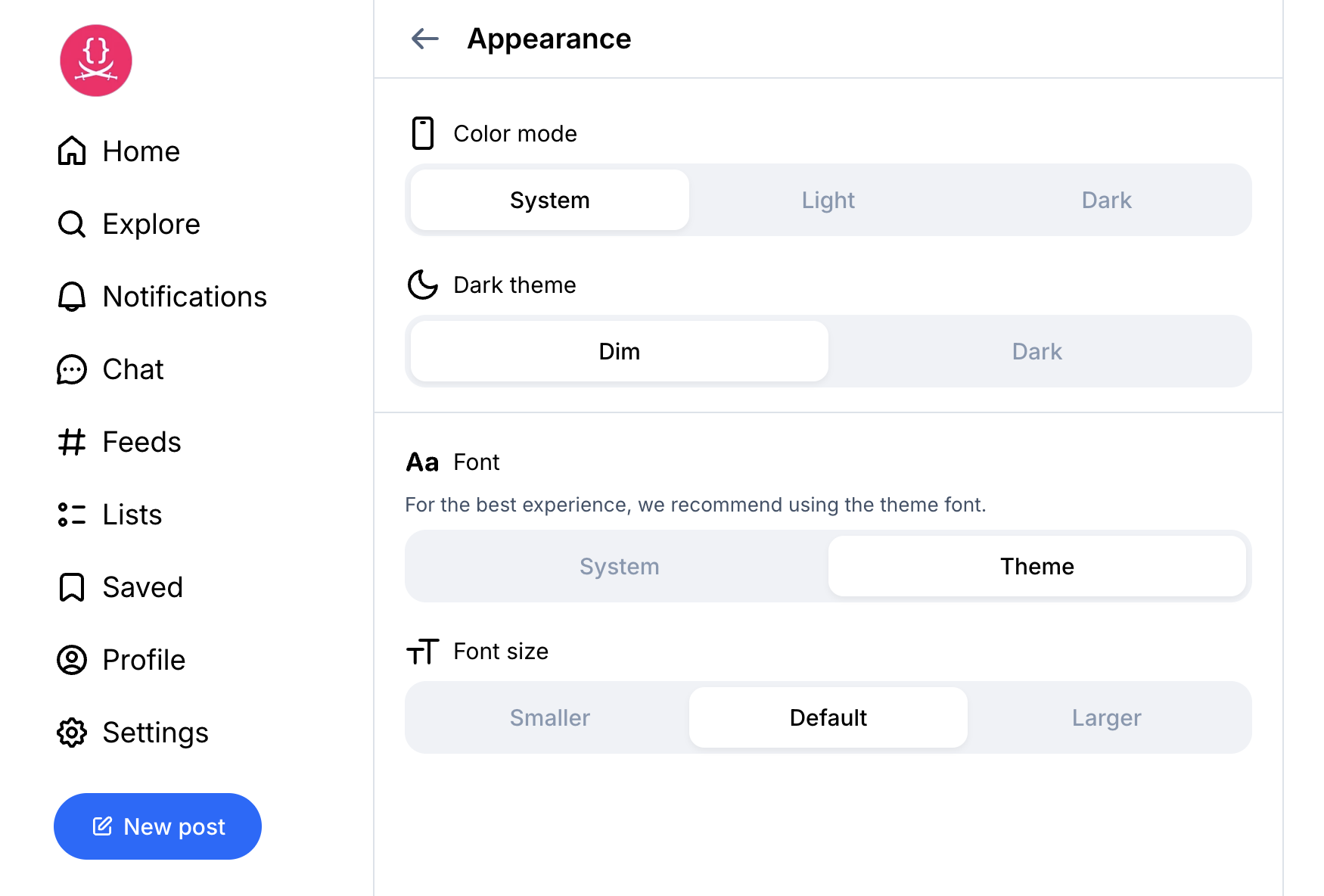
Bluesky’s Appearance settings panel. The tri-state is fine here. Showing the “Dark mode” option below even when it produces no effect, on the other hand…
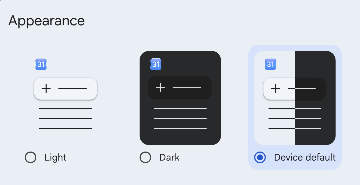
Google Calendar. Love the icons, it would be nice to actually indicate what System currently resolves to.
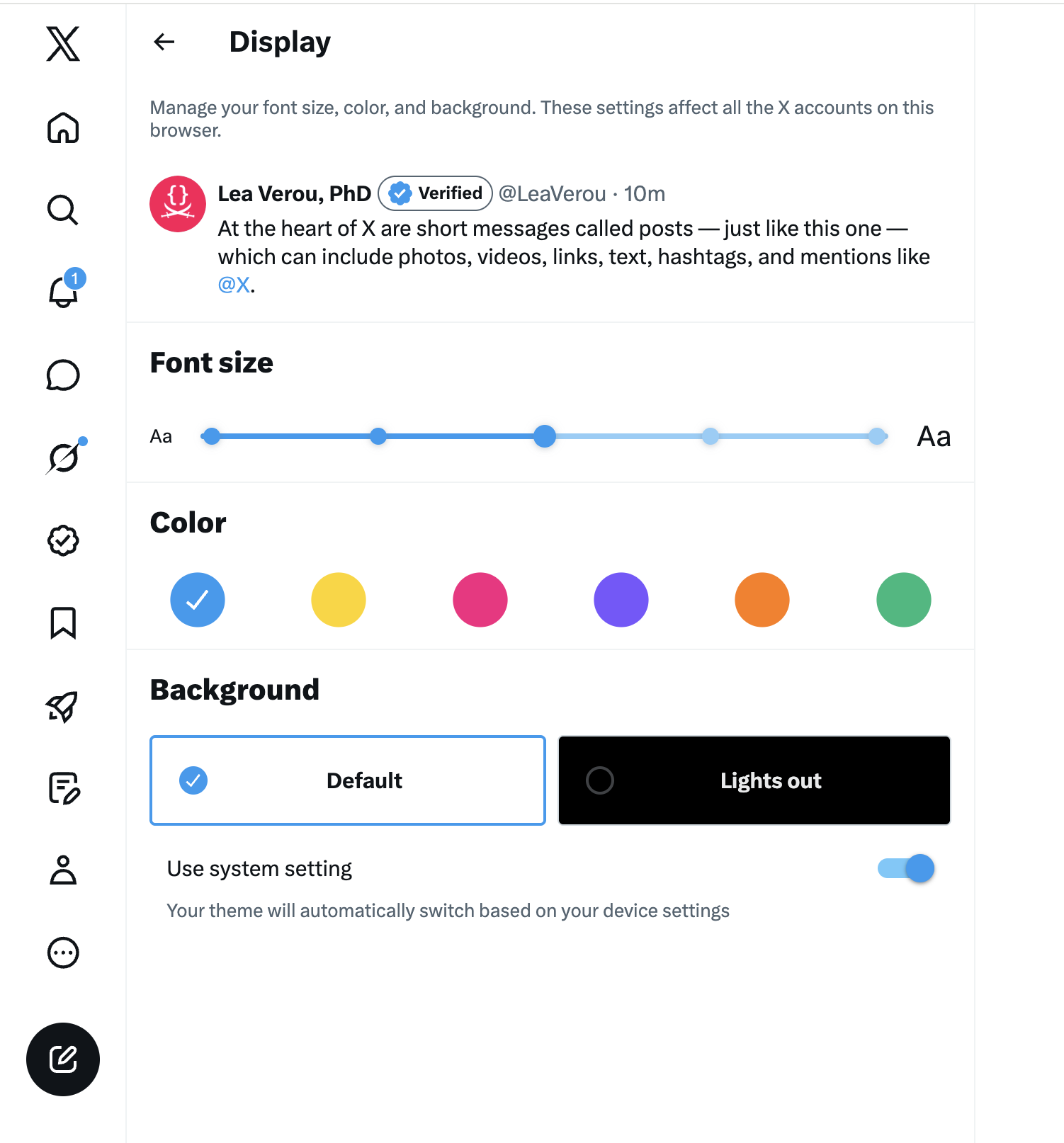
I’m not one to praise post-X Twitter, but having two two-state toggles instead of one tri-state is a very interesting design choice. The UX is not quite there, but if done well, I think it could be the best of both worlds when you have the screen real estate.

2. When color schemes are implemented differently depending on the system setting

This entire essay assumes the common case where a website only has two color schemes: light and dark, and there is no difference between light mode in a dark OS vs light mode in a light OS. Vadim Makeev had an interesting idea: color schemes should take the underlying OS setting into account. Light mode should be less bright in a dark OS and dark mode should be less dark in a light OS, to reduce the contrast between the website and the rest of the system.

I have not seen many UIs doing this, and CSS does not make it easier (light-dark() is very much designed around duality), but if you are actually doing this, you have earned your three states my friend, display them as prominently as you like, none of this applies to you!

Edit: I reached out to Vadim to ask if he had seen any UIs following his guidance. Here’s what he had to say:

Unfortunately, I haven’t seen any websites using this idea. I would say we’re pretty limited with tools currently to do so. The moment we want to override prefer-color-scheme, the whole light-dark() convenience is falling apart.

Yet another problem that CSS functions will solve (nothing preventing us from creating a 2-4 arg version of this).

The general version

The dark mode toggle is a nice case study, but the underlying lesson is bigger:

Users do not seek out solutions to problems they don’t currently have.

The tri-state toggle is the GUI version of low signal-to-noise APIs that ask you to pass dozens of parameters that could have sensible defaults, forcing you to decide on problems you have not encountered and are not relevant.

Do not flood users with options that are irrelevant to their current situation. Options that might become relevant in the future, should be surfaced in that future, not pre-emptively.

Not every state of your state machine warrants visible UI.

Ultimately, everything boils down to the very same principle: Respect user effort.

Thanks to Chris Lilley and Jake Archibald for reviewing an earlier version of this draft

2footnotes

Unless otherwise noted, this refers to a permanently visible toggle in the header or (rarely) footer, not a theme setting in a separate settings panel. ↩︎

This is about users. Yes, the developers of the site may have a goal of testing the theme, but we optimize UIs for being used, not getting debugged. ↩︎

Enjoyed this post?

Want more like it? Pay what you want

Something resonated? Work with me

Report broken page

UX, Usability, Product Design, Dark Mode

📋 讨论归档

讨论进行中…